How to Improve Risk-Adjusted Returns


‘Risk-adjusted returns’ is a common term used in trading and investing, even to the point of being a buzzword. It’s what every institutional investor strives for in order to add value to their clients. And what every individual trader wants to get more bang for their buck.
Risk-adjusted returns normally refers to the idea of improving the relationship between return and risk in a portfolio relative to a common benchmark, such as the S&P 500.
In other words, how can you get more return for each unit of risk you take on?
Among all the basic asset classes – cash, bonds, stocks – equities return the most. But that comes at the expense of a lot of risk.
In a zero– or low-interest rate world, that also means the return on stocks will be nothing like the recent past.
We also have greater than normal risks to contend with.
So, the concept of diversification and improving risk-adjusted returns has never been more important when the returns on all financial assets are low going forward.
We’ll cover some ways about how to go about thinking about correlations within a portfolio and how to construct a portfolio that can help you get better risk-adjusted returns.
Correlations and their role in improving risk-adjusted returns
The less correlated returns streams are, the better they help improve return per unit of risk.
We covered the mathematics behind effective asset allocation in a separate article.
But the basic idea is that if you have four uncorrelated returned streams instead of just one (assuming they’re similar), you keep the same return but cut your risk in half.
If you have about 10 of these, you cut your risk by a factor of 3x.
If you have about 15 independent equal bets, you cut your risk by a factor of 4x. If 25, then 5x.
We can model this in the graph below.
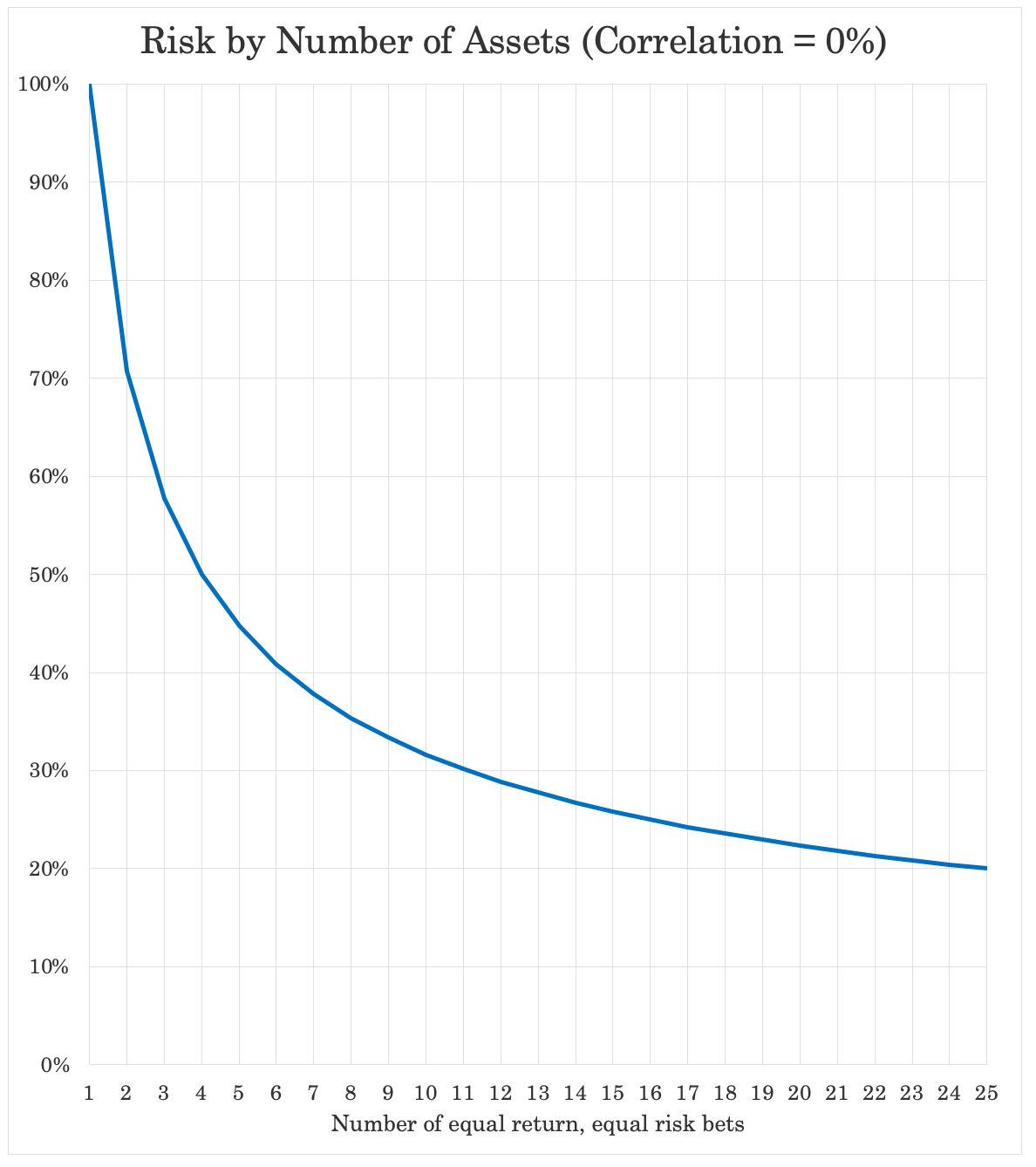
As you can see, the marginal gain from diversification is greatest at first and then declines from that point forward. But any type of diversification is worthwhile.
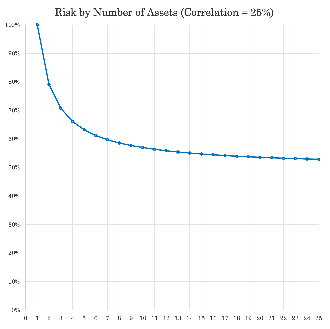
If our returns streams are still 25 percent correlated to each other, diversification is still absolutely worth it, but it becomes much less effective than having truly uncorrelated bets.
Having 25 bets that are 25 percent correlated to each other only improves our return to risk by a factor of not even 2x, instead of the 5x if they’re uncorrelated.
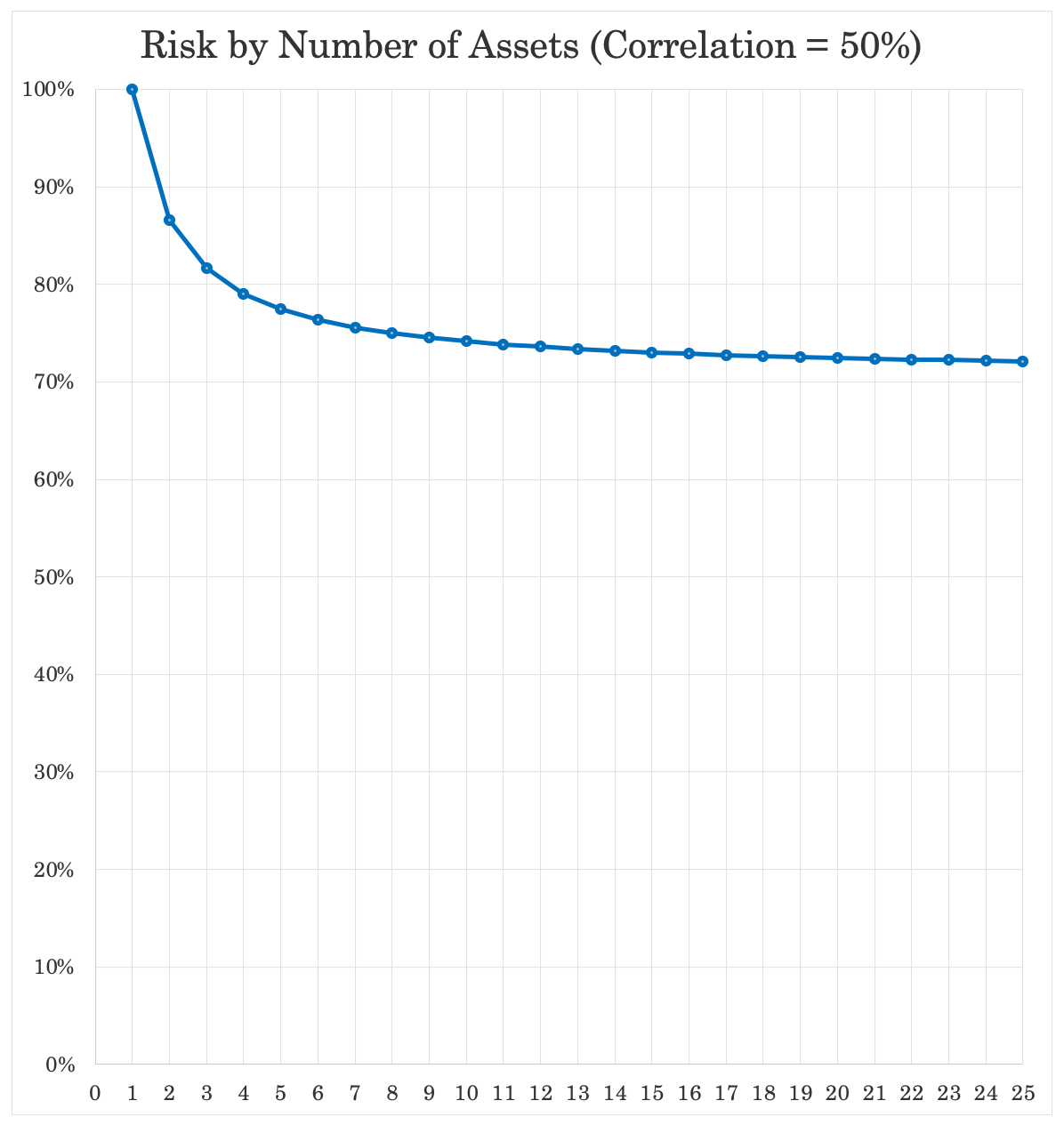
When we get up to 50 percent, the effects erode further, cutting total risk by not even one-third.
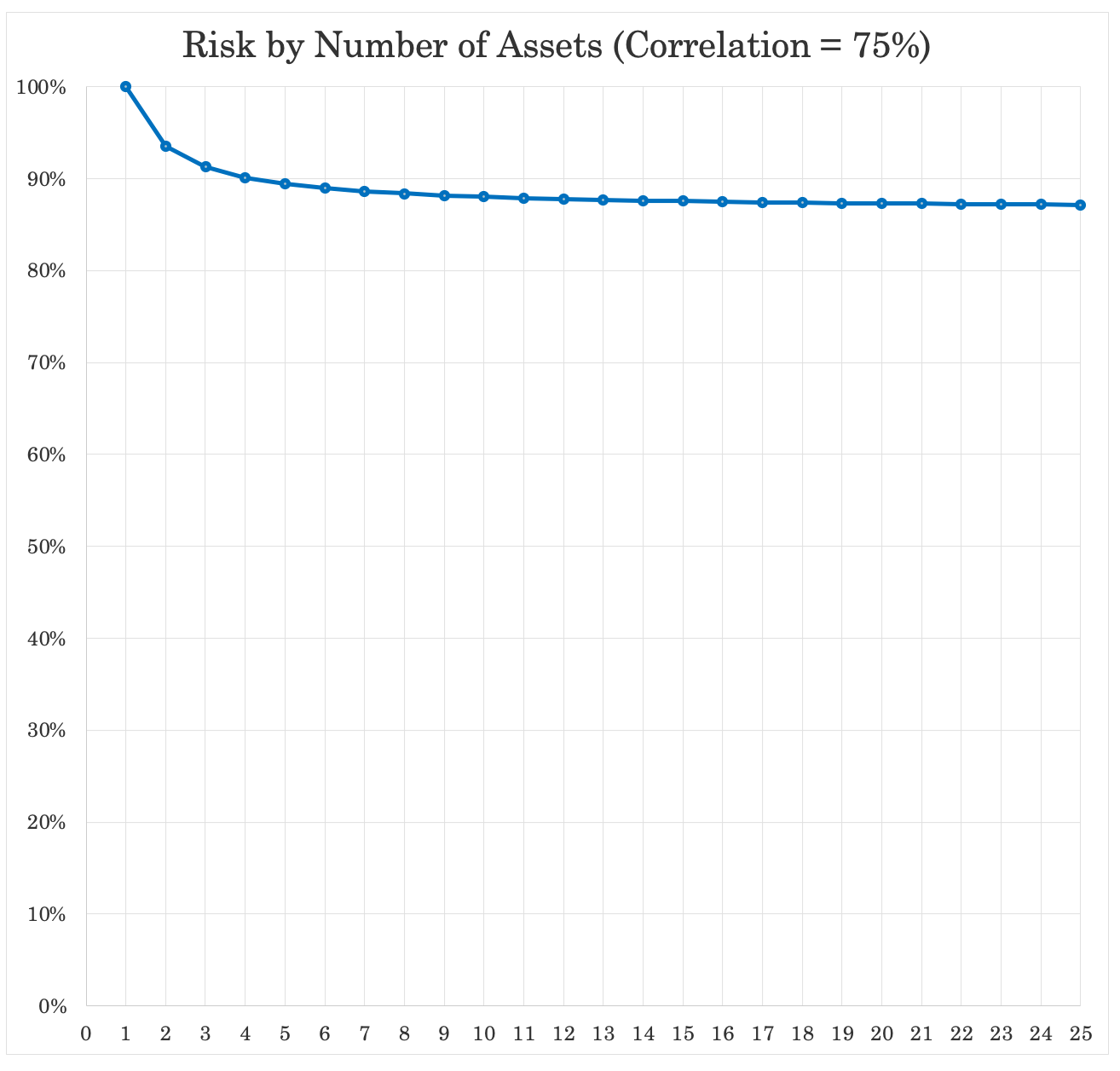
At 75 percent correlation – for example, owning different stocks – past a handful, it doesn’t matter a whole lot. Risk at 25 different bets is cut by only a bit over 10 percent.
How do you find uncorrelated bets?
An easy way is to put your money in different asset classes.
You have stocks, bonds, cash, gold, and different variations of traditional asset classes (often called betas) by risk, geography, currency, and so on.
The problem with diversifying into traditional betas is that there are only so many asset classes.
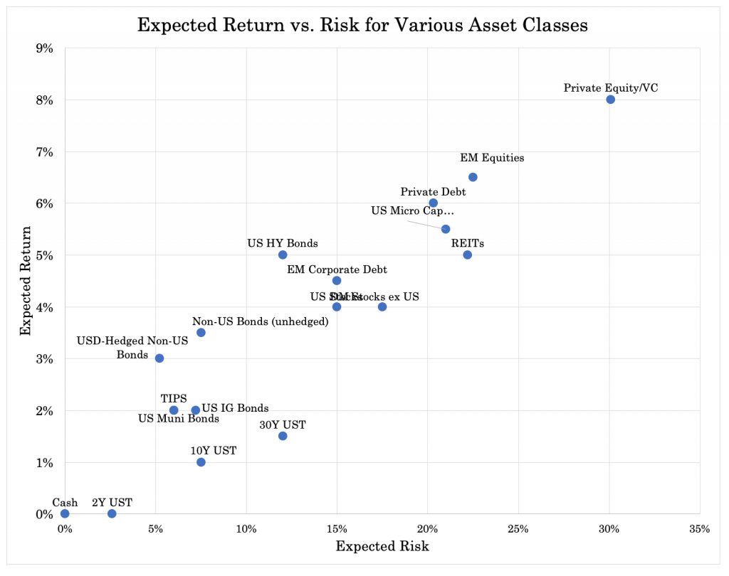
There are various different types of assets (based on type, duration, creditworthiness, country, leverage) that have their own distinct return and risk characteristics.
There’s what called a capital market line that displays the returns of certain assets, with risk increasing as you go to the right.
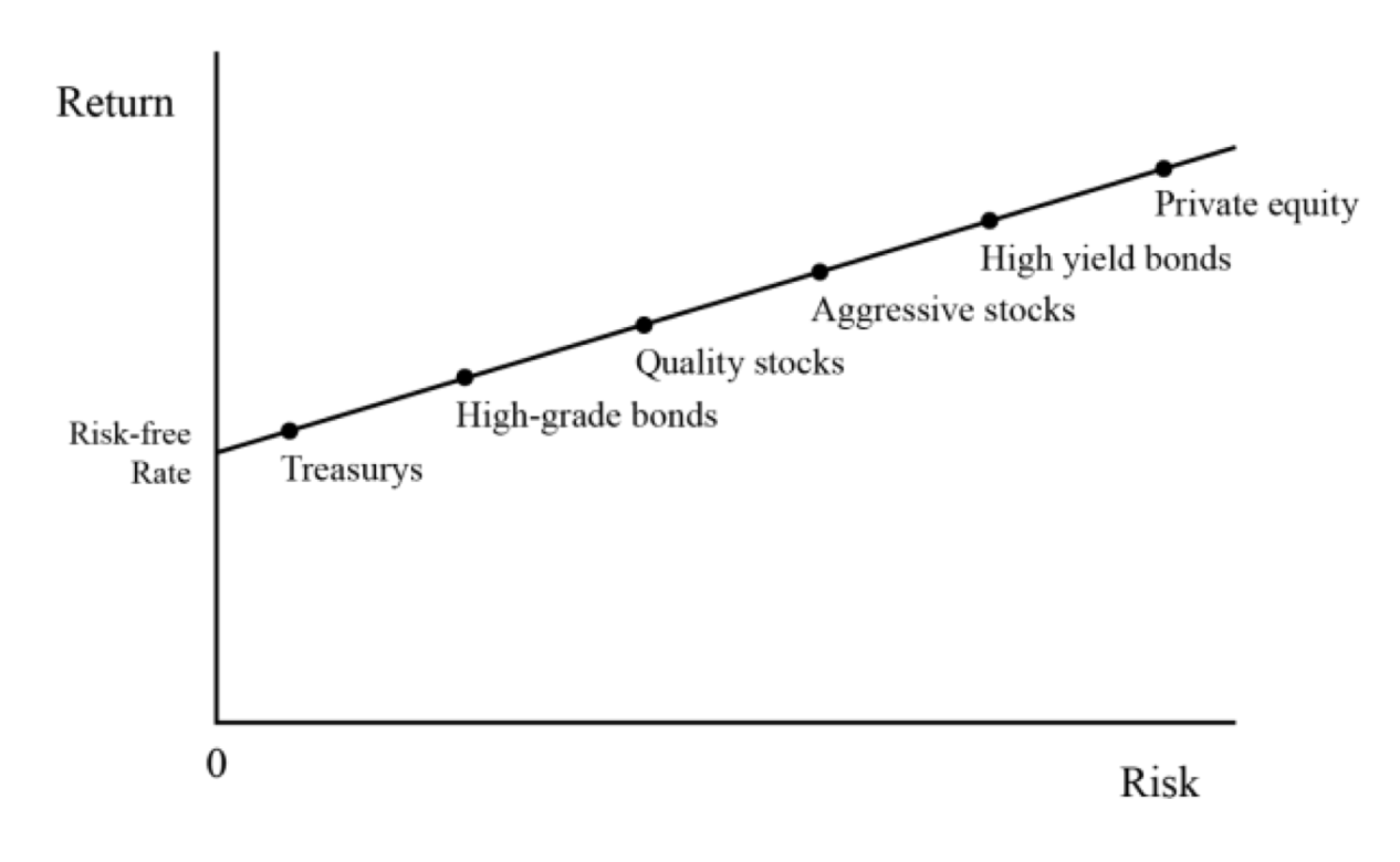
In terms of our risk curve, we transfer from:
– cash/short-term paper and safe government bonds at the lower left, which are the the safest sources of returns…
– to investment-grade corporate bonds to lesser quality bonds…
– to high-quality stocks of moderate volatility and stable cash flows…
– to more speculative stocks with higher growth, low or negative earnings, or less certain financial positions…
– to the very riskiest high-yield bonds…
– and finally into investments like venture capital and private equity. These involve highly uncertain futures, speculative ideas, and/or leverage and come with long lock-up periods. They lack the regular everyday tappable liquidity should an investor need it, which drives risk premiums higher (i.e., the liquidity premium).
The rise in expected return should show a fairly reasonable relationship relative to the risk.
One of the natural equilibriums between the markets and economies is that riskier forms of capital should exhibit higher returns relatively to less risky assets.
Here’s one conception when breaking them down further. Some assets might have the same or comparable returns but different risks (e.g., short-term and long-term bonds, US stocks and developed market stocks (ex-US)):
The general idea is how to have to have balance.
All assets compete with each other. A bond can compete with a stock, which can compete with private equity.
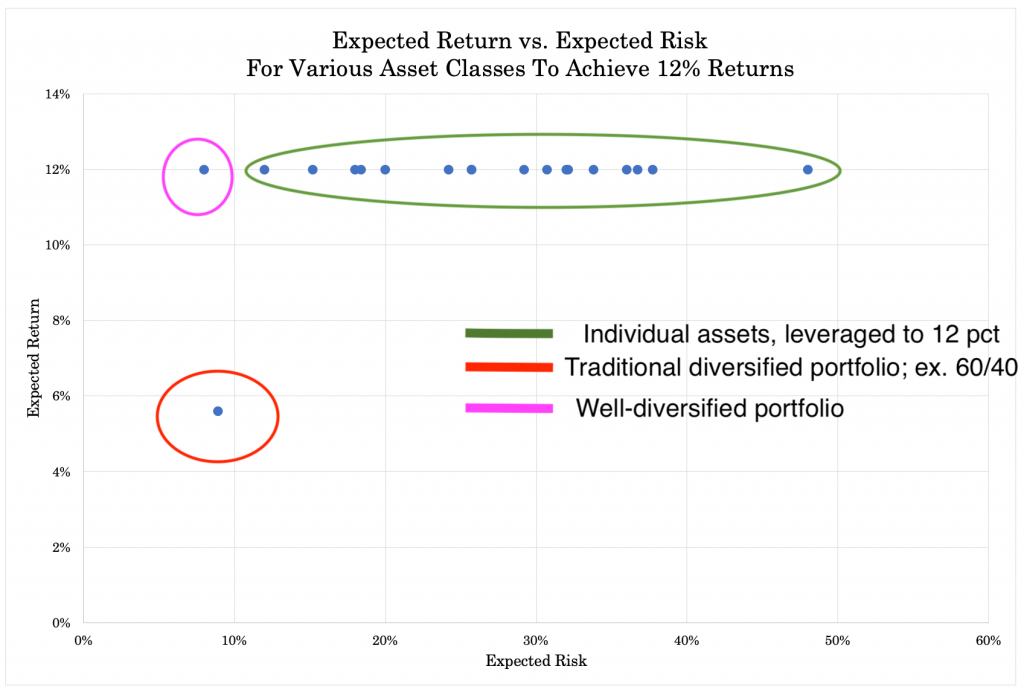
Their returns can be made compatible heavily through the use of leverage.
If a trader or investor has a target return in a portfolio, he can get to that target return by using leverage, if it can be done in a way that’s cost effective and without excess risk.
If we take the above graph and leverage all sources of return to equal 12 percent we could do so with most. When we can’t, it’s because we don’t have the spread between cash/our borrowing rate and the asset itself.
For example, if our borrowing rate is one percent, then any asset yielding below one percent in total returns can’t be leveraged.
But taking that basic idea, if we have the appropriate balance between assets such that they’re balanced and leveraged well, we can create something with much lower risk and higher returns relative to a poorly diversified portfolio.
The 60/40 portfolio is more of a traditional idea of “diversification” but with 60 percent allocated to the more volatile asset class, it still retains about 90 percent of its risk in equities and allocating more to bonds sacrifices long-term returns.
The graph below conceptually illustrates the idea:
The basics of balancing
All asset classes have an environmental bias.
Stocks do well when inflation is moderate to decreasing and growth is moderate to above expectation.
Throwing a bunch of stocks into a portfolio doesn’t diversify well.
No matter how many stocks you may own, it’s not a balanced portfolio because they have the same general environmental bias.
This would also be true if you owned only a bunch of corporate or government bonds or various commodities. You have that concentration risk that’s going to give you bigs ups and painful downs.
Things that are ostensibly balanced like the aforementioned 60/40 or 50/50 portfolio (i.e., 50-60 percent in stocks and 40-50 percent in bonds) are not balanced.
This is because stocks are more volatile than most bonds by about 2x-3x depending on the exact types of each asset class.
Stocks are perpetual cash flow instruments while most bonds have a fixed maturity. Stocks are therefore more volatile because they have longer duration. They also have higher credit risk. If a company has to liquidate, bondholders get paid ahead of common shareholders.
Therefore, a 60/40 portfolio is more like a 88/12 portfolio in terms of the risk decomposition between stocks and bonds, respectively. A 50/50 portfolio is more like 77/23.
To get diversification, you’d have to be more like 35/65. But the problem with that allocation is that the dollar amount in stocks is so low relative to bonds that you severely hurt your long-term returns. That’s especially true in an environment where bond yields are so low.
This is where the judicious use of leverage comes into play. If you can leverage the fixed income side of the portfolio to match the volatility of stocks, you can have that balance between the two and without sacrificing long-run returns.
In other words, you can have the ‘100’ in stocks instead of the suboptimal ‘60’, ‘50’, ‘35’ or whatever it might. But you still have balance with fixed income by bringing that up to the same level of risk through leverage or leverage-like techniques (e.g., bond futures).
In terms of environment, stocks do well when growth is above expectation and safe bonds do well when growth is below expectation.
So, an equal-risk stock and bond portfolio diversifies well with respect to growth.
But it doesn’t do a very good job of diversifying when inflation runs above expectation. Both stocks and nominal rate bonds do best in moderate to low inflation environments.
Both do poorly when inflation rises because of the implication for interest rates and what higher interest rates means for the discounting of future cash flows.
This is where “inflation” assets come into play. This includes inflation-linked bonds (e.g., TIPS, inflation-linked GILTs), variable rate loans, commodities, and gold and other precious metals come into play. It could even mean certain forms of land or real estate.
If you can combine these well, you’ll have a much better portfolio than the average one tracking an index.
Wealth also isn’t destroyed so much as it shifts around.
Money and credit is always shifting between asset classes, between countries, between currencies, and between fiat and non-fiat stores of wealth of various uses and durations.
If you’re only in stocks (or any other asset class, country, or currency) and you don’t have anything else to “catch” shifts out of it, then you will inevitably have very large and painful drawdowns.
When stocks go down a lot, where did the money go? Did it disappear?
Some of the decline could have been actual credit contraction. Namely, when somebody thinks they have an asset but there is no underlying cash flow to make due on that claim, then they don’t actually have an asset at all.
Part of any decline can be real wealth destruction when an asset declines or a business fails.
But a lot of it is simply moving to a different place. If a stock declines, it could be money and credit shifting into bonds, into different geographies, into different currencies, or any range of assets or uses.
It could be converted into cash and saved. It could spent in the real economy. It could be used to pay down a debt.
But any time there’s a shift out of something it can disperse to many other asset classes, geographies, and currencies that are deemed to be more hospitable to the right mix of returns relative to the risks.
Learning how to blend well among all those factors is key to systematically improving return relative to the level of risk taken on.
Having a portfolio that’s well-balanced and can do well in a variety of economic environments and limit drawdowns is important.
Otherwise one is going to spend too much time simply trying to earn back money that was lost in previous drawdowns.
Example of improving risk-adjusted returns
Let’s compare two basic portfolios.
In the first one we have a mix of three assets:
– stocks
– gold
– long-term US Treasury bonds
In the second portfolio we have just stocks.
Here are the allocations:
Portfolio Allocations
| Asset Class | Allocation |
|---|---|
| US Stock Market | 33.00% |
| Gold | 12.00% |
| Long Term Treasury | 55.00% |
| Asset Class | Allocation |
|---|---|
| US Stock Market | 100.00% |
We have a more or less simple balanced portfolio in the first case and a normal concentrated stocks portfolio in the second.
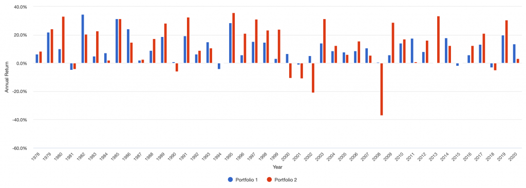
Here’s how they did from January 1978 through the end of 2020:
Portfolio Returns
| Portfolio | Initial Bal | Final Bal | CAGR | Stdev | Best Year | Worst Year | Max. Drwdwn | Sharpe Ratio | ||
|---|---|---|---|---|---|---|---|---|---|---|
| Portfolio 1 | $10,000 | $583,276 | 9.96% | 8.60% | 34.46% | -4.92% | -14.02% | 0.63 | ||
| Portfolio 2 | $10,000 | $1,036,977 | 11.45% | 15.39% | 35.79% | -37.04% | -50.89% | 0.50 |
For the diversifying we undertook, we sacrificed 150bps of annual returns and cut our risk nearly in half from a 15.4 percent annualized volatility down to just 8.6 percent.
The “best year” of each portfolio was comparable.
The “worst year” was much better at just minus-4.9 percent for the diversified against minus-37.0 percent for the stocks portfolio.
Our maximum drawdown for the diversified is 14.0 percent for the diversified versus 50.9 percent for the stocks.
The Sharpe ratio improves to 0.63 versus 0.50. The Sortino ratio (not shown in summary statistics above) improves to 1.02 from 0.71.
The market correlation is 0.62 for the diversified versus a perfect correlation for the default (since it’s an all stocks portfolio). The beta of the diversified portfolio is just 0.34.
Portfolio Growth
Below we can see the market growth over time of each portfolio on a logarithmic scale. The red line is stocks. The blue line is diversified.
Portfolio Growth
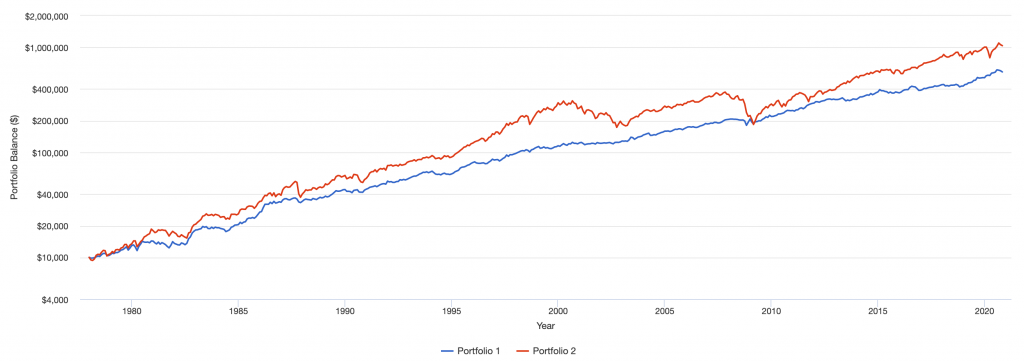
(Source: portfoliovisualizer.com)
Here are year by year returns. The stocks portfolio has conspicuously larger drops due to its concentration risks.
Annual Returns
For more complete statistics of the basic balanced portfolio vs. the stocks portfolio, please see the Appendix at the bottom of this article.
Diversified portfolio shows better risk-adjusted returns
The stocks portfolio comes out ahead, but it only tells part of the story. It did so at higher risk.
When we have a 15.4 percent volatility versus just an 8.6 percent volatility. One can leverage the diversified portfolio by a factor of 1.8x to match the volatility of the stocks portfolio.
In other words, for each $1 in equity, one can borrow $0.80 to match the same volatility.
We assume that the cost of borrowing approximates the rate on cash over this time period plus a bit extra (about 5 percent).
If that were the case then our statistics now look like this:
Portfolio Returns
| Portfolio | Initial Bal | Final Bal | CAGR | Stdev | Best Year | Worst Year | Max. Drwdwn | Sharpe Ratio | ||
|---|---|---|---|---|---|---|---|---|---|---|
| Portfolio 1 | $10,000 | $2,255,580 | 13.43% | 15.39% | 63.02% | -8.86% | -25.24% | 0.63 | ||
| Portfolio 2 | $10,000 | $1,036,977 | 11.45% | 15.39% | 35.79% | -37.04% | -50.89% | 0.50 |
We get an extra 200bps of return per year at the same risk.
Our “worst year” is still much better at around 9 percent.
And our maximum drawdown is only half as bad.
A simple mix yield great improvements in both absolute and risk-adjusted terms.
The benefits of balancing
If you can balance well, you will improve risk-adjusted returns. Any drawdowns will be much shallower.
Volatility and left-tail risk will also be lower by a factor of 2x to 3x just based on fairly simple mixes of assets.
With this advantage, you can:
– enjoy a less risky portfolio
– have the same return for less risk
– obtain more return for the same risk
– or some combination
Correlations
It’s important to have an idea of how everything in your portfolio correlates.
By correlation, it’s not meant that stocks and bonds are X percent correlated to each other, but to know how each acts.
Instead this means what are they like intrinsically.
Correlations and their importance in boosting risk-adjusted returns
When constructing a portfolio, you should keep the following in mind:
What drive their returns and risks and how do their prices change in response to certain variables, such as movements in the expectations of growth and inflation?
If you own, for example, stocks, bonds, real estate, private businesses, collectibles, gold or precious metals, you’re spread among different currencies, and so on, how do all those assets behave independently and in relation to each other?
Are they alike or are they different?
If you think of previous big downturns like 2008, how did they perform through those events?
Did their prices move around a lot? Assets that held steadier are better stores of wealth than those that aren’t. Consumer staples companies like JNJ, PG, and KO did much better than cyclical or highly leveraged companies.
Did those big events impact how much cash you could generate from them?
Did some assets rise to help offset the losses in others, creating diversification and preserving equity (ideally better than the equity market)?
How did the overall value of the portfolio shift? Did it largely at least hold steady or did it result in painful drawdowns?
What other things can you do to improve your return relative to your risk?
Correlation examples
As a basic example, stocks and corporate bonds correlate positively. They both do well when companies do well and poorly in recessions, so they are both in the “positive growth” bucket.
Stocks and government bonds over the long-term should not correlate. They have had a negative correlation in recent decades, which has increased their demand.
For instance, traders are willing to buy into negative yielding debt because they know it will still retain most of its worth over time and believe that it may act as a natural hedge on equity declines.
The thinking goes – stocks could easily lose 20 percent should something (whatever it is) go wrong. But the bonds will still mostly retain their value.
Even in Switzerland, with the lowest interest rates in the world, you’re losing not even one percent of your principal per year. That can sound comparatively okay if you’re heavily concerned about equity risk.
Gold and stocks should not traditionally correlate.
Gold should also not correlate much with oil. Gold is a long duration storehold of wealth asset while oil is a shorter duration asset whose spot price is heavily dependent on the near-term demand for energy (e.g., travel, manufacturing, etc.).
Treasury inflation-protected securities (TIPS) should correlate positively with nominal rate bonds to a notable degree (though far from perfect) and correlate positively with gold (though to a lesser degree than nominal rate bonds).
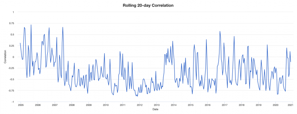
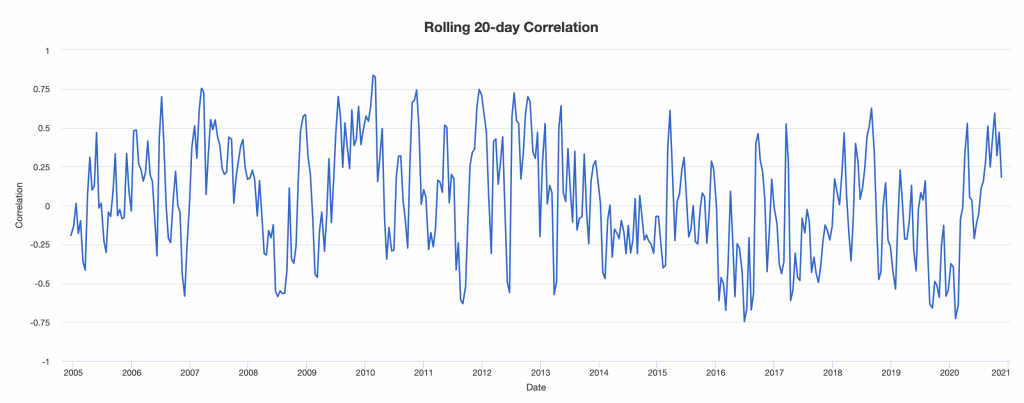
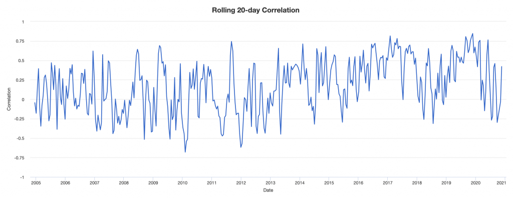
In the chart in the next section we give the correlations of five different asset classes through their representative ETFs – stocks, US Treasury bonds, gold, Treasury inflation protected securities (TIPS), and oil.
Correlations of various asset classes and types
Here are the correlations between popular assets since they all began simultaneously trading (i.e., the ETFs) on May 1, 2006.
| Name | Ticker | SPY | TLT | GLD | TIP | USO | Ann. Return | Daily Std Dev | Monthly Std Dev | Ann. Std Dev |
|---|---|---|---|---|---|---|---|---|---|---|
| SPDR S&P 500 ETF Trust | SPY | – | -0.33 | 0.07 | 0.20 | 0.43 | 8.65% | 1.28% | 4.35% | 15.07% |
| iShares 20+ Year Treasury Bond ETF | TLT | -0.33 | – | 0.25 | 0.52 | -0.38 | 7.81% | 0.92% | 3.90% | 13.51% |
| SPDR Gold Shares | GLD | 0.07 | 0.25 | – | 0.51 | 0.12 | 7.11% | 1.16% | 5.01% | 17.36% |
| iShares TIPS Bond ETF | TIP | 0.20 | 0.52 | 0.51 | – | 0.10 | 4.37% | 0.40% | 1.63% | 5.64% |
| United States Oil | USO | 0.43 | -0.38 | 0.12 | 0.10 | – | -19.21% | 2.36% | 10.82% | 37.49% |
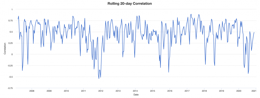
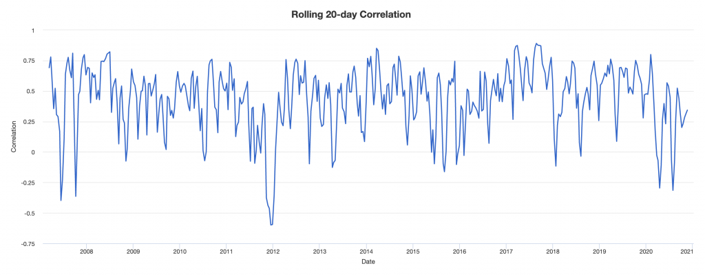
Correlations are not stable
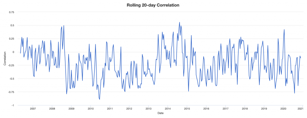
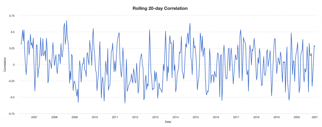
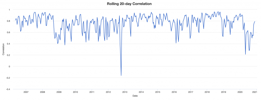
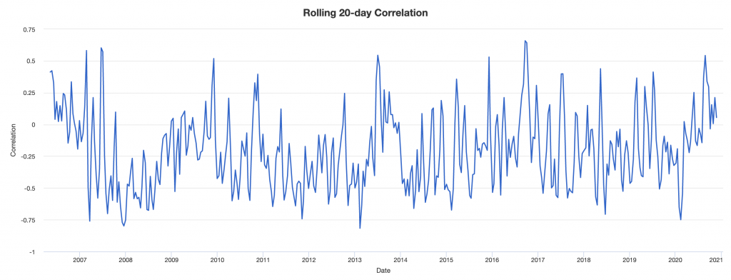
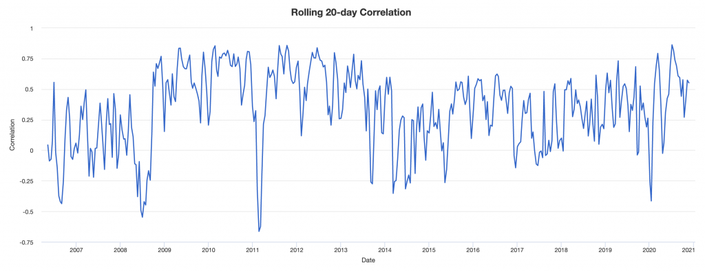
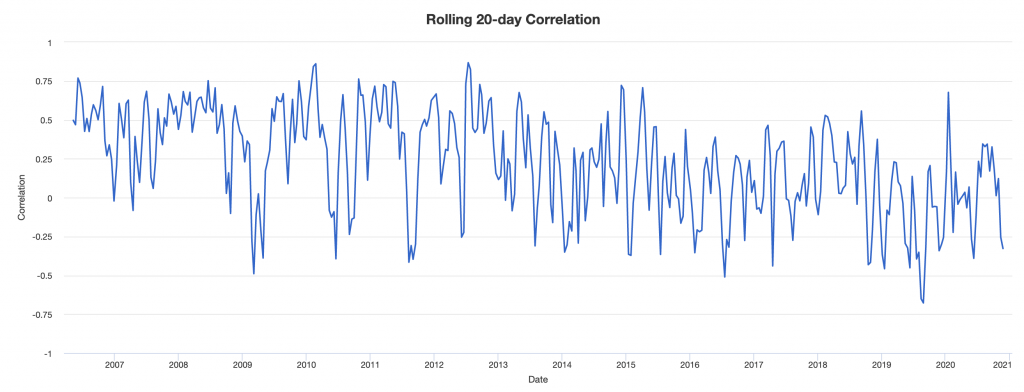
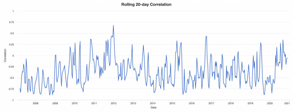
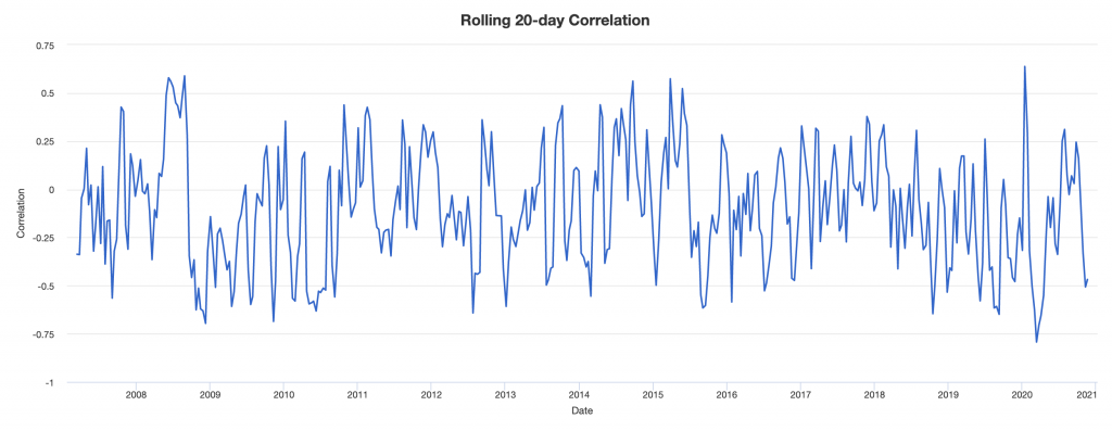
If we look at 20-day rolling correlations among asset classes, we see that correlations are far from stable. This is why using historical correlations is not a good idea when building a portfolio around them.
There are still nonetheless some discernible trends on what can be expected when you mix them in your portfolio.
For example:
Stocks and US Treasuries
Stocks and Gold
US Treasuries and Gold
More important is to learn how they move.
Consider oil and bonds.
Oil and Nominal Rate Bonds
Higher oil feeds into inflation.
Inflation is bad for bonds because it tends to increase interest rates, which lowers the price of bonds. Prices and yields move inversely.
Accordingly, you see this transpire with an inverse correlation.
Owning both oil and bonds is a type of natural hedge in a way. Albeit an imperfect, as you do see periods of positive correlation on a rolling 20-day basis.
Oil and Inflation-Linked Bonds
Oil and inflation-linked bonds are a different story and oil and regular bonds.
Both are “inflation” assets, though different, with one being good in positive growth environments (oil) and one being good in negative growth environments (safe inflation-linked bonds like TIPS).
Here we tend to see a mild, positive correlation, which makes sense.
Nominal Rate Bonds and Inflation-Linked Bonds
With Treasuries (nominal rate bonds) and TIPS (inflation-linked) they’re on opposite sides when it comes to inflation, but are both assets that tend to do well in a negative growth environment.
So they tend to correlate positively:
Stocks and Inflation-Linked Bonds
Stocks tend to do well in positive growth, moderate to low inflation environments. TIPS do better in a negative growth environment where inflation is above expectation.
They should diversify fairly well to each other. But it’s also important to note that both do well when interest rates are falling. This leads to periods of positive correlation.
Stocks and Oil
Stocks are both positive growth assets.
Oil does better in a rising inflation environment relative to stocks (oil and commodity producers tend to be exceptions).
Gold and oil
Gold and oil are both commodities, but they are very different from each other.
People use gold as a way to store wealth. Governments, central banks, and reserve managers use it as a reserve asset. Investment managers commonly use it as a currency hedge when real interest rates become unacceptably low.
It’s a type of alternative currency that is better thought of as a currency than an actual commodity subject to supply and demand based on the intent for near-term consumption like oil.
They both may do well in a rising inflation environment, though gold is more versatile and can also do well when inflation is below expectations. Gold’s long-term value is proportional to fiat reserves and currency in circulation.
It’s effectively the inverse of money and rises in demand when real interest rates or real yields on traditional financial assets decline.
So we see times when it positively correlates and times when they act more independently of each other.
Currency diversification
Even something like owning some yen can help diversify a portfolio to things like stocks and oil.
Yen has traditionally been viewed as a safe haven as traders like to borrow in it to fund carry trades. That’s become less of a thing as the two other main reserve currencies (USD and EUR) can be used for this purpose as well.
So the yen’s safe haven status may be shifting in a way, which we covered in a separate article.
But the main idea is that owning different currencies is an important part of diversification as well.
Yen and US stocks
Yen and Oil
Japan is a commodity importer, so unlike countries like Mexico, Canada, Norway, and others that produce it, their economy can actually benefit from weak oil instead of strong oil.
Yen can also diversify any portfolios holdings in oil (e.g., the commodity itself or commodity producers).
Yen and nominal rate bonds
Yen tends to have a mild positive correlation with nominal rate bonds (i.e., US Treasuries), given their mutual “safe haven” status treatment. The correlation going forward is likely to be lower.
Yen and inflation-linked bonds
The same is true with respect to inflation-linked bonds (i.e., US TIPS) in roughly the same fashion as nominal rate bonds.
Currency diversification is undervalued
Yen and other currencies (including gold) are useful for diversification and improving your portfolio’s risk-adjusted returns over time.
Too much emphasis is placed on diversification within asset classes. Past a point, because the correlations among different stocks is so high, it won’t matter much.
Sprinkling in some bonds to diversify equity risk will yield an improvement in risk-adjusted terms, but it’s generally done in an insufficient way where the portfolio is still heavily in equities and the bonds lower the overall long-run returns.
Currency diversification tends to be heavily undervalued. Most investors are biased toward whatever their home currency is because that’s typically what they make their income in. US traders, for example, have the bulk of their portfolio in dollars.
Owning yen can help diversify. Gold is a diversifier and acts more as a currency.
Owning some Chinese renminbi (yuan; RMB or CNY) can help as the world become more bipolar and the US and China drift more apart.
Chinese incomes will also get more in line with US incomes over time. China will take steps to make the RMB more of a reserve currency globally.
Having something like 10 percent of your portfolio in gold and another 5-10 percent in yen and 5-10 percent in RMB could be viable.
The FX positions are not core trading positions per se (unless you want to actually buy Chinese assets in RMB, for example), but simply a way to obtain more diversification by changing up your cash mix. Some brokers may have margin requirements associated with doing this while others won’t.
The same can also be said for owning EUR and GBP, and smaller amounts of other currencies (e.g., CHF, CAD, AUD, NZD, emerging market FX).
Tying everything together
Improving your risk-adjusted returns is always the goal in trading and investing, but it’s not exclusive to it.
The idea of getting more with less is applies to all businesses. You should always be looking for ways to balance your bets well to achieve more with less. And as you do this, you will learn more to be even more effective over time.
Diversifying well is the best thing you can do to improve risk-adjusted returns – i.e., improving your return for each unit of risk.
Betting on what’s going to be good or bad is difficult to do as the consensus is already reflected in the price.
For most traders and investors, their best bet is to have a well-diversified portfolio.
More of the focus should be in terms of how can one structure the portfolio in a way that provides an excellent asset allocation mix that doesn’t bias the portfolio to outperformance or underperformance in any given environment.
Combining the various elements in a portfolio and balancing them well is key.
You can choose among:
– Stocks
– Nominal rate bonds
– Inflation-linked bonds
– Gold and other precious metals
– Oil and other commodities
– Different currencies
You can also choose among assets in different geographies.
Appendix
Below we have a more diverse set of portfolio statistics between the 33/55/12 (stocks / long-term US Treasury bonds / gold) portfolio and stocks.
| Metric |
|---|
| 33% / 55% / 12% | 100% Stocks | |
|---|---|---|
| Arithmetic Mean (monthly) | 0.82% | 1.01% |
| Arithmetic Mean (annualized) | 10.36% | 12.78% |
| Geometric Mean (monthly) | 0.79% | 0.91% |
| Geometric Mean (annualized) | 9.96% | 11.45% |
| Volatility (monthly) | 2.48% | 4.44% |
| Volatility (annualized) | 8.60% | 15.39% |
| Downside Deviation (monthly) | 1.34% | 2.93% |
| Max. Drawdown | -14.02% | -50.89% |
| US Market Correlation | 0.62 | 1.00 |
| Beta(*) | 0.34 | 1.00 |
| Alpha (annualized) | 5.74% | -0.00% |
| R2 | 37.83% | 100.00% |
| Sharpe Ratio | 0.63 | 0.50 |
| Sortino Ratio | 1.02 | 0.71 |
| Treynor Ratio (%) | 15.94 | 7.67 |
| Calmar Ratio | 2.02 | 0.48 |
| Active Return | -1.49% | 0.00% |
| Tracking Error | 12.17% | 0.00% |
| Information Ratio | -0.12 | N/A |
| Skewness | 0.10 | -0.74 |
| Excess Kurtosis | 1.56 | 2.26 |
| Historical Value-at-Risk (5%) | -3.20% | -7.09% |
| Analytical Value-at-Risk (5%) | -3.26% | -6.30% |
| Conditional Value-at-Risk (5%) | -4.61% | -10.19% |
| Upside Capture Ratio (%) | 44.47 | 100.00 |
| Downside Capture Ratio (%) | 21.65 | 100.00 |
| Safe Withdrawal Rate | 6.37% | 8.41% |
| Perpetual Withdrawal Rate | 6.08% | 7.35% |
| Positive Periods | 335 out of 514 (65.18%) | 331 out of 514 (64.40%) |
| Gain/Loss Ratio | 1.29 | 0.99 |
Among the improvements relative to a standard stocks portfolio:
- Volatility is cut by 44 percent
- Downside deviation is cut by more than 50 percent
- Max drawdown is only about one-quarter as deep
- Beta is just 0.34 (particularly important for an institutional investor trying to offer a differentiated product)
- Alpha is nearly 600bps per year
- Notable Sharpe, Sortino, Treynor, and Calmar ratio improvements
- Skewness is superior (doesn’t bear a lot of large drawdowns)
- Lower kurtosis (experiences less tail events either way to go along with lower volatility in general)
- Value-at-risk (VaR) is cut by more than 50 percent considering historical, analytical, and conditional approaches
- Upside capture ratio is about 2x the downside capture ratio as opposed to the normal 1x in equity portfolios (since they’re considered the market)
- The number of positive periods is higher; namely, in what percentage of the months does the portfolio produce a gain? (About 65 percent of the time)
- Gain/loss ratio is higher