Tail Risk Hedging: Strategies and Comparisons


Tail risk hedging and tail risk protection strategies help mitigate the risk of substantial drawdowns in a portfolio.
How do investors protect against these potential price falls?
Whether it’s a rapid 20% loss in a month or a gradual decline over a year, the timing and duration of these drawdowns can drastically affect long-term gains.
Below we look in deeper detail at tail risk hedging, exploring strategies that not only shield portfolios from sudden downturns but also position them for growth over the long-run.
Key Takeaways – Tail Risk Hedging: Strategies and Comparisons
- Tail risk hedging strategies, especially with options, provide significant protection during sudden market crashes but have negative expected returns over longer durations (like most forms of insurance).
- The efficacy of these strategies is path-dependent, excelling in sharp downturns like 2008 but potentially underperforming in prolonged declines like the early 2000s tech bust or during the more gradual 2022 bond/stock sell-off.
- Beginner/intermediate traders/investors may overlook the nuances and potential drawbacks of tail risk hedging, underscoring the need for clear communication about potential risks and costs.
Options-based Tail Risk Hedging: Drawdown Length Is Important
Let’s say you have a portfolio making 6 percent per year. For simplicity’s sake, assume this return is constant. And let’s say your time horizon for the portfolio is ten years.
And at some point over those ten years, there’s a 20 percent drawdown in the portfolio.
Now let’s assume you get to pick how fast that crash occurs:
- 20 percent loss over the course of one month, or
- 20 percent loss over one year
After that loss occurs, the portfolio goes back to making 6 percent per year.
Which one of those 20 percent losses is preferable?
Naturally, you’d expect that most investors would not be able to tolerate losing 20 percent over just one month. Beyond the purely psychological element of it, there would be concerns about the ability to keep clients, stay invested, and so forth.
However, if that loss is spread out over twelve months, it’s still bad but more tolerable and not particularly extreme.
That would come to losing around 1.8 percent per month – based on 1 – 0.20 = (1 – x)^12, where x comes to 0.018, or 1.8 percent. Or if you assume it’s a linear amount relative to your starting point, then 1.6-1.7 percent per month.
Dividing it into trading days, of which there are around 21 per month, or 252 per year, that comes out to losing 0.08 percent per year, dividing linearly. At the daily level, such losses are slow and virtually imperceptible.
However, for the sake of long-term portfolio gains, taking the loss sooner rather than over time is likely the superior choice in such an example.
The key difference between the two is that after the “quick” 20 percent loss (i.e., wiped out one month of returns) the portfolio went back to producing 6 percent annualized returns whereas the “slow” 20 percent loss wiped out an entire year’s worth of returns.
In this hypothetical example, extended, “slow” drawdowns carry an opportunity cost (i.e., not making money for an extended period of time).
Analogically, it would be similar to someone needing to make an upfront investment into a business.
If you had to pay $100,000 to build assets so that the business could start to generate income, would you rather have this $100,000 worth of work done in one month or one year?
Assuming you could cover the cost in that timeframe, you’d prefer to have the work done in one month, or as soon as possible, in general. That way, the business could make money sooner.
For a loss of the same magnitude, a slower loss may be worse
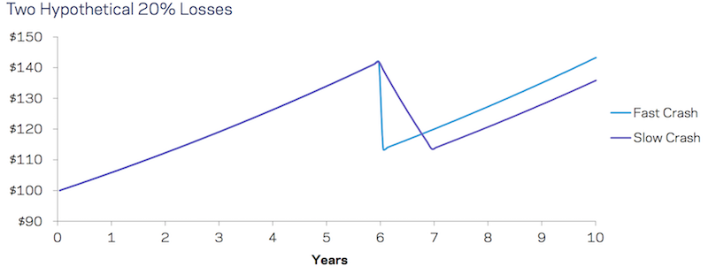
Source: AQR. Both losses start at the beginning of year 6, though they could begin at the start of any year shown. Illustrative purposes only; hypothetical data has inherent limitations.
In the real world, when it comes to drawdowns, depth isn’t the only thing that’s important. Generally, the longer the bad outcome, the worse the effects for the investor.
This is not because longer lasting drawdowns are likely to be deeper, per se. It’s because longer periods stuck in a drawdown tend to mean longer periods of foregone positive returns that are detrimental to long-term wealth accumulation.
Real Life Example: September 2000 vs. December 2007
Let’s take a real life example where two investors use the basic 60/40 model for their portfolio (60 percent stocks, 40 percent bonds). Each starts with $1,000.
One begins their investing journey at the beginning of September 2000. The other begins at the start of December 2007.
Both are about to go into turbulent markets. The year 2000 coincided with the dot-com/tech downturn. The tail end of 2007 started the financial crisis/subprime related bust.
For the September 2000-start investor, he will lose 22 percent of his portfolio over the next 24 months. The December 2007-start investor will lose 30 percent, but the loss will occur over just 16 months (one-third shorter).
One year in, both investors are in a drawdown. The financial crisis investor, however, has lost more money.
By year two this nonetheless changes. By this time, the financial crisis investor has started to make money back. The dot-com bust investor is still seeing a drop in their portfolio. (The US market was down in 2000, 2001, and 2002. It was down in 2008, but up in 2009 and 2010.)
The financial crisis investor was also higher over the next year (three years after the drop), after another year, and so on.
Despite the fact that the financial crisis lost more overall portfolio wealth than the dot-com drop, the subprime crisis was over more quickly. He also fared better in the ensuing years.
This is only one example, but one can observe something similar digging further.
Length vs. Depth of Drawdowns
This article focuses on the length of detrimental outcomes as opposed to the more orthodox way of looking at their depth.
The image below gives some perspective as to why. In the first image, detrimental outcomes are plotted out showing worst cumulative returns and 5th percentile worst cumulative returns for a 60/40 portfolio over different horizons.
Performance of a US 60/40 Portfolio (Excess of cash)
Absolute Worst through 5th Percentile Worst Outcomes Over Various Horizons
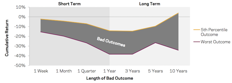
Sources: AQR, Federal Reserve, Bloomberg. US 60/40 references a 60%/40% combination of US market-cap-weighted equities and US 10-Year Treasuries. The graph plots the worst returns (dark red line) and 5th percentile (orange line) worst returns over each time period.
Unsurprisingly, a bad month tends to be worse than a bad week; a bad quarter is worse than a bad month; and a bad year is worse than a bad quarter.
However, the pattern of cumulative losses flattens past the “year one” point. It might seem to suggest that longer-term drawdowns aren’t as detrimental to portfolio gains as those that last just one year. But that’s where the earlier 60/40 examples come into play.
Let’s say you are a 60/40 investor, have a time horizon of ten years, and your return mandate or objective is 5 percent in excess of cash. (Namely, if cash yields zero, your absolute return objective is 5 percent; if a two percent cash rate, then your goal is 7 percent, and so on.)
Below we can see what “short term” bad outcomes had on the ability to generate this return objective. If these losses were suffered quickly, then the 5 percent annualized excess return was generated most of the time. Even when these sharp outcomes occurred for 60/40, it didn’t have much of an effect on hitting the 5 percent excess return benchmark over the next ten years. In other words, there was still plenty of time to hit the returns needed.
But things change for the longer term bad outcomes – i.e., demonstrated in the right half of the graph below. This means that the longer the duration of the bad outcome, the more damaging it is to the investor trying to achieve their goal.
When the “bad outcome” is the entire 10-year period, then naturally it is impossible to achieve the goal.
Performance of a US 60/40 Portfolio (Excess of cash)
10-Year Average Returns Starting with a 0-5th Percentile Bad Outcome, (Labels are Percentage of Time the 10-Year Return Exceeds 5%)
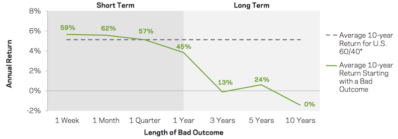
*Note: The 60/40 portfolio over this period generated a +5 percent ten-year annual return (excess of cash) 65 percent of the time.
Sources: AQR, Federal Reserve, Bloomberg. Shows 10-year returns starting with (i.e., including) the initial drawdowns from the prior image (i.e., “what have returns been over the past ten years been, starting with a bad outcome?”). Mechanically, each of the points along the line becomes increasingly overlapped with the “bad outcome” up to the 10-year horizon – where the bad outcome is the entire evaluation period. Cash here and throughout the article refers to US Treasury bills. Underlying calculations use arithmetic returns.
The findings from the above diagram have economic meaning. Investors that have bad quarters see little hit to their long-term return goals. This means that investors and institutions that have longer-term time horizons should probably not worry much about quick, sharp drawdowns as long as they are manageable and obviously not ruinous.
The media will nonetheless focus on these episodes, such as October 1987, October 2008, even if they aren’t of major concern to the long-term investor. (And hopefully they are well diversified to help mitigate their impact, as we’ll get into later.)
On the other hand, what is important is that a bad 3-year period could mean no positive portfolio gains over ten years. Practically no institutions have investors that are that patient. For individual investors, it could cause material changes to one’s financial future, such as one’s retirement timeline or a downward revision in future spending habits.
Not all losses are equally important. Historical data suggests that longer-term losses are more influential.
This makes sense because:
a) shorter underwater periods are better (you get back to making money quicker), and
b) a faster turnaround to wealth accumulation is more indicative of a successful approach or strategy to making money.
Path Dependency of Tail Risk Strategies
Tail risk hedging strategies, particularly those utilizing options, promise substantial payouts during abrupt market downturns – or simply protection from large losses when they serve their fundamental purpose (cutting off tail risk).
However, they often entail negative expected returns over extended periods.
Moreover, their effectiveness is path-dependent.
While they might offer substantial protection during sharp market crashes like those of 2008 or 2020, their performance can be lackluster during prolonged declines, such as the tech bust of the early 2000s or the more subdued losses of 2022.
Those with less financial knowledge might not appreciate these nuances of tail risk hedging strategies, potentially leading to misplaced expectations unless they’re clearly informed of the potential costs.
Options-Based Hedging Strategies Tend to Weaken Over Time
Options provide the advantage of giving drawdown specificity to a portfolio.
That means you can measure how much downside loss you’re willing to take.
To take a simple example, let’s say your portfolio is 100 percent in the S&P 500 index and that it’s currently trading at 3,000.
If you wanted to have no more than a 10 percent maximum drawdown, you could buy 2700-strike put options at a certain maturity. This would cover your loss at anything more than 10 percent from your current equity level. If you wanted a 20 percent maximum drawdown, then you could consider 2400-strike puts.
However, this tail risk insurance comes at a cost. You have to pay a premium for the insurance.
If the market does better than what’s specified by the options contract, then the option expires worthless and the premium you paid provides a negative return. If the market does worse, then you’re protected by that amount.
Put options have done a good job of protecting portfolio from sharp, short-term price moves down. But due to theta decay, their ability to add value to a portfolio declines over longer time horizons.
In the image below, the lines show the average cumulative outperformance of the portfolio in question – in this instance, put options – compared to the 60/40 stocks/bonds portfolio during the various “bad outcomes”, which is shown here as the absolute worst through 5th percentile worst return outcomes for 60/40.
In other words – “on average, what was the cumulative overall return of this portfolio compared to 60/40, when 60/40 had a bad outcome?” The labels show the “hit rate”, or how often that outperformance was positive.
As shown in the diagram, put options consistently outperformed a 60/40 portfolio over bad outcomes lasting up to three years, but tailing off after that.
This result is due to the following:
i) equity put options tend to generate positive returns during bad outcomes, and
ii) this is comparing options’ returns to 60/40 stocks/bonds when 60/40 had otherwise poor performance.
But looking at the longer-term 3+ year horizons, both the value and consistency of the put options goes down. The insurance premium – in particular, the volatility risk premium – tends to eat at the returns. The negative result over ten years is particularly noteworthy.
60/40 portfolios even over their worst ten-year periods did better than options-hedged portfolios.
Options-hedged portfolios, which are usually pursued by investors to add downside support, have reduced portfolio returns over the time horizons that are most important.
In other words, 60/40 portfolios using options for tail risk hedging purposes tend to perform worse than the “plain vanilla” versions over longer horizons.
Outperformance of Options during Bad Outcomes for US 60/40 Portfolio Jan 5, 1996 to Mar 31, 2020
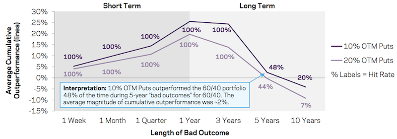
*Note: The unconditional “hit rates” for the two options over all 3-year periods are 15 percent for 10 percent out-of-the-money puts and 12 percent for 20 percent out-of-the-money puts.
Source: AQR, OptionMetrics, Federal Reserve, Bloomberg. Puts are a 10 percent or 20 percent OTM put option that have a quarterly expiry or rebalance. This diagram shows the average cumulative outperformance of puts compared to 60/40 during the worst 5 percent outcomes for 60/40 over each horizon shown on the horizontal axis.
Best Long-Term Tail Risk Mitigation Strategies
Here we focus on broad strategies like we did in our portfolio construction post covering risk mitigation.
In each case we will consider simple implementations and uses of each strategy. Each manager has their own ways of implementing different strategies that change their reward and risk characteristics, as well as their level of diversification.
Like in the portfolio construction article, we argued that options markets tend to be an overpriced method of securing portfolio protection.
Accordingly, it is perfectly logical to argue for the implementation of a variety of strategies to reduce risk without sacrificing a portfolio’s expected return.
How to lower portfolio risk
Here, we’ll look at three main ways of doing so:
- i) by addressing allocation within asset classes: e.g., defensive stocks
- ii) by addressing allocation between and among asset classes: e.g., risk parity
- iii) by addressing the source of your return: e.g., alternative risk premiums and/or trend following
These approaches all represent different types of diversification. For example, diversification in equities can only lower your risk so much relative to diversifying among many asset classes and returns streams.
For a 60/40 portfolio, given this is such a popular traditional approach to portfolio construction, it is important to take a look at each of these approaches performs when 60/40 suffers.
The defensive stocks approach has the same allocation to equities, but lowers volatility and risk.
The risk parity approach traditionally diversifies across many different asset classes, including stocks, bonds, commodities, and different geographies and currencies.
The alternative risk premium and/or trend following approach should be the most diversified because it seeks to limit market exposure entirely. While the first two approaches are traditionally structurally long to capture tradition risk premiums over time, the third is not structurally biased toward bull or bear markets in anything.
Having a range of diversification is important in order to understand how effective they are during the drawdowns suffered by traditional portfolios.
Defensive Equities
Defensive equities have the (deserved) reputation of offering returns that are in line with the broader equity markets but with less volatility and overall risk.
Accordingly, this makes them appealing for investors looking to put money into an asset class that people love for its liquidity and high returns (relative to bonds and cash) but at the cost of large drawdowns. Going more defensive with the approach helps to mitigate the risk for the worst outcomes of one’s equity allocation.
Defensive equities are those with more predictable returns streams. These generally include stocks of companies that are relatively mature, cash flow positive, produce dividends, and are in stable industries that are less prone to fluctuations in market cycles like utilities and consumer staples.
The diagram below shows the outperformance of a 60/40 portfolio with defensive equities (i.e., the equities portion is comprised of defensive equities only).
Because big drawdowns for 60/40 tend to be driven by drops in stock prices, a defensive equity allocation tends to make the drawdowns not as bad.
With that said, it doesn’t always add ideal protection. In very bad crashes, like 2008, and of course 1929, when stocks are sold off en masse due to extreme liquidity shortages, defensive stocks can see the same type of losses as the broader market.
Nonetheless, over long time horizons, defensive equity allocations due to a good and consistent job of adding long-term value.
Outperformance of Hypothetical Defensive 60/40 during Bad Outcomes for U.S. 60/40 August 17, 1971 to March 31, 2020
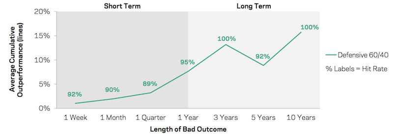
Source: AQR, Federal Reserve, Bloomberg. Hypothetical Defensive US 60/40 is identical to US 60/40, except its equity portion is replaced with Hypothetical Defensive US Equities. Hypothetical Defensive U.S. Equities is a long-only US equity portfolio that over-weights low-beta and higher quality stocks. This diagram shows the average outperformance of the Hypothetical Defensive US 60/40 portfolio compared to the regular 60/40 portfolio during the worst 5 percent outcomes for 60/40 over each horizon shown on the horizontal axis. The percentage labels show the “hit rate” or the percentage of the time the Hypothetical Defensive US 60/40 portfolio outperformed the 60/40 portfolio over this sample. All returns are excess of cash with underlying calculations based on arithmetic returns. For illustrative purposes only.
Risk Parity
The implementation of risk parity used here uses three asset classes:
- stocks
- bonds
- commodities
Risk parity provides strategic exposure to each in such a way to balance risk throughout the market cycle to increase return per each unit of risk.
This structure helps lower drawdowns, mitigate left-tail risk, provide lower beta/correlation to any given asset class individually, lower downside capture ratios, a greater number of periods in which the allocation makes a positive return, among a host of other benefits.
Some forms of the strategy include dynamic signals that tactically alter asset allocation to reduce exposures when risks are believed to be too high.
Risk parity fundamentally improves reward to risk and can help investors by:
a) reducing a portfolio’s equity risk exposure, and
b) increasing the exposure to other types of return sources
With respect to B, this lessens the dependence on returns from any given asset class. Risk parity practitioners typically keep the volatility among asset classes the same. Once asset classes exhibit roughly the same risk, it is possible to diversify for all economic environments without having to give up expected returns.
A 60/40 stocks/bonds portfolio is not well diversified because stocks are more volatile than bonds and will disproportionally dominate the price movement of a portfolio. A 60/40 portfolio has a 94 percent long-term correlation to the stock market. In terms of the risk decomposition, 60/40 is in effect really 88/12. (For 50/50, another common portfolio construction, the portfolio’s correlation to stocks is 88 percent, with a risk decomposition of 77/23.)
Moreover, bonds yield less than stocks. In much of the developed world, they yield nothing and sometimes negative in both nominal and real terms. So, having 40 percent bonds as part of the allocation drags down long-run returns.
A risk parity implementation will often get around this problem by leveraging the bond portion of a portfolio to match the risk of the stock portfolio. This will usually be done using bond futures, where a small collateral outlay provides exposure to a larger quantity of bonds.
This way, your search for diversification is no longer constrained by its impact on your long-run returns.
Asset classes are priced according to what an investor to pay for the future cash flows on which that asset is a claim. This is true for a stock, bond, or piece of real estate. (Commodities can also generate a yield depending on how they’re traded. As a whole, they can be thought of as alternative currencies and storeholds of wealth, a growth-sensitive asset class, and a mix of individual markets subject to their own supply and demand considerations.)
The most important determinant of return is when the expectation of that income stream changes.
When there’s a change in economic conditions relative to what was discounted in, that might benefit commodities and stocks relative to bonds, or bonds and commodities relative to stocks, and various other permutations.
Sizing each appropriately helps parts of your portfolio “kick in” and take over for underperforming asset classes. You may not know which asset class is going to perform best over the next day, week, month, year, or even decade. But you do know that they’ll act differently. You can use this to your advantage by diversifying well among these sources of return.
Accordingly, strategic diversification throughout the economic cycle is best achieved through a balance among asset classes whose fundamentals are optimally suited to different parts of the economic cycle.
– Increasing growth – good for stocks, credit, emerging market debt, commodities
– Falling growth – good for nominal and inflation-linked bonds
– Increasing inflation – good for inflation-linked bonds, emerging market debt, commodities
– Falling inflation – good for stocks and nominal bonds
Sources of returns in risk parity portfolios can come from various different sources, including currencies, emerging market debt, commodities, and even non-traditional illiquid sources (e.g., real estate, private companies). But for this example, we use a basic portfolio of stocks, bonds, and commodities.
Risk parity can make money in periods of drawdowns in equities if other components of the portfolio rise enough to offset the drop. It shouldn’t necessarily be expected, as equities are part of the portfolio.
But during bad periods for traditional equity-based investors, risk parity has tended to outperform due to its better diversification (and smaller equity allocation).
The strategy below covers only liquid asset classes for simplicity.
Outperformance of Representative Risk Parity during Bad Drawdowns for US 60/40: August 17, 1971 to March 31, 2020
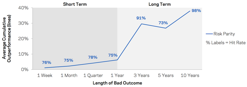
Source: AQR, Federal Reserve, Bloomberg. This hypothetical risk parity strategy is a risk-balanced portfolio of global developed-market stocks, global developed-market government bonds, and commodity futures. The strategy is scaled to 10 percent annualized volatility. The diagram shows the average outperformance of risk parity compared to the 60/40 portfolio during the worst 5 percent outcomes for 60/40 over each horizon shown on the horizontal axis. All returns are excess of cash and gross of fees. All underlying calculations use arithmetic returns. For illustrative purposes only.
Alternative Risk Premiums and Trend Following
Alternatives that have little sensitivity and correlation to equity and bond markets can be particularly valuable during bad outcomes for traditional asset classes.
In the diagram at the bottom of this section, two strategies are tested:
– “Styles” (blue line) – takes four long/short alternative risk premia (defensive, carry, value, and momentum) and applies it across multiple liquid asset classes
– “Trend” (green line) – trend following; namely, it takes different asset classes and goes long or short depending on whether their trailing performance was positive or negative, respectively
The large outperformances shown in the visual below can be explained in basic terms. Given these alternative portfolios have no net average exposure to equity and bond markets, their performance during market drawdowns will tend to emulate their average performance over the long-term.
In other words, the larger the drawdown for the 60/40, the stronger the relative performance for the alternative portfolio strategies.
“Trend” strategies can go beyond basic diversification.
In downturns, because the market is falling and trend following strategies are designed to mimic the direction of the broader market, it can actually act as a hedge to a falling market.
Namely, if a 60/40 investor is getting their portfolio hit due to a declining stock market, a trend following strategy that can short a market as it falls can offset those losses.
Diversification of the underlying portfolios should help achieve higher returns over time, which is reflected in the 10-year time horizon in the diagram below.
However, large, sharp sell-offs that are accompanied by a deleveraging may create a short-term risk to various types of long/short portfolios.
Outperformance of Representative Styles and Trend during Bad Drawdowns for US 60/40 January 2, 1985 to March 31, 2020
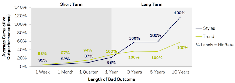
Source: AQR, Federal Reserve, Bloomberg. The representative Styles portfolio represents a diversified, market-neutral portfolio that invests in four alternative risk premia themes (defensive, carry, value, and momentum) across four major asset groups (stock indices, stocks and industries, global government bonds, and commodities). The representative Trend portfolio is a trend-following portfolio that uses 1-month, 3-month, and 12-month price momentum signals to invest across equity indices, government bond futures, commodity futures, and currency (FX) forwards. Styles and Trend are each scaled to 10 percent annualized volatility. Styles is discounted to realize a 0.8 Sharpe ratio and Trend is discounted to realize a 0.6 Sharpe ratio. This chart shows the average outperformance of Hypothetical Styles and Trend compared to the 60/40 portfolio during the worst 5 percent outcomes for 60/40 over each horizon shown on the horizontal axis. The percentage labels show the “hit rate,” or the percentage of the time Styles and Trend outperformed the 60/40 portfolio over this sample.
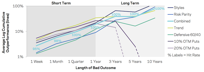
A collection of good strategies beats just one
Diversification can improve your return for each unit of risk better than practically anything else you can do.
This means a variety of good strategies can provide better performance than only one. This is especially important for portfolios that have an emphasis on risk mitigation – e.g., lower left-tail risk, lower drawdowns, improvement of return per unit of risk.
This diagram below shows an equal-weighted combination of the four portfolios (Styles, Risk Parity, Combined, Trend), along with each one individually, and the two options portfolios.
Given the large distribution in cumulative returns across them, the vertical axis uses a log scale to get a clearer idea (and for clarity, the “hit rate” labels are shown only for the “Combined” portfolio).
January 5, 1996 to March 31, 2020
___
Outperformance during Bad Outcomes for US 60/40 (dashed lines show negative returns)
___
Full-Period Average Returns and Equity Beta (sorted by average returns)
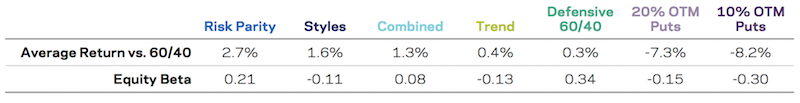
Sources: AQR, Federal Reserve, OptionMetrics, Bloomberg. US 60/40, Hypothetical Puts, Hypothetical Defensive US 60/40, Hypothetical Risk Parity, Hypothetical Styles, and Hypothetical Trend are described in previous sections. The Hypothetical Combined portfolio consists of a 25 percent capital weight each to Hypothetical Risk Parity, Defensive US 60/40, Styles, and Trend. This chart shows the average outperformance of the Hypothetical portfolios compared to the 60/40 portfolio during the worst 5 percent outcomes for 60/40 over each horizon shown on the horizontal axis. The percentage labels show the “hit rate,” or the percentage of the time Hypothetical portfolios outperformed the 60/40 portfolio over this sample. Average Return vs. 60/40 is the unconditional average outperformance over the period. Equity Beta is the unconditional beta to U.S. Equities over the sample period. Each series is compared to 60/40 over the common overlapping period from 1/5/1996 to 3/31/2020.
Over the shortest horizons, put option portfolios are among the best and most consistent profit-generating strategies. Naturally, this is expected given protection against sharp drawdowns is the environment in which they do best.
Nonetheless, this outperformance against other strategies start to lose ground past the one-year mark.
Over the longest time horizons, put options fail to help performance.
These longer horizons also the time periods that matter most for the majority of individual investors (e.g., saving for retirement or another long-term goal) and for many institutional funds as well.
Puts also lose money over the long-run given the premium market makers require to obtain a positive margin on the options underwriting business.
The other non-options portfolios show a more favorable stream of outperformance that tends to improve with longer time horizons and higher positive average returns.
Trend and Styles appear to provide the highest relative returns during most of the bad drawdowns for 60/40. This makes sense because of their very low equity beta and should look good when stocks (or all financial asset markets) do poorly, such as dislocations in liquidity.
Strategies like the Defensive Stocks 60/40 and Risk Parity have positive correlations to the equity market (i.e., positive equity betas).
Nonetheless, their sources of return are less correlated to the traditional 60/40 portfolio. This also helps their outperformance when the 60/40 portfolio is suffering bad outcomes.
In the image below each portfolio covered in this article is ranked by hit rate over each horizon’s bad outcomes.
In general, the consistency of put options portfolios weakens as bad outcomes get stretched over longer time horizons. They are the worst performers over those longer spans.
The opposite is true for the risk-mitigating portfolios studied here. That is, over longer time horizons, their value additive nature improves along with their cumulative overall returns. This makes them the more compelling choice for most investors pursuing goals over longer time horizons.
Outperformance over Various Horizons, Sorted by Hit Rate; January 5, 1996 to March 31, 2020
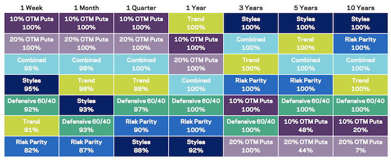
Sources: AQR, Federal Reserve, OptionMetrics, Bloomberg. All portfolios and strategies are described in previous sections. This diagram ranks each of the Hypothetical implementations of each portfolio based on their hit rate versus 60/40 over the various horizons. If two portfolios have the same hit rate, priority is given to the portfolio with the larger magnitude of outperformance over the given period. Each portfolio/strategy is compared to the 60/40 portfolio over the common overlapping period from 1/5/1996 to 3/31/2020.
Final Thoughts
A tail risk hedging strategy is a way of identifying and employing market instruments that will be profitable if tail events happen.
For example, an investor might buy credit protection on high yield bonds or purchase options that would deliver large gains if tail events happen such as stock index levels dropping by more than 30 percent over the course of a year.
Other types of the most common tail risks (tail events), beyond the stock market, include:
- inflation remaining high for several years;
- bond yields rising or falling significantly;
- credit spreads widening significantly;
- large rallies or falls in commodity prices; and
- interest rates rising materially
Tail risk hedging can also mean investing in assets with low correlations to the broad financial markets such that these investments would deliver good returns even when tail risks materialize and cause severe damage to asset prices.
It is important for investors and traders seeking to hedge tail risks (and thus reduce their exposure to them) to identify tail risk hedges that are both cheap and liquid.
Tail risk extends beyond capital markets and insurance markets. There are also catastrophic risks such as weather-related disruptions, cyberattacks, supply chain breakdowns, energy disruptions, earthquakes, terrorism, and other events that businesses need to watch out and prepare for.
For tail risk hedging to be profitable, tail risks must happen with reasonable frequency. And there is a timing element to it. For derivative-based hedges, they very typically carry expiration dates.
Be cautious when extrapolating
Over the past decade-plus, most investors, usually long stock and bond markets, were more accustomed to good periods than bad periods.
It is nonetheless important to think about downside risk and strategies to help you get through these bad times in good shape. One bad drawdown can mean years of hard work getting back up to where you were, or worse.
During the post-financial crisis bull market, the diversifying portfolios generally kept up with traditional 60/40 portfolios. This may seem surprising given that the March 2009 to February 2020 period was marked by above-average returns for stocks and bonds with lower than normal risk.
The period caused options portfolios to underperform, which also hit active managers who use them as part of their tail risk hedging. While these managers may have been “doing their job” to protect capital and prevent the risk of ruin, put portfolios lost money on average.
With options, timing often matters a lot. Their portfolio protection characteristics are less effective the further out the time horizon.
The risk-mitigating portfolios studied are not sensitive to timeframe and generally have superior risk hedging characteristics than options. Moreover, their returns on average have been positive and there’s never a perfect time to diversify into these strategies.
And because stocks and bonds as a whole are more expensive than normal (based on their forward yields), this makes the case for having well-diversified portfolios more important than usual.