How to Build A Stock Portfolio


When we think of how to build a stock portfolio, let’s preface this by saying that beating the market is hard.
Best Brokers For Building A Stock Portfolio


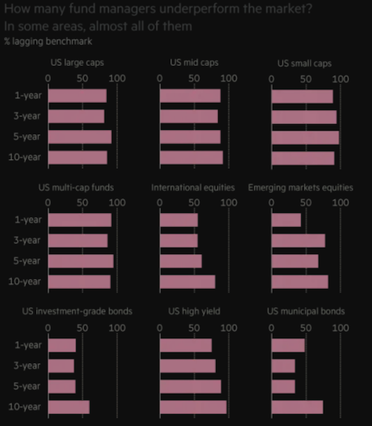
About 95 percent of professional equity managers won’t be able to beat a representative benchmark over time (nor is it necessarily the goal to do so). This is actually readily apparent after just one year.
This is why passive investing is on the rise. Many simply buy an index fund and call it a day. It’s cheap and simple. If you want to have exposure to stocks, and the odds are so against you picking which ones are going to do better than the market – and which ones will do worse if you short-sell – then why try?
In investing, it’s not whether things turn out good or bad for a company or asset class, but whether they turn out good or bad relative to what’s already discounted in the price. And if you trade tactically, then timing is important, and that’s hard to do. You can also be right about something but get the timing very wrong.
Bettering your reward to risk ratio is a function of achieving balance and avoiding environmental bias. Each asset class does well (or poorly) in a particular set of conditions. How do you balance the menu of options available to you to better linearize your returns over time?
While you don’t know which asset or asset class is going to perform best or worst in the next day, month, year, or decade, you do know that they will act differently. Adding uncorrelated returns streams increases your return per each unit of risk.
Equities do best when growth is above expectation and inflation is low to moderate. Government bonds of reserve currency countries do best in times when growth and inflation are below expectation. Corporate credit is in a similar bucket to equities. Cash does best when money and credit are tight. Gold and commodities tend to do well when inflation expectations pick up.
It is commonly said that diversification is famously the only free lunch in finance. This means proper diversification will increase your reward to risk ratio and, when done effectively, without lowering your long-term returns.
When we look at the sector breakdowns of the S&P 500 (the benchmark that most US equity managers will compare their performance against), we see that the index is heavily skewed toward tech (about one-quarter of its allocation) and healthcare (about 14 percent).
S&P 500 sector breakdown
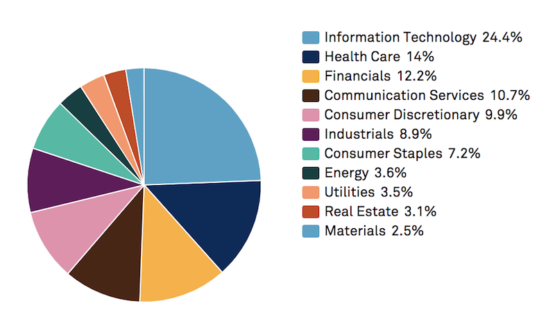
(Source: S&P Global. Please note that these allocations are not static and will change over time.)
Because tech has done so well since the financial crisis, with corporations like Apple, Google, and Facebook replacing GE, ExxonMobil, and Walmart as the world’s most valuable public companies, the US market has outperformed. Europe largely hasn’t participated in the tech revolution and has lagged behind US returns. (European stock indices have around 5 percent exposure to tech.)
Post-crisis, the weight of financials has come down and this sector has deleveraged. So, the S&P 500’s allocation toward financials is less than what we see in most other markets.
Combined together, energy, materials, real estate, and utilities combine to be only 12-13 percent of the S&P 500. When we think about how to achieve balance in equities, we probably want to weight assets like utilities higher than 3-4 percent each because of their sensitivity to interest rates. This gives them a behavior that’s often unique relative to other sectors.
Moreover, utilities have a more bond-like character. No matter how bad the economy is, people still need to pay their water, gas, and electric bills. So the cash flow is more stable relative to cyclical sectors like tech, energy, and consumer discretionary.
Consumer staples, at about 7 percent, are also more stable compared to the market. Staples are products that companies sell that are always in demand – like food and everyday items – and not as vulnerable to being cut out of a budget when the economy turns down, like the latest electronic gadgets, luxury items, vacation cruises and other gaming, lodging, and leisure products.
How to build a stock portfolio – achieving better balance
Dividend stocks and “defensive” stocks – e.g., utilities, low price-to-earnings stocks with positive cash flows – are commonly sought after by investors who want the upside of equity-like returns but want some extra safety as well.
Those who trade tactically will often want to own cyclicals toward the beginning of the cycle (e.g., tech, consumer discretionary, autos, equipment), and shift more into utilities, staples, or even healthcare as the cycle progresses. Some might view something like healthcare as more secular than cyclical because of aging populations, though it’s dependent on political winds.
Investors often look toward dividend stocks because the size of the dividend effectively implies that a certain amount of earnings are more or less “guaranteed” each quarter.
But, of course, there are a ton of different things that can impact the health of a business. Even for mature corporations selling products with stable non-seasonal demand, they will inevitably see quarterly earnings underperforming the dividend at some point. This can also increase the odds that the dividend will be cut if it can’t be sustained at its current level. The stock is generally badly punished whenever a dividend is cut because it signals a broader warning over the company’s financial health.
Defensive stocks are often commonly thought of as stocks with a relatively low US market correlation and low drawdowns relative to the market.
The energy sector is less correlated to the overall market than average and tends to have higher than average dividends. But oil and gas companies normally use a lot of leverage because they are capital intensive. And they are tied heavily to the performance of energy commodity markets. The oil market is about twice as volatile as the US stock market and is prone to painful trending down moves. This makes the oil sector more vulnerable than average to large drawdowns. Any companies whose cash flow is heavily tied to the price of a singular or limited set of commodities is at risk.
Being overly concentrated in a certain sector or two can be dangerous because the source of the cash flow isn’t well diversified relative to how it might be within a representative index.
In 2000, tech crashed due to excessive optimism over the future prospects of internet and tech companies. In 2008, financials crashed due to overleverage in the banking sector, mostly related to excessively risky lending in the residential housing markets. In 2015-16, oil and gas stocks drew down because of the crash in the crude oil market due to a supply overhang. You don’t want to be too dependent on a certain type of cash flow.
The data below run from January 1999 to February 2020:
General findings
Note that staples and utilities have the lowest correlation to the market. They are less cyclical because their cash flows are more stable.
We also know that we want to have the appropriate balance to growth and value to build a better equities portfolio in risk-adjusted terms rather than having a bias of one theme or factor over the other.
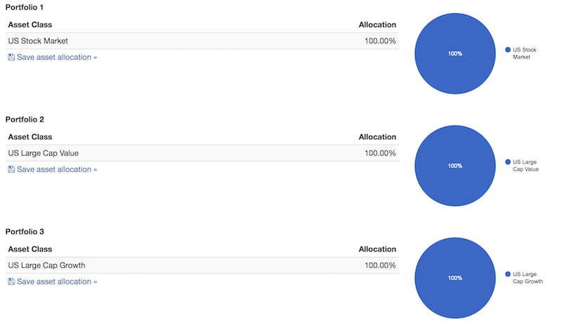
Notice how the general market outperforms (portfolio 1 below) both a “value” portfolio (portfolio 2) and a “growth” portfolio (portfolio 3).
Portfolio allocations
Portfolio results

General points
So far, we can probably take away the following points:
1. We can increase our reward to risk by balancing our sector weights in a more efficient way. We can limit our concentration to more cyclical forms of cash flow and increase our weights to sectors that produce more stable cash flow.
2. To balance our risks better, we should weight more heavily toward sectors that are less correlated to the market and toward sectors that have lower beta to the market.
A study by the asset management firm AQR found that the lowest beta parts of the market tend to have higher risk-adjusted returns than the highest beta components.
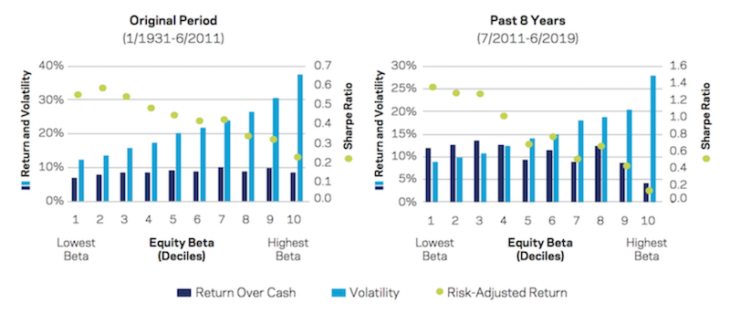
The green dots in the image show risk-adjusted return.
The 1931 to 2011 period (left image above) shows superior risk-adjusted returns in the lowest beta equities. From 2011 to the present (right image), this relationship has become even more pronounced with the lowest beta stocks outperforming their higher beta peers. The 2011-2019 period, of course, was also characterized by a relatively steady bull run.
This means we should probably overweight lower beta sectors like utilities and staples relative to high beta, cyclical sectors like consumer discretionary and industrials.
3. We should strive to have a healthy balance between value and growth. Though tech is cyclical and has high drawdowns when people concentrate their bets in this sector, it is an important growth leg and source of balance in a portfolio.
4. We should also balance to a degree based on market capitalization or size. A portfolio that’s split between small caps (i.e., Russell 2000), large caps (i.e., Dow Jones Industrial Average), and the NASDAQ (i.e., a tech-/growth-focused index) in equivalent parts improves the reward relative to the risk in comparison to the S&P 500.
Example allocation of a balanced equities portfolio
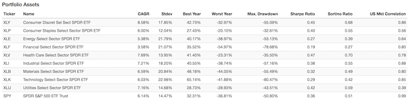
If we’re looking for a stock allocation that’s better balanced throughout the economic cycle and not too dependent on idiosyncratic cycles (e.g., tech, oil and gas, mining), here’s one that improves our reward relative to our risk over the S&P 500:
| Ticker | Name | Allocation |
|---|---|---|
| XLY | Consumer Discret Sel Sect SPDR ETF | 5.00% |
| XLP | Consumer Staples Select Sector SPDR ETF | 19.00% |
| XLE | Energy Select Sector SPDR ETF | 5.00% |
| XLF | Financial Select Sector SPDR ETF | 6.00% |
| XLV | Health Care Select Sector SPDR ETF | 8.00% |
| XLI | Industrial Select Sector SPDR ETF | 4.00% |
| XLB | Materials Select Sector SPDR ETF | 4.00% |
| XLK | Technology Select Sector SPDR ETF | 16.00% |
| XLU | Utilities Select Sector SPDR ETF | 23.00% |
| IWM | iShares Russell 2000 ETF | 10.00% |
We can see below that the portfolios mirror each other – after all, they are the same asset class – but the blue line (“balanced”) outperforms the pre-packaged version (S&P 500). Slowly over time it produces better returns with less risk.
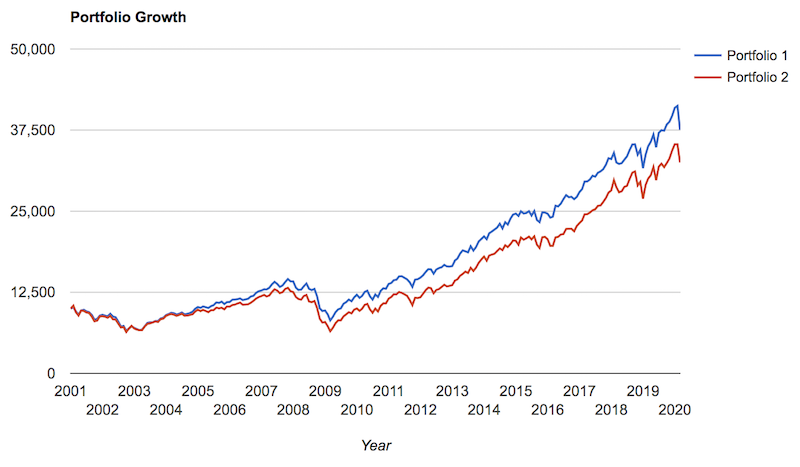
Portfolio Returns
| Portfolio | Initial Balance | Final Balance | CAGR | Stdev | Best Year | Worst Year | Max. Drawdown | Sharpe Ratio | Sortino Ratio | US Mkt Corr |
|---|---|---|---|---|---|---|---|---|---|---|
| Balanced | $10,000 | $37,551 | 7.15% | 12.80% | 29.37% | -31.63% | -43.91% | 0.49 | 0.69 | 0.97 |
| S&P 500 | $10,000 | $32,511 | 6.34% | 14.41% | 32.31% | -36.81% | -50.80% | 0.40 | 0.56 | 1.00 |
Differences in Exposures
Here we can observe the differences in exposures between the two among various market capitalizations, sectors and themes:
| Style Category | Balanced Portfolio | S&P 500 |
|---|---|---|
| Large-cap Value | 25.19% | 46.22% |
| Large-cap Growth | 48.40% | 52.83% |
| Mid-cap Value | 9.92% | 0.00% |
| Mid-cap Growth | 0.00% | 0.55% |
| Small-cap Value | 0.00% | 0.00% |
| Small-cap Growth | 0.00% | 0.00% |
| Global ex-US Developed Markets | 0.86% | 0.00% |
| Emerging Markets | 0.00% | 0.05% |
| REITs | 2.91% | 0.00% |
| Corporate Bonds | 0.00% | 0.36% |
| Long-Term Treasuries | 5.09% | 0.00% |
| Intermediate-Term Treasuries | 6.46% | 0.00% |
| Short-Term Treasuries | 1.16% | 0.00% |
| R Squared | 95.14% | 99.90% |
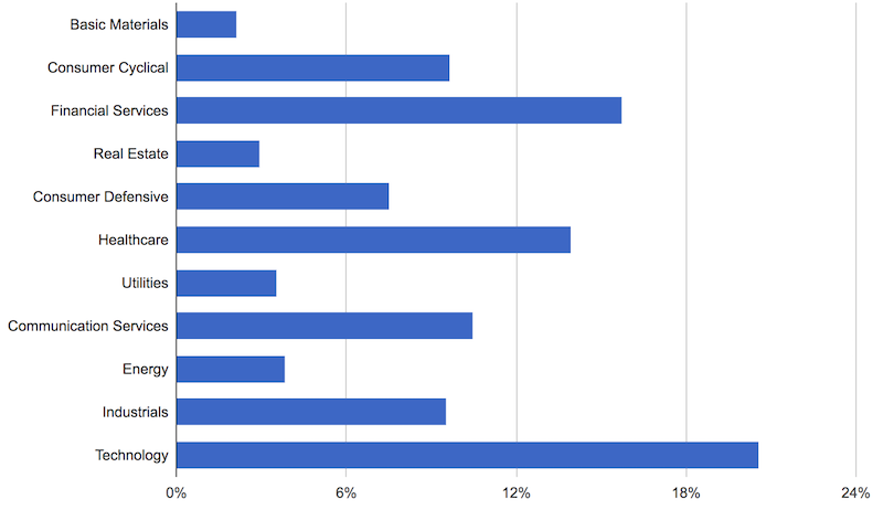
Balanced portfolio sector exposure
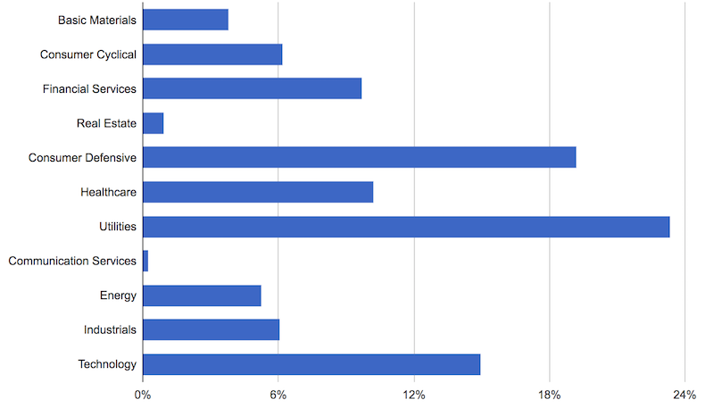
S&P 500 sector exposure
Rolling Returns
We can also see that if we look at our rolling returns, or the average annualized returns over various timeframes, the balanced portfolio is an improvement over the S&P 500. It achieves higher returns and has lower drawdowns.
| Roll Period | Balanced Portfolio | S&P 500 | ||||
|---|---|---|---|---|---|---|
| Average | High | Low | Average | High | Low | |
| 1 year | 9.05% | 29.37% | -31.63% | 8.49% | 32.31% | -36.81% |
| 3 years | 8.85% | 18.61% | -4.14% | 8.02% | 20.31% | -8.36% |
| 5 years | 8.79% | 16.85% | 1.53% | 7.80% | 17.85% | -2.23% |
| 7 years | 8.70% | 14.24% | 1.01% | 7.63% | 14.70% | -1.53% |
| 10 years | 8.62% | 12.94% | 3.26% | 7.53% | 13.44% | 1.42% |
| 15 years | 8.67% | 10.89% | 6.19% | 7.60% | 9.82% | 4.97% |
(More information on portfolio statistics can be found in the Appendix at the bottom of this article.)
Advanced Techniques
The biggest knock against stocks is typically that they’re volatile.
Their prices move around a lot relative to their actual earnings.
Building a stock portfolio that weathers macroeconomic turbulence while delivering stable, long-term returns requires blending strategic equity selection with derivative overlays.
The goal is to isolate predictable cash flows from price volatility, leveraging macroeconomic insights and tools to hedge against external risks.
Below is a step-by-step framework for constructing a portfolio that maintains resilience across market cycles.
Key Considerations for a Stable Equities Portfolio
- Short-Term vs. Long-Term Drivers of Equity Prices
- Short-Term: Stock prices are heavily influenced by macroeconomic factors like changes interest rates, changes in discounted growth and inflation, and changes risk premiums.
- Long-Term: Cash flows and fundamental earnings dominate returns, emphasizing the importance of selecting cash flow-generating assets.
- Primary Objective
- Design a portfolio that isolates and stabilizes cash flow streams, minimizing the influence of volatile pricing and macroeconomic cycles.
Step 1: Identifying Reliable Compounders
The foundation of a resilient equities portfolio lies in selecting companies with stable cash flows and strong fundamentals.
These “reliable compounders” consistently generate earnings and maintain strong balance sheets, making them more resilient during economic downturns.
Selection Criteria
- Stable Earnings – Consistent profitability across economic cycles.
- Predictable Revenue Growth – Companies with stable demand, often in sectors like consumer staples and utilities.
- Strong Balance Sheets – Low debt levels and high liquidity reduce sensitivity to interest rate increases.
Screening Approach
- Focus on established dividend-paying companies (e.g., Dividend Aristocrats).
- Use financial metrics such as low earnings volatility, high free cash flow yield, and debt-to-equity ratios below industry averages.
- Emphasize sectors known for stability, such as healthcare, utilities, and consumer goods. They sell products and services that people regularly need.
Outcome
A diversified pool of high-quality equities forms the portfolio’s core.
This gives steady cash flow generation and reduces vulnerability to economic shocks.
Step 2: Valuation Assessment
After identifying reliable compounders, the next step is to assess valuation.
Selecting undervalued stocks with strong cash flow potential enhances resilience and positions the portfolio for growth.
Key Metrics
- Free Cash Flow Yield – A high free cash flow yield signals undervaluation and robust cash flow generation.
- Price-to-Earnings (P/E) Ratios – Avoid overpaying for growth by focusing on stocks with favorable P/E ratios relative to their sector and historical averages.
- Dividend Yield – Companies with sustainable, growing dividends provide consistent income and indicate financial stability.
Benefits of Valuation Focus
- Downside Protection – Undervalued stocks are less likely to experience large price declines.
- Upside Capture – These stocks often outperform during recoveries, boosting portfolio returns.
Step 3: Macro Overlay with Derivatives
Still, even a more carefully constructed stock portfolio is vulnerable to macroeconomic volatility.
A derivative-based macro overlay helps hedge against systemic risks, stabilizing returns and preserving cash flow integrity.
Interest Rate Derivatives
- Objective – Can reduce the impact of discount rate changes on equity valuations.
- Tools – Interest rate swaps, bond futures
- Application – Hedge against unexpected rate increases that would devalue future cash flows.
Credit Spread Derivatives
- Objective – Balance risk premiums that impact equity valuations.
- Tools – Credit default swaps (CDS)
- Application – Offset the widening of credit spreads that signals increased market risk.
Inflation Derivatives
- Objective – Counter the negative effects of rising inflation on cash flows and valuation.
- Tools – Inflation swaps, long positions in Treasury Inflation-Protected Securities (TIPS).
- Application – Hedge inflation risk by swapping variable rates for fixed rates or holding inflation-linked securities.
Growth Derivatives
- Objective – Hedge against fluctuations in economic growth expectations.
- Tools – Growth-linked derivatives tied to GDP or industry performance indices.
- Application – Protect the portfolio from valuation adjustments tied to reduced growth expectations.
- Note – Growth derivatives are often the hardest to come by for individual traders/investors.
Advantages of Macro Overlays
- Neutralize Volatility – Derivatives reduce the impact of macroeconomic shocks, aligning portfolio performance with cash flow fundamentals.
- Transaction Efficiency – Hedges target broad risks without the need for extensive individual stock adjustments.
Step 4: Geographic and Sector Diversification
To further insulate the portfolio from macroeconomic risks, geographic and sector diversification is essential.
Geographic Diversification
- Rationale – Reduces exposure to region-specific economic cycles and policy changes.
- Implementation – Allocate investments across developed and emerging markets, balancing growth potential and stability.
Sector Diversification
- Rationale – Different sectors respond uniquely to economic conditions, reducing overall portfolio volatility.
- Implementation – Blend defensive sectors (e.g., utilities, consumer staples) with growth-oriented sectors (e.g., technology, industrials) for balanced exposure.
Step 5: Liquidity Management
Maintaining liquidity is important for portfolio adaptability.
Liquidity helps your ability to rebalance, capitalize on market dislocations, and sustain income generation during downturns.
Approach
- Dividend-Paying Stocks – Focus on companies with high dividend yields to provide steady income.
- Cash Reserves – Hold sufficient cash or cash equivalents to take advantage of buying opportunities during market corrections.
Time Horizon Considerations
The portfolio’s design should reflect the differing impacts of price changes and cash flows over various time horizons.
Short-Term
- Price volatility dominates, driven by macroeconomic factors and sentiment.
- Mitigation – Use derivative overlays to manage short-term risks.
Long-Term
- Cash flow stability becomes the primary driver of returns.
- Optimization – Focus on reinvesting cash flows to help with the power of compounding.
Systematizing the Process
Automating portfolio management processes – if possible – helps with consistency and efficiency.
A systematic approach includes:
- Regular reassessment of security selection and valuation metrics.
- Dynamic adjustments to macro overlays.
Conclusion
When thinking of how to build a stock portfolio, the default construction (the S&P 500) is a notoriously hard benchmark for investors to beat over the long-term. With the role of trading costs (slippage, commissions, margin fees) and proper liquidity management, adding value to the markets is not an easy thing to do.
However, we can make improvements to the allocation to be better balanced to various sectors and market capitalizations (large cap, mid cap, small cap) to improve our reward relative to our risk.
That doesn’t come without drawbacks. For an individual investor, better optimization of a portfolio requires measurement, management, and additional complexity in general. Trading and investing is a full-time job.
Moreover, the S&P 500 – as well as the NASDAQ, Russell 2000, Dow Jones, and emerging markets – have their own liquid futures markets. So, gaining a certain level of leveraged exposure to the stock market might fit the needs of certain traders and investors better. In those cases, it’s often simply the best option to invest in a pre-packaged version of the stock market.
Indexes also provide the buyer the benefit of survivorship bias. Only 10 percent of the companies that were in the Fortune 500 in 1955 still remain. Picking which companies are going to be good over the long-run is a difficult exercise. In the indexes, companies that perform well and meet certain criteria will be added while poor-performing companies will be dropped. This is all automatically done for you, whereas when to get in and out while investing in individual companies is up to your discretion.
The ones that do succeed tend to eventually decline and be replaced by entirely new types of businesses. Thirty years ago, we could have never anticipated that today’s big companies would be related to shopping on a computer (Amazon), finding information on a computer (Google), social networking on a computer (Facebook), electronic all-in-one “smart” devices (Apple), and software, hardware, and data storage (Microsoft). They’re related to technologies that didn’t exist in the recent past yet have created enormous amounts of value to consumers and advertisers. The landscape will look a bit different after another thirty years. Predicting what these technologies and types of businesses will be is not easy, and particularly which companies will become the next global stalwarts.
Getting a more balanced allocation requires investments into individual equities or ETFs that provide broad exposure. This involves trading costs and most ETFs still have fees that eat into returns. That can be another argument for sticking with passive index investing.
Even when we have better optimized exposure to the equities market (or US equities, as we mostly focused on within this article), we still need to position that within the context of a portfolio that’s balanced more broadly via fixed income, commodities, gold/metals, real and alternative assets (real estate, hardwood, private equity, specialty lending, venture), and different currencies.
That’s why we recommend learning how to achieve strategic diversification and to build a balanced portfolio that can perform well in different environments.
Appendix
Portfolio Assets
| Ticker | Name of instrument | CAGR | Stdev | Best Year | Worst Year | Max. Drawdown | Sharpe | Sortino | Corr |
|---|---|---|---|---|---|---|---|---|---|
| XLY | Consumer Discret Sel Sect SPDR ETF | 9.55% | 17.46% | 42.73% | -32.97% | -55.09% | 0.53 | 0.80 | 0.91 |
| XLP | Consumer Staples Select Sector SPDR ETF | 6.24% | 11.30% | 27.43% | -20.10% | -32.61% | 0.47 | 0.65 | 0.69 |
| XLE | Energy Select Sector SPDR ETF | 3.86% | 21.64% | 40.17% | -38.97% | -53.13% | 0.22 | 0.31 | 0.67 |
| XLF | Financial Select Sector SPDR ETF | 2.58% | 20.66% | 35.52% | -54.97% | -78.68% | 0.16 | 0.22 | 0.86 |
| XLV | Health Care Select Sector SPDR ETF | 8.23% | 13.80% | 41.40% | -23.31% | -35.50% | 0.54 | 0.80 | 0.77 |
| XLI | Industrial Select Sector SPDR ETF | 6.52% | 18.02% | 40.55% | -38.74% | -57.16% | 0.36 | 0.51 | 0.93 |
| XLB | Materials Select Sector SPDR ETF | 7.14% | 19.71% | 48.18% | -44.05% | -55.49% | 0.38 | 0.56 | 0.86 |
| XLK | Technology Select Sector SPDR ETF | 6.91% | 21.43% | 51.32% | -41.51% | -68.28% | 0.35 | 0.51 | 0.86 |
| XLU | Utilities Select Sector SPDR ETF | 7.05% | 14.11% | 28.73% | -28.93% | -42.84% | 0.45 | 0.62 | 0.47 |
| IWM | iShares Russell 2000 ETF | 7.40% | 18.91% | 47.90% | -34.13% | -52.46% | 0.40 | 0.57 | 0.92 |
| SPY | SPDR S&P 500 ETF Trust | 6.34% | 14.41% | 32.31% | -36.81% | -50.80% | 0.40 | 0.56 | 1.00 |
Monthly Correlations
| Ticker | Name | XLY | XLP | XLE | XLF | XLV | XLI | XLB | XLK | XLU | IWM | SPY | Balanced | S&P 500 |
|---|---|---|---|---|---|---|---|---|---|---|---|---|---|---|
| XLY | Consumer Discret Sel Sect SPDR ETF | – | 0.60 | 0.51 | 0.79 | 0.69 | 0.85 | 0.78 | 0.78 | 0.32 | 0.86 | 0.90 | 0.85 | 0.90 |
| XLP | Consumer Staples Select Sector SPDR ETF | 0.60 | – | 0.42 | 0.58 | 0.62 | 0.65 | 0.56 | 0.49 | 0.59 | 0.53 | 0.71 | 0.78 | 0.71 |
| XLE | Energy Select Sector SPDR ETF | 0.51 | 0.42 | – | 0.49 | 0.43 | 0.63 | 0.70 | 0.47 | 0.40 | 0.65 | 0.66 | 0.67 | 0.66 |
| XLF | Financial Select Sector SPDR ETF | 0.79 | 0.58 | 0.49 | – | 0.64 | 0.82 | 0.73 | 0.62 | 0.31 | 0.80 | 0.85 | 0.79 | 0.85 |
| XLV | Health Care Select Sector SPDR ETF | 0.69 | 0.62 | 0.43 | 0.64 | – | 0.70 | 0.63 | 0.61 | 0.40 | 0.68 | 0.78 | 0.77 | 0.78 |
| XLI | Industrial Select Sector SPDR ETF | 0.85 | 0.65 | 0.63 | 0.82 | 0.70 | – | 0.86 | 0.73 | 0.39 | 0.86 | 0.92 | 0.88 | 0.92 |
| XLB | Materials Select Sector SPDR ETF | 0.78 | 0.56 | 0.70 | 0.73 | 0.63 | 0.86 | – | 0.67 | 0.35 | 0.81 | 0.85 | 0.82 | 0.85 |
| XLK | Technology Select Sector SPDR ETF | 0.78 | 0.49 | 0.47 | 0.62 | 0.61 | 0.73 | 0.67 | – | 0.33 | 0.75 | 0.87 | 0.83 | 0.87 |
| XLU | Utilities Select Sector SPDR ETF | 0.32 | 0.59 | 0.40 | 0.31 | 0.40 | 0.39 | 0.35 | 0.33 | – | 0.37 | 0.48 | 0.66 | 0.48 |
| IWM | iShares Russell 2000 ETF | 0.86 | 0.53 | 0.65 | 0.80 | 0.68 | 0.86 | 0.81 | 0.75 | 0.37 | – | 0.89 | 0.87 | 0.89 |
| SPY | SPDR S&P 500 ETF Trust | 0.90 | 0.71 | 0.66 | 0.85 | 0.78 | 0.92 | 0.85 | 0.87 | 0.48 | 0.89 | – | 0.97 | 1.00 |
Drawdowns for the Balanced Portfolio
Here we can observe lower drawdowns for our balanced portfolio versus the S&P 500.
| # | Start | End | Length | Recovery By | Recovery Time | Underwater Period | Drawdown |
|---|---|---|---|---|---|---|---|
| 1 | Nov 2007 | Feb 2009 | 1 year 4 months | Apr 2011 | 2 years 2 months | 3 years 6 months | -43.91% |
| 2 | Feb 2001 | Sep 2002 | 1 year 8 months | Dec 2004 | 2 years 3 months | 3 years 11 months | -35.51% |
| 3 | Jun 2011 | Sep 2011 | 4 months | Jan 2012 | 4 months | 8 months | -11.02% |
| 4 | Oct 2018 | Dec 2018 | 3 months | Mar 2019 | 3 months | 6 months | -10.41% |
| 5 | Feb 2020 | Feb 2020 | 1 month | -8.93% | |||
| 6 | Aug 2015 | Sep 2015 | 2 months | Mar 2016 | 6 months | 8 months | -6.85% |
| 7 | Jun 2007 | Jul 2007 | 2 months | Oct 2007 | 3 months | 5 months | -5.53% |
| 8 | May 2019 | May 2019 | 1 month | Jun 2019 | 1 month | 2 months | -5.36% |
| 9 | Feb 2018 | Mar 2018 | 2 months | Jul 2018 | 4 months | 6 months | -5.04% |
| 10 | Apr 2012 | May 2012 | 2 months | Jul 2012 | 2 months | 4 months | -4.30% |
Drawdowns for the S&P 500
| Rank | Start | End | Length | Recovery By | Recovery Time | Underwater Period | Drawdown |
|---|---|---|---|---|---|---|---|
| 1 | Nov 2007 | Feb 2009 | 1 year 4 months | Mar 2012 | 3 years 1 month | 4 years 5 months | -50.80% |
| 2 | Feb 2001 | Sep 2002 | 1 year 8 months | Jan 2006 | 3 years 4 months | 5 years | -38.88% |
| 3 | Oct 2018 | Dec 2018 | 3 months | Apr 2019 | 4 months | 7 months | -13.52% |
| 4 | Aug 2015 | Sep 2015 | 2 months | May 2016 | 8 months | 10 months | -8.48% |
| 5 | Jan 2020 | Feb 2020 | 2 months | -7.95% | |||
| 6 | Apr 2012 | May 2012 | 2 months | Aug 2012 | 3 months | 5 months | -6.63% |
| 7 | May 2019 | May 2019 | 1 month | Jun 2019 | 1 month | 2 months | -6.38% |
| 8 | Feb 2018 | Mar 2018 | 2 months | Jul 2018 | 4 months | 6 months | -6.28% |
| 9 | Jun 2007 | Jul 2007 | 2 months | Sep 2007 | 2 months | 4 months | -4.55% |
| 10 | Jan 2014 | Jan 2014 | 1 month | Feb 2014 | 1 month | 2 months | -3.52% |
Metrics
| Metric: Description (time) | Balanced Portfolio | S&P 500 |
|---|---|---|
| Arithmetic Mean (monthly) | 0.65% | 0.60% |
| Arithmetic Mean (annualized) | 8.03% | 7.46% |
| Geometric Mean (monthly) | 0.58% | 0.51% |
| Geometric Mean (annualized) | 7.15% | 6.34% |
| Volatility (monthly) | 3.69% | 4.16% |
| Volatility (annualized) | 12.80% | 14.41% |
| Downside Deviation (monthly) | 2.59% | 2.91% |
| Max. Drawdown | -43.91% | -50.80% |
| US Market Correlation | 0.97 | 1.00 |
| Beta(*) | 0.84 | 0.97 |
| Alpha (annualized) | 1.37% | -0.18% |
| R2 | 93.68% | 99.03% |
| Sharpe Ratio | 0.49 | 0.40 |
| Sortino Ratio | 0.69 | 0.56 |
| Treynor Ratio (%) | 7.56 | 5.98 |
| Calmar Ratio | 0.80 | 0.73 |
| Active Return | 0.43% | -0.38% |
| Tracking Error | 4.03% | 1.50% |
| Information Ratio | 0.11 | -0.25 |
| Skewness | -0.89 | -0.66 |
| Excess Kurtosis | 1.79 | 1.21 |
| Historical Value-at-Risk (5%) | -6.46% | -7.90% |
| Analytical Value-at-Risk (5%) | -5.45% | -6.24% |
| Conditional Value-at-Risk (5%) | -9.16% | -9.65% |
| Upside Capture Ratio (%) | 86.38 | 95.35 |
| Downside Capture Ratio (%) | 81.93 | 96.78 |
| Safe Withdrawal Rate | 6.26% | 5.54% |
| Perpetual Withdrawal Rate | 4.79% | 4.07% |
| Positive Periods | 151 out of 230 (65.65%) | 148 out of 230 (64.35%) |
| Gain/Loss Ratio | 0.82 | 0.80 |
We see such advantages as:
- higher returns
- lower volatility
- lower downside deviation
- less beta
- more alpha
- higher risk versus reward metrics (Sharpe, Sortino, Treynor, Calmar)
- lower R-squared (i.e., less market correlation)
- low value-at-risk
- lower downside capture ratio
- higher upside to downside capture ratio (i.e., gain to loss ratio)
- higher safe withdrawal rate and higher perpetual withdrawal rate
- a greater number of months in which the allocation makes a positive return