Expected Asset Class Returns: Medium-Term (5-10 Years)


Originally published on Feb 7, 2021
AQR recently published its report on its expectations for asset class returns over the medium-term – i.e., next 5-10 years.
This covers the following asset classes:
– US equities
– Non-US developed market equities
– Emerging market equities
– US high-yield credit
– US investment-grade (IG) credit
– US 10-year Treasuries
– Non-US 10-year government bonds
– Cash (developed markets)
– Global 60/40
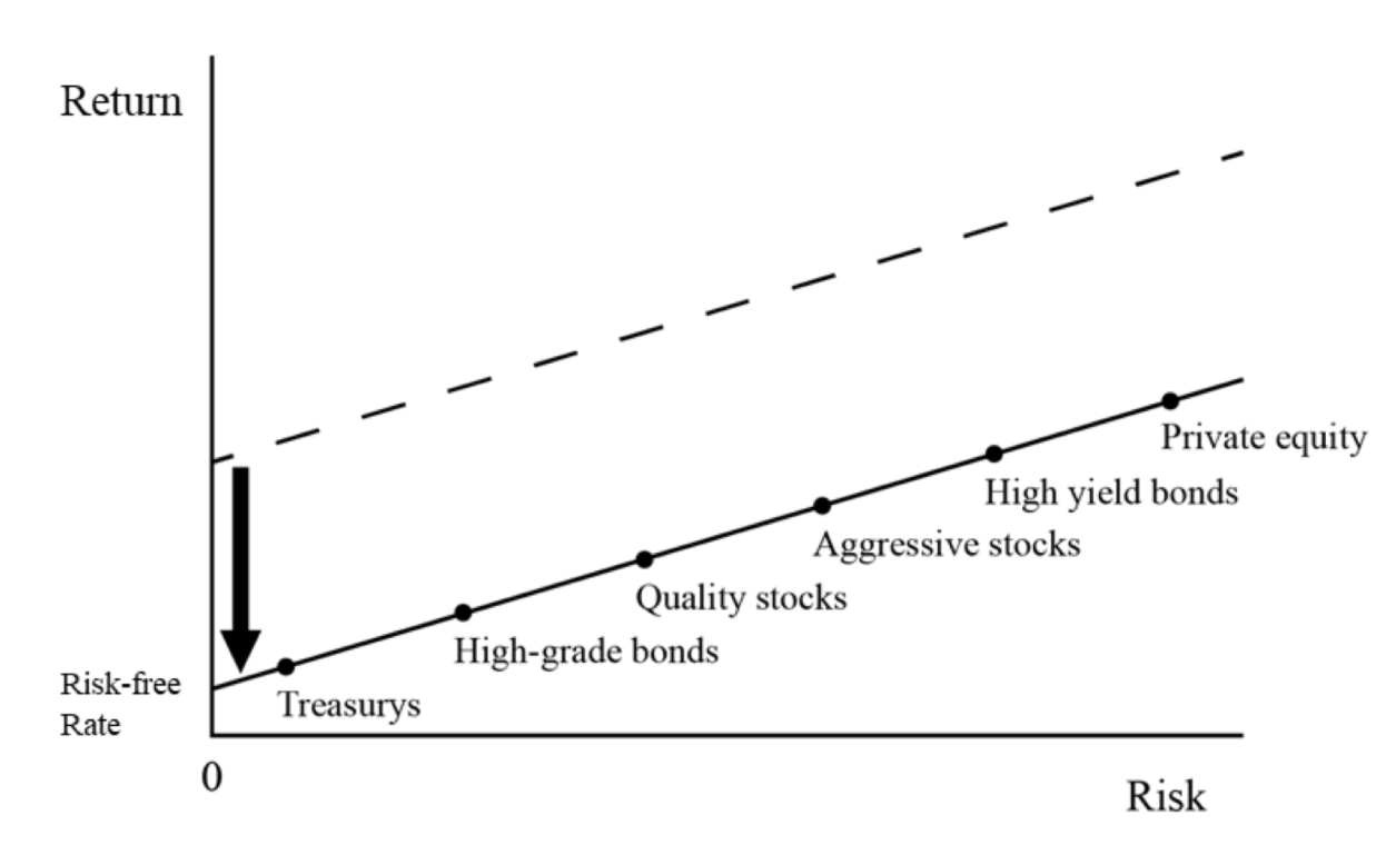
The primary finding is that expected real returns will be very low going forward. A global 60/40 portfolio is expected to yield about 1.4 percent in annual real expected returns.
Naturally, when interest rates are low on cash and bonds, this lowers the returns on riskier assets as well, as the diagram below summarizes.
Medium-Term Expected Real Returns for Liquid Asset Classes
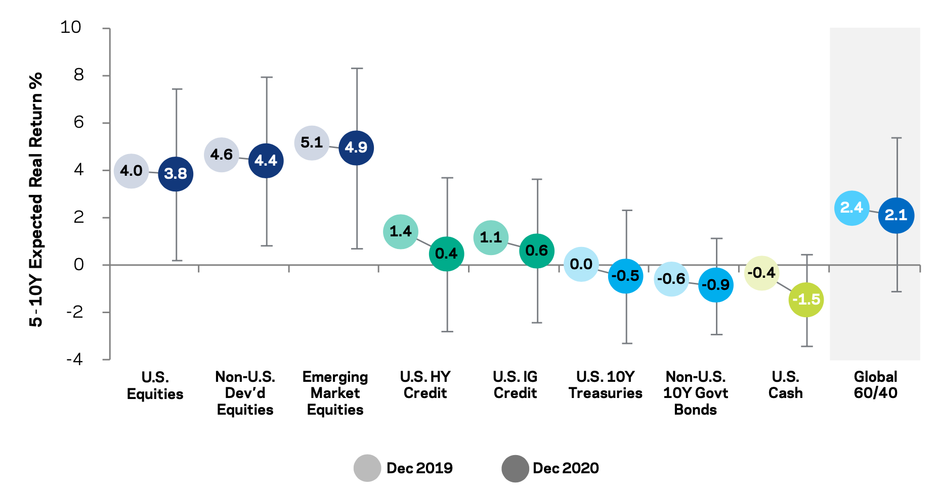
(Source: AQR; “Non-U.S. developed equities” is cap-weighted average of Euro-5, Japan, U.K., Australia, Canada. “Non-U.S. 10Y govt. bonds” is GDP-weighted average of Germany, Japan, U.K., Australia, Canada. Error bars cover 50% confidence range.)
Each year, AQR gives its annual estimates, with a focus over the next 5-10 years.
This medium-term outlook tends to be a reasonable horizon when using starting yields and valuations is concerned.
Over the short-term, returns are much noisier and less predictable. The macro environment and momentum tend to be more important.
Long-term, returns become more theoretical. One way is to look at historical average returns and how they’ve trended over time.
For example, you can look at something like gold, which has a track record going back hundreds of years and find that it has a return a little bit better than cash (when it comes to reserve currencies).
Gold is volatile in the short-term, though it tends to do a pretty good job of protecting purchasing power over a multi-decade time horizon by correlating with the prices of the things people need to buy.
Run alongside other asset classes in a portfolio, one could see its use as a diversifier.
Over the short-term, gold’s price movement will have more to do with real interest rates. All assets compete with each other and gold looks comparably favorable when financial assets yield less and looks worse when assets yield more.
What medium-term estimates are useful for
Such estimates can be useful in setting appropriate expectations. They are also uncertain and reflect mid-points in fairly wide distributions.
They are not appropriate to use for market timing purposes.
Like anything, less important are what the numbers are, but how they were formed in the first place. For financial assets, it comes down to earnings relative to their current valuations.
When you invest your money, you put up a lump sum for a stream of future income. The income per year relative to the price of the asset represents a yield.
For example, if corporate earnings of the S&P 500 index are 190 and the S&P 500 is trading at 3,800, that gives you a five percent nominal yield (190 divided by 3,800).
Earnings can be estimated bottom-up by taking each individual company and taking the salient factors that feed into their earnings.
They can also be taken top-down by taking macro factors – e.g., growth, inflation, interest rates, oil prices – and distilling that down into individual company earnings.
Based on AQR’s analysis of its 2018 edition of its estimates, there’s a 50 percent chance that the realized equity market returns over the next 10 years will overshoot or undershoot estimates by more than three percent per year.
For example, if the estimate is a 5 percent real return over the next 10 years, there’s a coin flip’s chance that the actual return is outside that 2-8 percent range (plus/minus three percent on each side of the median).
Part of the ebullience behind stocks has been that cash and bonds are now so low, there are few alternatives to them.
Equities going higher also means their forward returns are being compressed in the same way, much like safer asset classes.
When there’s a lot of liquidity relative to financial assets, their values get bid up and returns become compressed.
Cash and bonds yield about zero throughout the developed world and negatively in real terms. This means spending power erodes over time owning them.
While, as a whole, equities are also not very attractive relative to the risk, they do offer the long-run prospect of achieving real returns over time. Positive momentum also makes them look attractive as well (i.e., when they go up).
But all assets are low due to cash and bonds that yield negatively in real terms.
There are certain exceptions for duration. For example, there’s the 30-year US Treasury bond, but even that has the potential to yield negatively in real terms, if:
a) its nominal yield falls enough,
b) inflation exceeds the nominal yield, or
c) the price movement erodes its returns. (Thirty years is a long time to hold a bond.)
There are, of course, also exceptions for credit risk.
You can buy many high-yield bonds that will yield positively in real terms in exchange for volatility and potentially getting defaulted on and getting back some of your investment in recovery (eventually) or none of it.
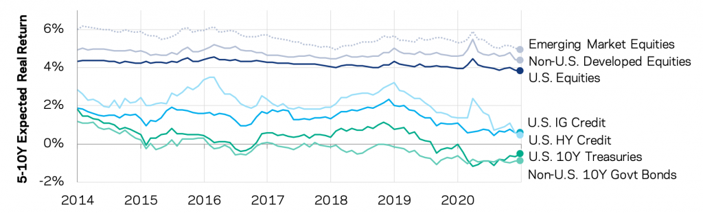
Expected Real Returns for Liquid Asset Classes
December 2013 to December 2020
Equity markets
The dividend discount model (DDM) is a common starting point for equities.
The real return is roughly equal to the sum of the dividend yield (Y), the expected growth in real dividends (g) or earnings per share (EPS), and the expected change in valuation (∆v).
Mathematically:
E(r) = Y + g + ∆v
It’s hard to predict changes in valuations over time based on multiple expansion or compression.
Because we’re in a world where interest rates are anchored low, valuations are comparatively high relative to where they’ve been historically.
But it’s common to assume no changes in valuations, which reduces the formula down to a function of growth in the dividend yield and growth in the dividends or EPS.
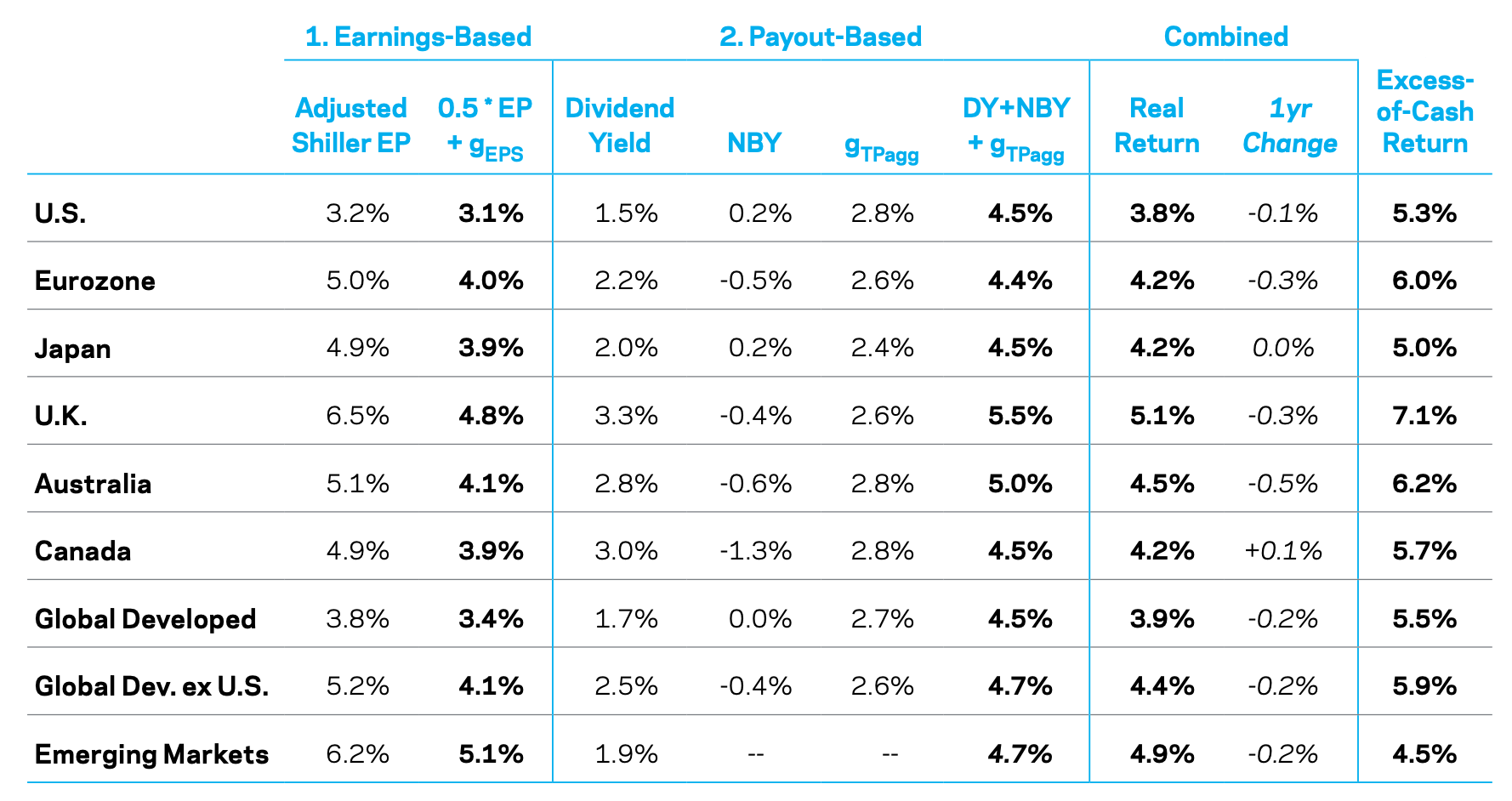
You can take the average of two approaches:
Earnings-based
If you start from the inverse of the CAPE ratio, this represents the cyclically adjusted price-earnings ratio (P/R).
This is inflation-adjusted earnings divided by today’s valuations (prices).
The dividend payout ratio is about 0.5 in the US over the long-run. Real earnings growth is about 1.5 percent per year taking the US long-run average.
So earnings based on expected return is: 0.5 * Adjusted Shiller E/P + g(in EPS)
Payout-based
Net payout yield (NPY) is the sum of the dividend yield (Y) and net buyback yield (NBY). In addition, there is a growth estimate of aggregate payouts to be added over time, including net issuance.
So we have:
E(r) = Y + NBY + g(in payouts)
Using these estimates, AQR comes up with the following:
Expected Local Returns for Equities
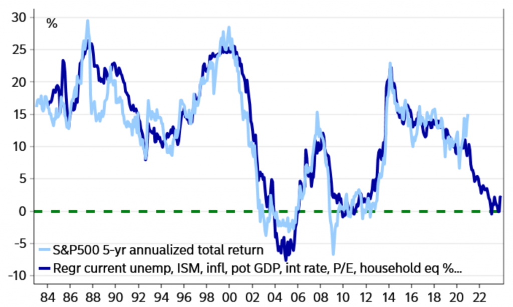
Nordea 5-year returns model (S&P 500)
The Nordea model estimates the 5-year annualized total return of the S&P 500 by taking a mix of the following factors:
- current unemployment (U-3)
- ISM
- inflation
- potential GDP
- interest rates
- price-earnings (P/E), and
- household equity investment (i.e., a measure of how bullish people are)
They find estimated total five-year returns to be around zero.
S&P 500: 5-year total return, Nordea model
It’s hard to imagine the government (Federal Reserve plus fiscal arm) allowing returns to stagnate.
Zero returns could be the case in real terms, roughly matching inflation. But it’s hard to see them being zero in nominal terms.
Given the level of contingent liabilities outstanding, and the technical need for stocks to go up, that would be a bad situation.
The US’s liability scheme looks something like this:
– $27.9 trillion national public debt
– $54.5 trillion private sector debt
– $21.0 trillion Social Security liability
– $32.6 trillion Medicare liability
– $159.2 trillion unfunded liabilities
– Total: $295.2 trillion ($892k per person, $2.4 million per taxpayer)
Annual GDP is about $21.3 trillion.
Total liabilities are around 14x GDP.
Federal tax take is around $3.5 trillion; state and local another $3.6 trillion. Annual per-capita income is around $64,300.
Paying off these liabilities will never happen by pulling money out of the economy.
The income being produced (a function of productivity) is very low in comparison to the total liabilities.
$2.4 million in total liabilities per taxpayer is small in comparison to per-capita income of $64,300 (37x), and taxes are only procured on a fraction of that $64,300.
So, inflating financial assets and devaluing the dollar is really the inevitable path forward, even if that means little real returns in equities and poor returns in fixed-rate assets like cash and bonds.
Government bonds
For government bonds, their returns are largely a function of their nominal yields.
There is also a rolling yield measure that might need to include a variance drag and convexity measure, but these factors are generally small for concentrated bond portfolios.
As a bond “rolls down” a positively sloped curve, it achieves capital gains.
For example, we know that in the US the return of a 10-year Treasury is about one percent and cash is zero. As yields decline, price goes up. This results in capital gains for the bondholder as that 10-year bond turns into a 9-year bond, 8-year bond, and so on, until maturity.
For example, if a 10-year US Treasury yields one percent, the capital gains obtained from rolling down the curve might be about 70bps per year, for a total return of 1.7 percent in nominal terms.
The table below shows local nominal bond yields (Y) and rolldown return yields (RR) for six countries. A 10-year inflation forecast is also given to help determine local real returns. Then what kind of return that gives in excess of cash can be achieved by hedged investors irrespective of their base/home currency.
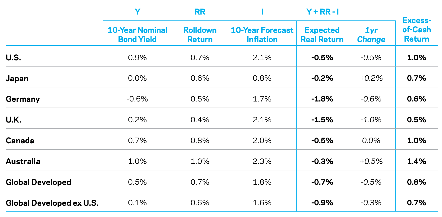
Returns stated in terms of excess of cash terms are often better than real returns when it comes to making capital allocation decisions on an international level and when traders have access to leverage.
For traders who are open to the idea of being in any market internationally, they care mostly about their returns above cash.
They will normally want to borrow cash if they can capture a spread and hedge back into their own currency (unless they want to make a bet on foreign-exchange).
For domestic investors, real returns are the primary motivation. There is no FX risk, so they largely care about the yield in excess of inflation.
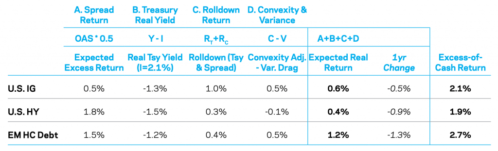
Credit
The expected real returns for credit – both investment grade (IG) and high yield (HY) – are found by applying a haircut of 50 percent to account for expected losses due to:
a) default,
b) downgrades (rather, the bias to downgrade), and
c) “bad selling practices”.
(Bad selling practices refer to the selling of bonds that no longer meet the rating or maturity criteria of an index they’re included in.)
The average credit risk premium, over the long-run, is about half of the average spread, both for IG and HY.
There is no assumed change in the spread curve via mean reversion. Additionally, there’s the addition of the expected real yield of a duration-matched Treasury and rolldown effects from both Treasury and spread curves.
There are also corrections made for convexity and variance drag.
(The convexity term estimates the influence of non-linearities when yields change. The variance drag term estimates the impact of compounding effects assuming return volatility will be non-zero.)
The chart below shows expected returns for US credit indices (IG and HY) and emerging market hard currency debt.
Real return estimates widened during the 2020 crash (though less so than the 2008 decline). They declined after markets normalized more thereafter, mostly due to lower Treasury yields.
The spread between HY and IG narrowed. It’s found that HY’s excess return over cash is the lowest of the three main categories at 190bps, followed by IG (210bps), and emerging market debt (270bps).
Expected Returns for Credit Indices: Beginning of 2021
Commodities
Unlike stocks, bonds, and other financial assets, commodities do not have obvious yield measures.
Accordingly, medium-term predictability of commodity returns is difficult to do with any statistical significance.
Therefore, the estimate of 5-year to 10-year expected return is simply based on the long-run average return of an equal-weighted return of commodity futures.
Since 1877, this has returned 3.0 percent over cash annualized. Since 1951, it’s similar as well.
Given the negative real return of US cash, this gives an expected real return of 1.5 percent.
Because of low cash and bond rates and a coordination of monetary and fiscal policy, this has caused many market participants to think about their alternatives with the widespread need to “print” a lot of money.
Gold is traditionally this type of safe haven, as its long-run valuation approximates currency and reserves in circulation relative to the global gold supply.
When real rates and real returns on assets are low, it tends to attract inflows.
Conversely, it tends to see outflows when real rates are higher given the opportunity cost associated with holding an asset with no yield. (Technically, it’s a negative yield asset after accounting for storage and insurance costs.)
Gold can have a place in a portfolio as a diversification asset and currency alternative (10 percent of an allocation or thereabouts can make sense for many portfolios).
But gold is also likely to have lower risk-adjusted returns that a diversified basket of commodities over the long-run.
Many commodities are growth-sensitive, which tend to have a higher premium.
Alternative Risk Premia
Long-only portfolios with style-tilt
A portfolio that tilted toward diversified value equities could reasonably achieve a real return that’s 0.5 percent higher than a cap-weighted index like the S&P 500 as a long-term estimate. Tracking error might approximate 2-3 percent.
A multi-strategy portfolio, which weights value-additive factors in a balanced way – e.g., value, defensive factors (size, quality) – may have a higher expected net active return of about 1 percent with a comparable tracking error.
We discussed how to build a balanced stock portfolio in a separate article.
A diversified basket of defensive, lower-risk equities might have a similar expected return to a cap-weighted index but with lower volatility.
This might include an strong allocation to more defensive sectors like consumer staples and utilities, which tend to grow their earnings fairly reliably over time. They sell products and services that people need and are therefore less dependent on the economic cycle.
Long/short style premia
Long/short strategies apply similar tilts as long-only strategies, but in a market neutral way. They’re also likely to be in multiple asset classes outside equities.
Long/short strategies can also be applied at any volatility level (unlike long-only, where it’s more constrained).
Therefore, the performance of long/short strategies is more focused on Sharpe ratios instead of returns in excess of a benchmark.
Diversification is essential in a long/short, relative value type of portfolio. Concentrated in a single asset class, the Sharpe ratio might be 0.2-0.3.
Over several asset classes where correlations among bets can be kept low, it can more reasonably expect something around 0.7-0.8, net of total transaction costs.
A well-diversified strategy of that sort at a target volatility of 10 percent would then expect to yield around 7-8 percent annualized. At 15 percent target volatility, 10-12 percent return would be realistic.
Long/short portfolios need to be carefully implemented and need to have great efficiency in terms of controlling transaction costs, financing costs, and shorting costs.
All of these eat into returns relative to simply following a benchmark, sometimes substantially. Strategies that are not well-designed or implemented effectively have lower long-term expected returns.
Current valuations
Among equities, momentum and defensive factors look expensive by many measures, though value looks comparatively cheaper.
However, there is generally a weak correlation between value and its future returns, so tactical timing is difficult.
Nonetheless, if something is cheap, such as value, it may warrant an overweight to that style in multi-factor strategies.
Private equity and real estate
Illiquid assets like private equity and real estate are more difficult to model than public, liquid markets. The lack of quality data also adds to the problem.
However, using a discounted cash flow (DCF) approach, future returns of private equity and real estate can be estimated.
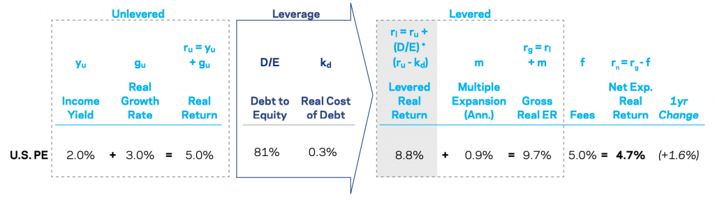
Private equity is based on US buyout funds. Expected returns are provided net of fees, as fees can be a substantial component of the returns for illiquid assets.
Because of the lack of quality data, inputs are based on simplifying assumptions. Each input can impact the final estimate.
Unlevered expected return can be understood using the dividend discount model (DDM).
Expected return = unlevered payout yield + EPS growth rate
Levered return can be found by applying leverage and knowing the cost of debt.
Then add multiple expansion (what are the earnings discounted at) and subtract fees.
The yield-based real return is 4.7 percent net of fees. This is higher than last year due to a lower cost of debt and a higher estimate for multiple expansion.
This is higher than the US large cap equity estimate of 3.8 percent.
Returns by private equity fund naturally vary wildly.
Expected Real Returns for US Private Equity
Expected returns for unlevered US direct real estate can be found based on a similar dividend discount model approach.
Real estate earnings are often found based on net operating income, subtracting out capital expenditures to give a cash yield, and adding a real growth rate.
Net operating income is found to yield 3.8 percent. Subtracting out capital expenditures of 1.3 percent, that gives a cash flow yield of 2.5 percent.
With an expected growth rate of zero, the cash flow yield equals the unlevered real return.
Expected Real Returns for US Private Real Estate

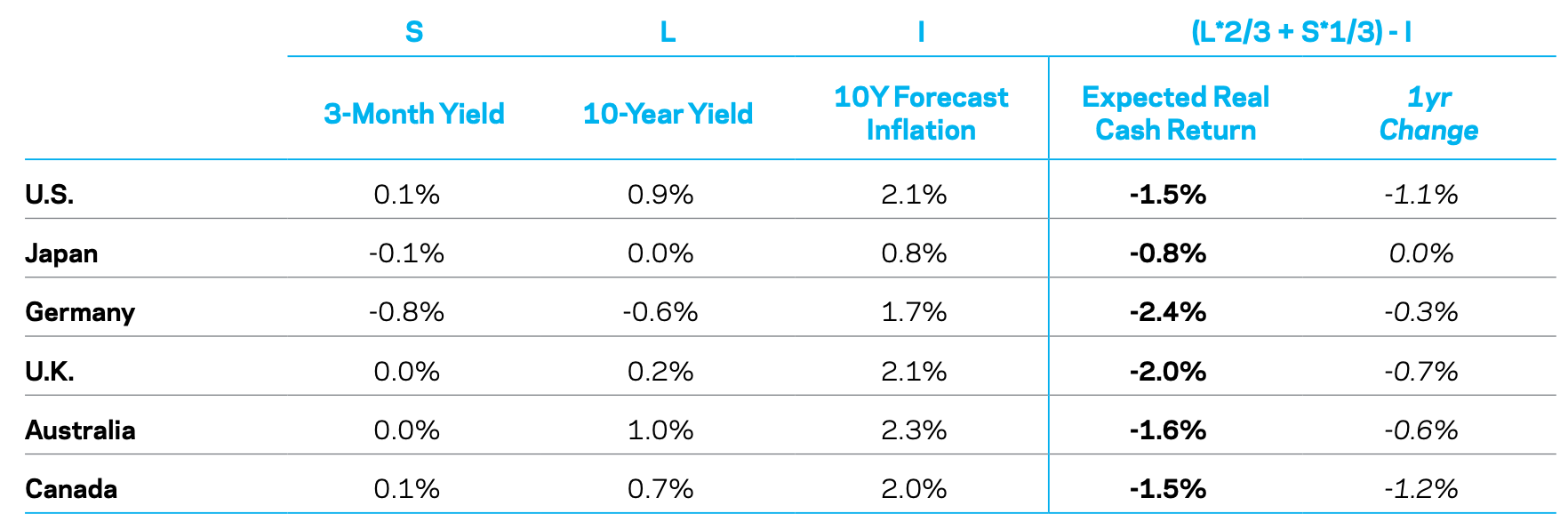
Cash
Yield-based cash return is based on an assumption of a weighted average of short-term and long-term yields.
Longer-dated yields and forward guidance set by central banks play a role. We also don’t know if the current low inflation paradigm will persist in developed markets, which makes future nominal yields not well known.
All major markets show negative real returns on cash.
Naturally, when the yields on bonds and stocks are low, the expected returns for equities are even lower.
The estimate is based on a mix of the 3-month yield, 10-year yield, and inflation forecast. It takes an average of the yields and subtracts the inflation estimate.
Expected Local Real Returns for Cash
Stock-Bond Correlation
The correlation between stocks and bonds, and the diversification benefit of each, is a determinant of risk rather than return.
Nonetheless, stock-bond correlation is highly important for many market participants as it pertains to the structure of their portfolios.
Since around the year 2000, investors have enjoyed the luxury of having two positive-yielding assets appreciate in price while diversifying each other well through a negative correlation.
Stock-Bond Correlation Since 1900: United States (Rolling 10-Year Correlation)
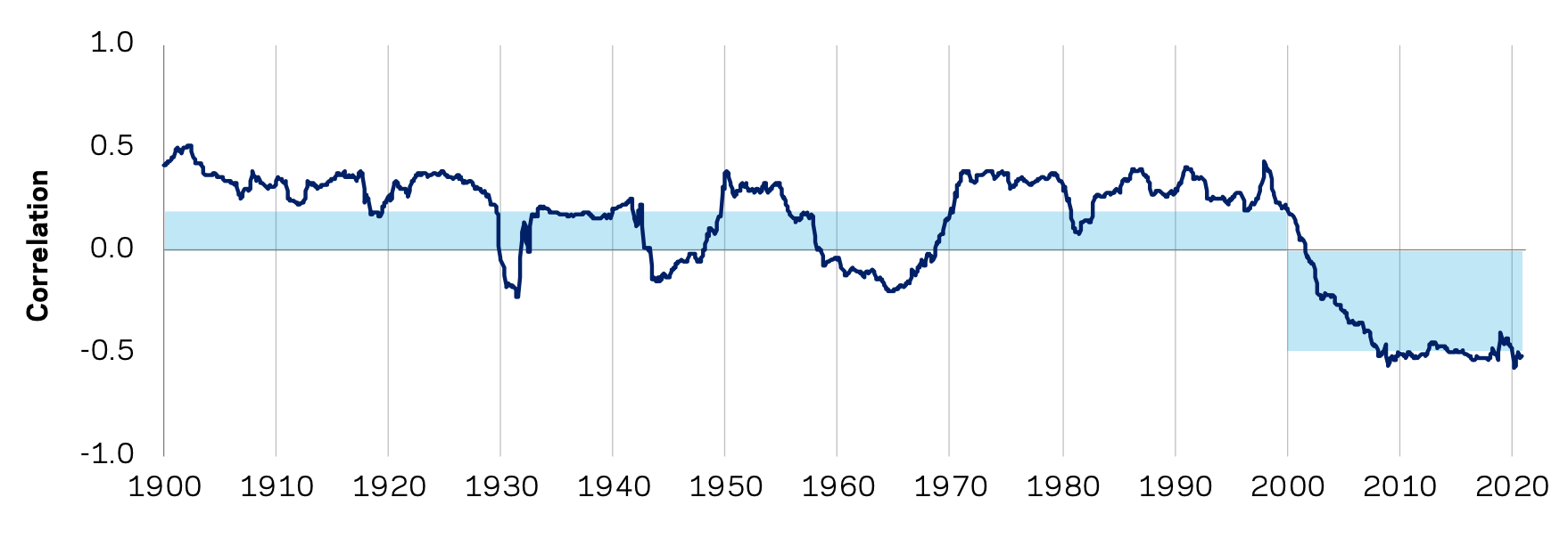
This was due to a macro environment where inflation was low and steady through central bank credibility and the ability to anchor inflation expectations.
Growth was the primary driver of returns. Safe bonds do best in a falling growth environment and equities do best in a rising growth environment (assuming inflation is low to modest for both).
So, investors have largely benefited from their allocations to each, helping to offset losses of the other while they’ve both returned positively in real terms.
The main takeaway is that growth shocks tend to move stocks and bonds in opposite directions, while inflation shocks tend to drive them in the same direction.
The environment from the 1990s forward has been one where growth shocks have been predominate.
However, now being in a new paradigm where monetary and fiscal policy are unified, this makes for an environment where the stability in inflation can no longer be taken for granted.
Inflation shocks are more likely to transpire, which is more likely to push up the stock-bond correlation.
Will this pattern persist or will it fall?
With monetary and fiscal policy moving in the same direction, it may be easier to get inflation higher.
Throughout the 2010s, central banks struggled to get inflation toward their targets, though their ability to bring it down appears straightforward.
There’s a lot of debt relative to income, so if you raise the rates on the debt, putting the brakes on shouldn’t be too difficult.
There are a few main of other deflationary forces in the mix:
- Aging demographics (higher dependency ratios, increasing obligations relative to revenue)
- Offshoring production of various forms to more cost-efficient places, a drag on worker salaries
- Technological developments to increase economy-wide pricing transparency and reduce reliance on expensive labor
- Lower role for organized labor
Short-term and long-term rates are zero and there’s no limit to how high those can be lowered to stamp out excess price pressure.
There’s always the risk that that money and credit doesn’t get into goods and services spending and the huge deflationary forces win out.
Equity markets are highly reliant on very easy monetary policy. As interest rates fall, that lengthens the duration of assets.
If equities are trading at 25x earnings, for example, that’s essentially equal to the duration of equities. It signals that the duration of equities is about that as well (25).
It’s not a perfect linear relationship, but it means – approximately – that for every one percent raise in interest rates across the curve, there would be about a 25 percent contraction in the price of equities.
So, stocks are very sensitive to any rises in rates. Any drop in financial assets has a negative feed-through into the economy.
Any policy tightening could hurt both stocks and bonds and the “taper tantrum” of 2013 saw a glimpse of.
If inflation expectations remain anchored, the stock-bond correlation seems likely to remain negative as well. But bouts of higher correlation in a new paradigm (i.e., monetary and fiscal policy unification) is a risk to traditional types of balanced portfolios, such as 60/40 and risk parity.
The main concern of investors and traders who rely on this important correlation is not necessarily fluctuations in the short-run, but the ability for bonds to offset declines in equity prices.
Yet if bond yields are zero and can’t be materially pushed lower, then not only are they bad for income generation purposes but bad as a diversifying asset.
Central banks can no longer cut cash and bond rates by much offset the decline in a recession. That means bonds can’t rise in response to a fall in growth and the potential downward move for equities becomes deeper.
That’s going to move traders into securities that are better viewed as stores of wealth.
That means those whose earnings aren’t likely to fall much in a recession (e.g., consumer staples, some utilities) or are growing rapidly and on the frontier of productivity (e.g., tech companies).
It also brings up the question of is there a lower bound for bond yields?
For nominal bond yields, we can have some confidence that they’re a little bit below zero (closer to minus-1 percent and not minus-10 percent) because after lowering them so negative it’s not really doing much to stimulate private sector credit creation.
After a point it becomes more feasible, for example, to simply stack bank notes in a vault somewhere and pay storage costs instead of owning a financial asset paying minus-100bps in yield.
Unless you want to make the assumption that central banks will be willing to let deflation set in, which is quite unlikely. Central bankers are always going to want to target at least a zero percent inflation level, and preferably something positive and steady.
Not all deflation is bad per se (e.g., the fall in the price of some consumer products (microwaves) and computing power over time), but at the macro level having a positive and stable inflation level helps indicate that resources are being allocated at a certain level of full capacity.
Real yields can fall much more than nominal yields, as real yields are nominal yields minus inflation.
So it’s feasible that more market participants are going to want to switch more to inflation-linked bonds (ILBs) instead of nominal yields.
It better helps diversify their portfolio with respect to inflation and helps remove some of the price capped nature of nominal bonds given their yields can only go so low.
Even small positive returns can be very valuable during a crisis.
The negative stock-bond correlation also contributes to a term premium in bonds. This means the insurance they provide comes at some cost.
Because traders know bonds are somewhat of an insurance mechanism against a fall in stocks that has been reliable for a while, bond yields are lower (and therefore prices higher) than they otherwise would be if there wasn’t this negative stock-bond correlation.
Instead of owning costly put options to hedge a drop in equities, bonds have provided a positive carry hedge.
And while falling yields cannot fall forever, they still provide some diversification properties. For instance, if the deflationary outcomes win out, bonds will provide some positive returns while other asset classes struggle.
Moreover, while zero or near-zero bond yields characterize the environment in developed markets, that isn’t characteristic in Eastern markets, even outside of China.
So, the positive yield potential is still there while getting a “deflation protection” part of one’s portfolio that can also offset the “growth” part (e.g., equities).
In the scenarios of rising inflation and a greater distribution of potential inflation outcomes – like we have now, with a coordination of monetary and fiscal policy – both stocks and bonds are vulnerable.
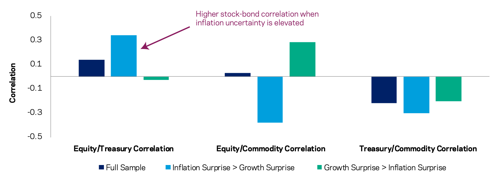
The stock-bond correlation may become positive in that outcome. This is shown in the diagram below. Even commodities can be an especially important diversifier in environments where inflation surprises are greater than growth surprises.
Major Asset Class Correlations for Different Inflation vs. Growth Surprise Periods: January 1972 – June 2020
Low inflation and a negative stock-bond correlation remain the basic assumption for the medium-term.
Higher inflation won’t kick in right away and the deflationary forces are so large that central banks still largely have control of inflation if they need to (depending on the trade-offs they face).
However, an allocation to commodities and other forms of real assets can help to increase a portfolio’s to a range of macroeconomic outcomes.
Conclusion
The estimates put forward here represent expected returns over the next 5-10 years for these asset classes.
It suggests that many investors will struggle to achieve the types of returns they need in terms of additional real spending power.
Low cash returns and low bond returns work to drag down the expected returns in everything else, from equities to real estate to private equity and riskier forms of credit.
It should also be noted that these return estimates have wide variations around the media.
And because returns are low doesn’t mean tactical allocation decisions should necessarily be more aggressive.
It may, however, mean that returns expectations may need to be re-rated downward. For pensions, it may necessitate higher contribution rates and lower future payouts.
Moreover, the case for diversifying away from equity risk premium and into other stores of wealth is more important than ever.