List of Macroeconomic Models for Trading Applications


How do you turn data and frameworks into trading decisions?
This is where models and equations come in.
This moves raw inputs into outputs that you can logically use to make decisions to help you achieve your goals.
We’re going to cover the main categories of macroeconomic models used and the main models within each.
We use eight categories:
- Business Cycle and Growth Models
- Inflation and Monetary Policy Models
- Financial Conditions and Liquidity Models
- Yield Curve and Rates Models
- International and FX Macro Models
- Risk-Based and Market-Driven Macro Models
- Crisis, Stress, and Debt Sustainability Models
- Practical “Trader Macro” Frameworks
We’ll focus on the top two categories, especially.
Key Takeaways – List of Macroeconomic Models for Trading Applications
Business Cycle and Growth Models
- IS–LM Framework
- IS–MP Framework
- New Keynesian DSGE Models
- Output Gap Models
- Okun’s Law
Inflation and Monetary Policy Models
- Phillips Curve Variants
- Taylor Rule and Policy Rules
- Monetary Transmission Models
- Real Rate (r-star) Models
Financial Conditions and Liquidity Models
- Financial Conditions Indices (FCIs)
- Credit Cycle Models
- Liquidity Preference and Money Supply Models
Yield Curve and Rates Models
- Expectations Hypothesis
- Term Structure Models (Affine Models)
- Curve Steepening and Flattening Regime Models
International and FX Macro Models
- Balance of Payments Models
- Purchasing Power Parity (PPP)
- Interest Rate Parity (Covered and Uncovered)
- Global Capital Flow Models
Risk-Based and Market-Driven Macro Models
- Risk-On / Risk-Off Regime Models
- Factor-Based Macro Models
- Macro Trend and Momentum Models
Crisis, Stress, and Debt Sustainability Models
- Debt Dynamics Models
- Balance Sheet Recession Models
- Financial Instability Hypothesis
Practical “Trader Macro” Frameworks
- Growth–Inflation Quadrant Models
- Policy Dominance vs Market Dominance Models
- Liquidity-First Frameworks
1. Business Cycle and Growth Models
These models help to identify where the economy is in the business cycle and how growth and inflation are likely to evolve.
This is some of the most popular macro applications within markets, given the implications for financial markets.
Generally speaking, it helps to be long assets when growth and inflation are low and there’s high employment – because policymakers have incentives to get the economy moving again, which favors stocks.
And to be more cautious when inflation is above-target and central bankers want to (or have the incentive) to slow things down.
IS-LM Framework
Used to understand interactions between real activity, interest rates, and monetary policy.
We do an example in the image below showing how adjusting different parameters will spit out unique output and interest rate amounts:
The IS curve shows combinations of interest rates and output where goods markets are in equilibrium. This means investment equals savings.
Lower interest rates raise investment and output, while higher rates reduce demand and growth.
The LM curve gives you combinations of interest rates and output where money markets are in equilibrium – i.e., money supply = money demand.
Higher output raises money demand, which pushes interest rates higher, given a fixed money supply.
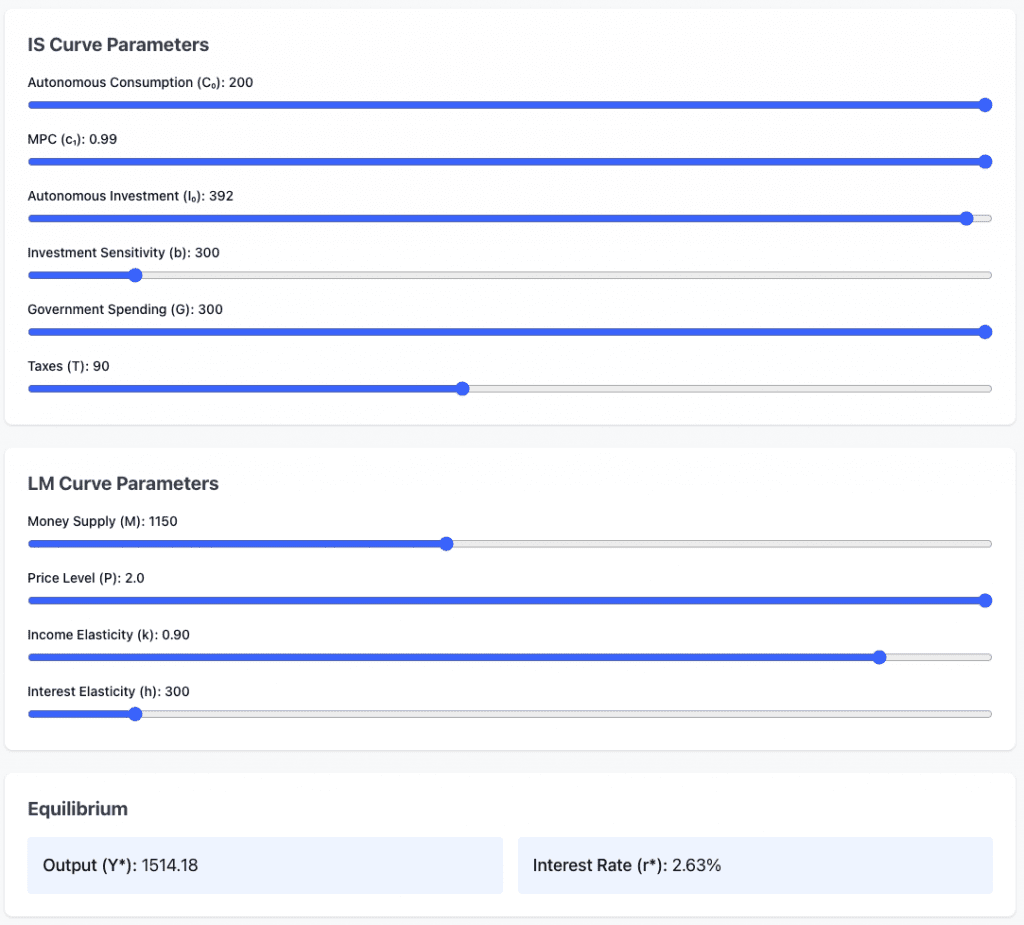
Traders use simplified versions to reason about the rate sensitivity of equities and FX.
IS-MP Framework
The IS curve in IS-MP is the same concept as in the IS-LM framework.
It represents goods-market equilibrium, showing combinations of interest rates and output where:
- investment = saving
- aggregate demand = output
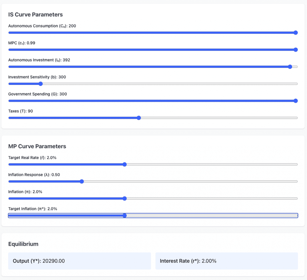
The MP curve is the central bank’s monetary policy reaction function.
It shows the interest rate set by the central bank at each level of output and inflation. It replaces the LM curve with a policy-driven rate instead of money supply equilibrium.
New Keynesian DSGE Models
We wrote about DSGE more here.
Core central bank models incorporating sticky prices and rational expectations.
It’s used for anticipating policy reaction functions.
Let’s use a standard three-equation model with sticky prices (Calvo), monopolistic competition, and Taylor rule.
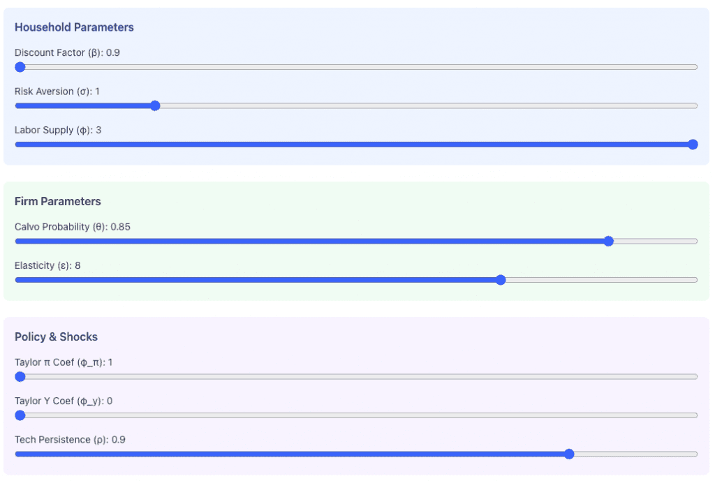
And we get the following outputs and their progression over time:
- output gap
- inflation
- interest rate
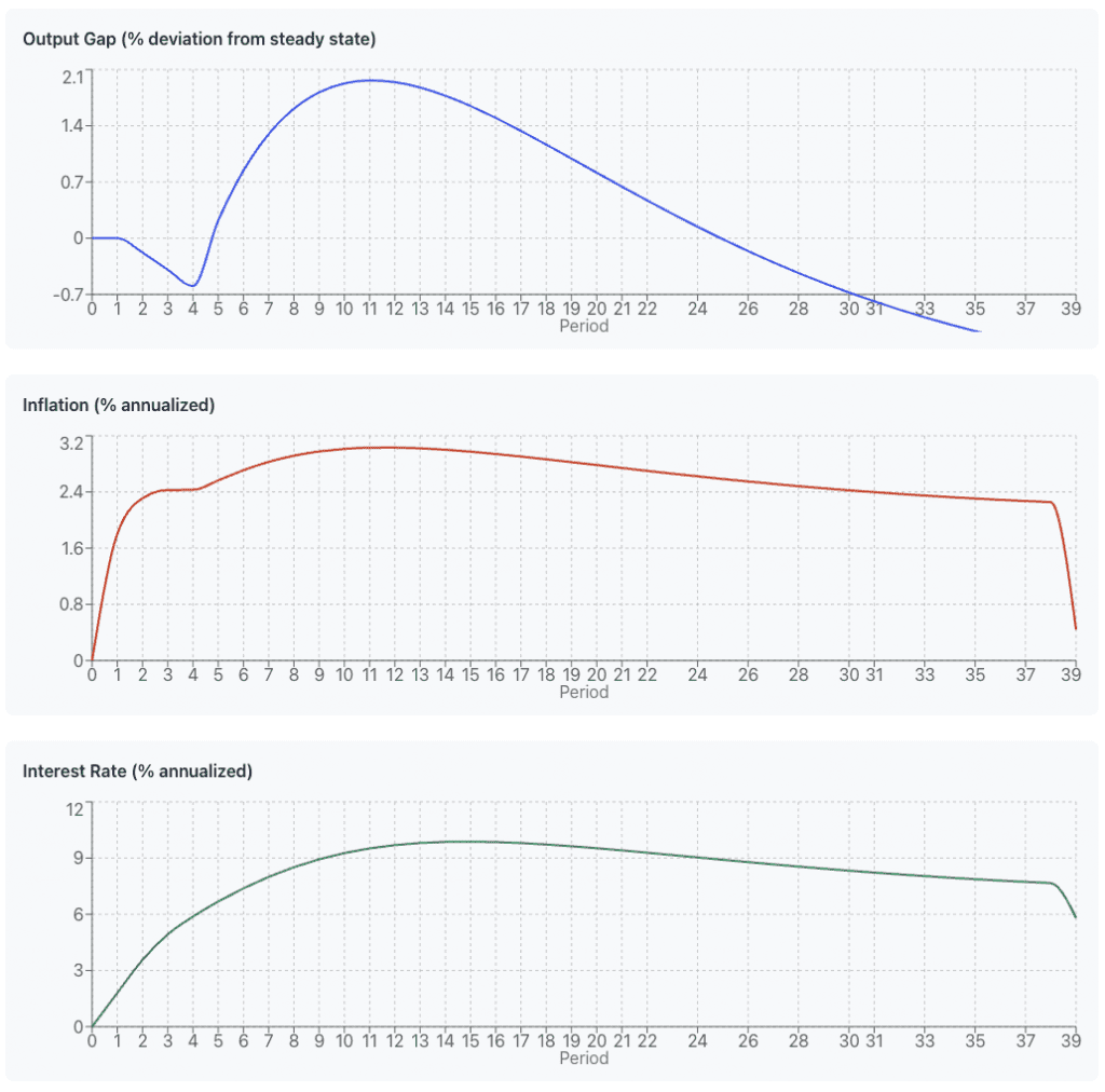
Essentially, it maps: macro data -> central bank action -> asset prices
This DSGE model helps you anticipate how economic shocks propagate through the economy and predict central bank reaction functions.
When you see a productivity shock (e.g., tech breakthrough, policy change), the model shows whether it’s inflationary or deflationary and how aggressively the Fed will respond with rate hikes/cuts.
This helps you:
- Front-run Fed policy based on economic data
- Predict bond/stock correlations (will growth boost stocks or trigger rising rate fears?)
- Time risk-on/risk-off based on output-inflation dynamics
Understand regime shifts when policy parameters change.
Output Gap Models
Estimate slack in the economy relative to potential output.
Widely used to forecast inflation pressure and central bank tightening or easing bias.
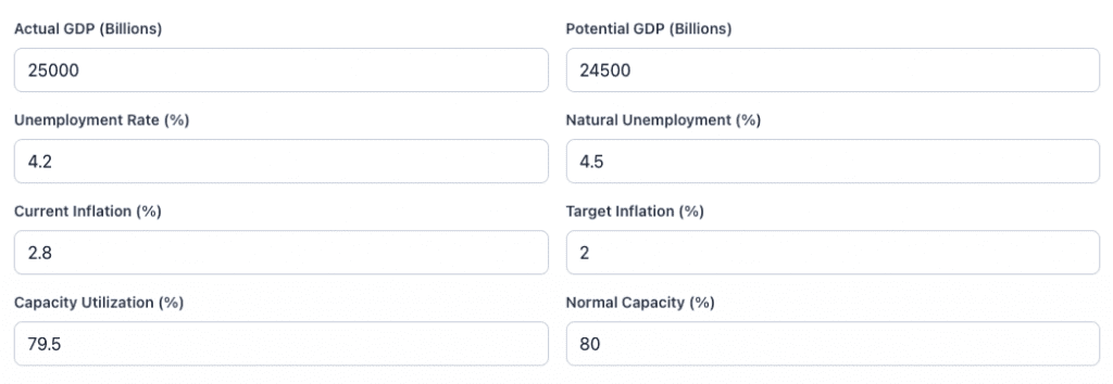
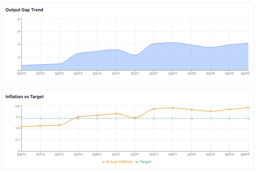
Okun’s Law
Okun’s Law explains changes in unemployment to GDP growth.
It’s useful for translating labor data into growth implications.
When GDP grows faster than potential, unemployment tends to fall. When growth is below potential, unemployment rises.
A common rule of thumb is that a 1 percentage point increase in unemployment corresponds to roughly a 2 percentage point shortfall in GDP relative to trend.
Example
For example, assume trend GDP is $10 trillion per year.
If unemployment rises by 1 percentage point, Okun’s Law implies GDP falls about 2 percent below trend.
- GDP shortfall: 2 percent of $10 trillion = $200 billion
- Resulting GDP: $9.8 trillion instead of $10 trillion
This shortfall is typically interpreted as an annual effect.
If the higher unemployment goes on for a full year, roughly $200 billion of output is lost over that year.
2. Inflation and Monetary Policy Models
These models are critical for rates, FX, and cross-asset positioning.
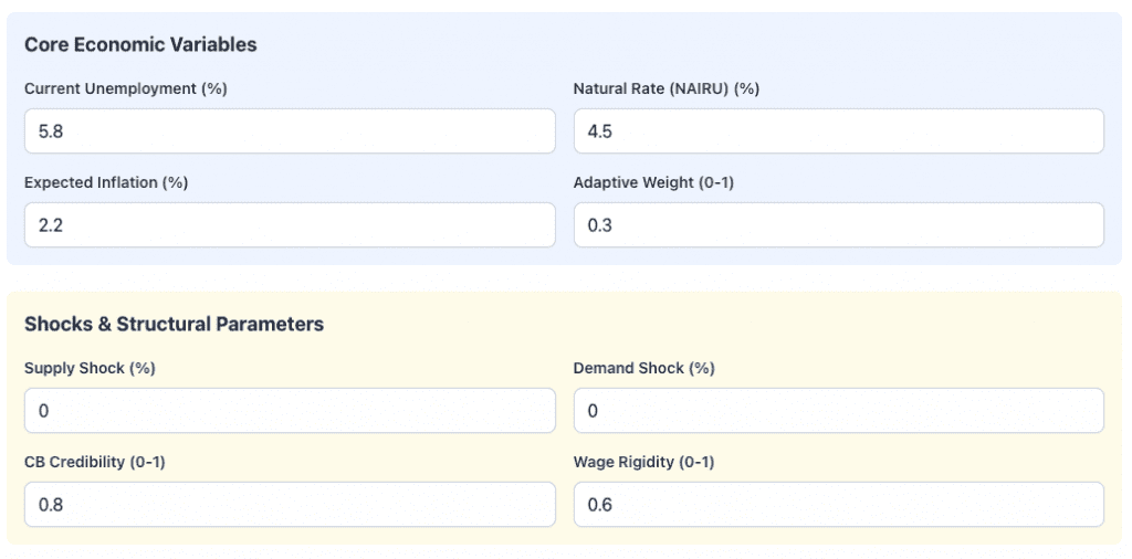
Phillips Curve Variants
Connect inflation to labor market tightness and expectations.
Modern versions focus heavily on inflation expectations rather than unemployment alone.
The inputs define the macroeconomic state and key behavioral assumptions of the model.
Current Unemployment is the observed jobless rate in the economy, while the Natural Rate (NAIRU) represents the unemployment level consistent with stable inflation.
The gap between the two signals slack or overheating.
Expected Inflation reflects forward-looking price expectations that influence wage setting and policy decisions.
Adaptive Weight controls how strongly agents update expectations based on recent inflation outcomes.
Supply Shock captures exogenous changes to production costs or capacity, such as energy disruptions.
Demand Shock reflects sudden changes in aggregate spending.
Central Bank Credibility measures how well inflation expectations remain anchored to policy targets.
Wage Rigidity has to do with how slowly wages adjust to labor market conditions. This shapes inflation persistence and unemployment dynamics.
Outputs from this example:
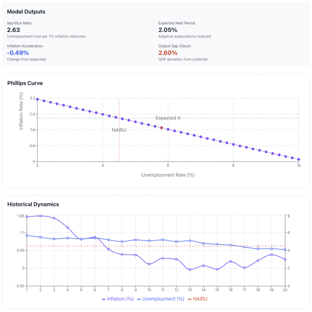
The macroeconomic implications implied by the model inputs:
The sacrifice ratio of 2.63 means that reducing inflation by 1 percentage point would require roughly a 2.63 percentage point increase in unemployment, which shows the real economic cost of disinflation.
Expected next-period inflation of 2.05% has to do with adaptive expectations updating from current conditions and policy credibility. Traders relying on these models can back out what’s in asset prices and compare their own models with what’s implied.
Some trades are more “pure” than others. For example, inflation trades are often better expressed with inflation-linked bonds/nominal bonds pair trades than through equities.
Inflation acceleration of -0.49% shows inflation is decelerating relative to prior expectations, which is consistent with labor market slack.
The output gap (Okun) of 2.60% meanss GDP is operating below potential – i.e., unused capacity and weaker demand.
The Phillips Curve visualization shows the inverse relationship between unemployment and inflation. Unemployment above NAIRU places the economy on a disinflationary portion of the curve, pulling inflation below expected levels.
The historical dynamics chart tracks inflation and unemployment over time relative to NAIRU. It shows inflation easing as unemployment remains elevated, which makes logical sense. This reinforces the model’s implication of cooling price pressures and below-potential economic activity.
Taylor Rule and Policy Rules
Translate inflation and output gaps into an implied policy rate.
Traders often compare market-implied rates to Taylor-rule estimates to identify mispricing.
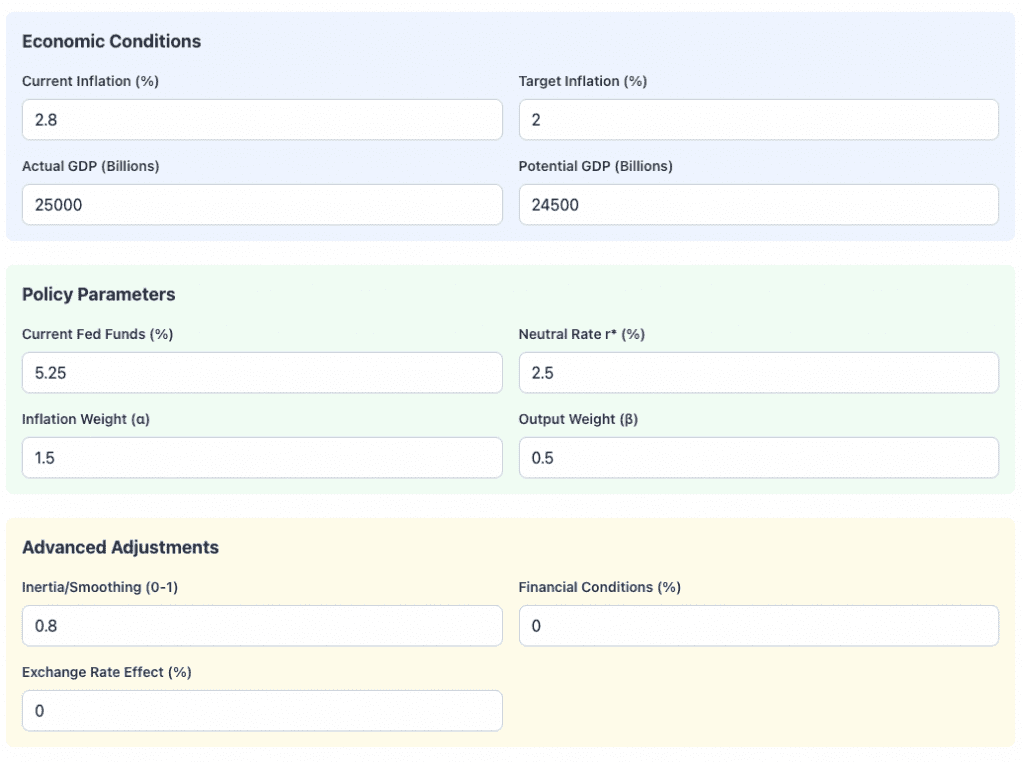
These inputs are used to define a) the economic environment and b) the central bank’s policy reaction function.
Current inflation and target inflation establish the inflation gap that policy tries to close. Inflation above target will signal restrictive policy pressure and vice versa.
Actual GDP compared with potential GDP determines the output gap. This shows whether the economy is operating above or below sustainable capacity.
Current Fed Funds is the prevailing policy rate – the “short rate” – while the neutral real rate (r*) is the interest rate otherwise consistent with stable inflation and full employment over the long run. (The Fed has a statutory dual mandate – inflation + employment – while other central banks may target only inflation or factor in currency stability.)
The inflation weight (α) and output weight (β) control how aggressively policymakers respond to inflation deviations versus economic slack.
Inertia or smoothing reflects gradualism in rate changes. This is the tendency of central banks to move cautiously rather than abruptly.
Financial conditions allow external tightening or easing to substitute for rate moves. These factor in things like stock prices, credit spreads, and currency movements.
Exchange rate effects capture currency-driven influences on inflation and growth, which are relevant in open economies.
Some standard outputs:
So…
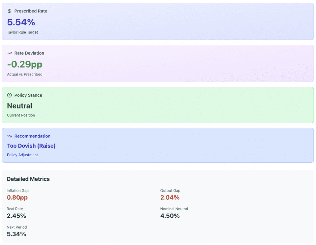
The prescribed rate of 5.54% is the policy rate implied by current inflation and output gaps, given the chosen reaction coefficients.
The rate deviation of -0.29 percentage points indicates the actual policy rate is slightly below the model-implied level (i.e., policy is marginally easier than prescribed).
As a result, the policy stance is classified as neutral rather than restrictive.
The recommendation of “too dovish (raise)” reflects the view that modest additional tightening would better align policy with economic conditions.
The inflation gap of 0.80 percentage points shows inflation remains above target.
The output gap of 2.04% suggests demand is still running above potential.
The real rate of 2.45% is close to the estimated neutral real rate.
The next-period rate is about smoothing and gradual adjustment rather than abrupt policy changes.
Monetary Transmission Models
These describe how policy rates affect financial conditions, credit, asset prices, and growth.
Often used implicitly in rates and equity macro strategies.
Conceptually, what you need to understand as a trader is:
Policy Rates -> Financial Conditions -> Real Economy
Asset markets lead the real economy.
Some standard inputs:
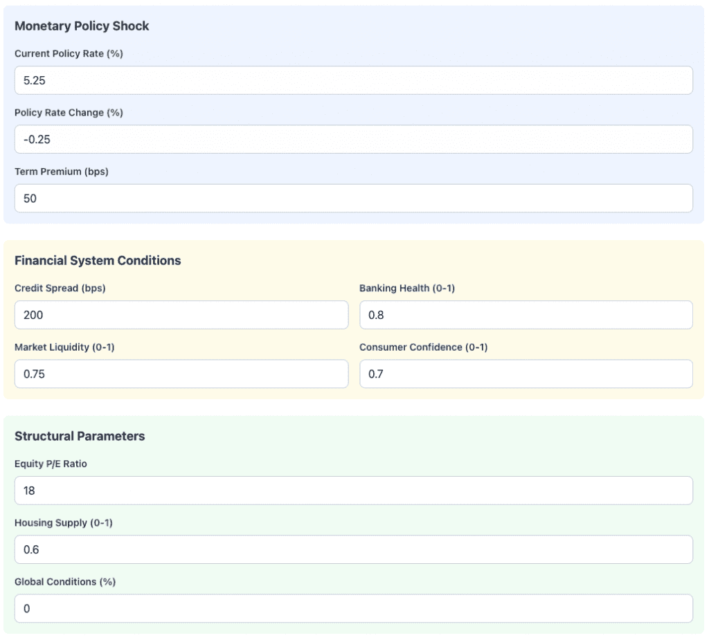
These inputs parameterize a monetary transmission model – i.e., they describe how a policy move propagates through financial markets and into the real economy.
The current policy rate establishes the starting level of monetary restrictiveness, while the policy rate change captures the size and direction of the shock.
A negative change represents easing. The term premium reflects how much longer-dated yields move independently of policy expectations, shaping mortgage rates, equity discount rates, and investment decisions.
Credit spreads measure private-sector borrowing costs relative to risk-free rates and are a key amplifier of policy. Wider spreads indicate tighter financial conditions even if policy rates fall.
Banking health captures balance sheet strength and risk tolerance, which influences credit creation, which influences asset prices.
Market liquidity affects how smoothly assets reprice. Consumer confidence governs how strongly households respond through spending and borrowing.
The equity P/E ratio has to do with valuation sensitivity to discount rates and earnings expectations. The higher the P/E ratio, the more sensitive the market will be to changes in interest rates due to the higher duration.
Housing supply determines how policy affects construction, prices, and mortgage activity.
Global conditions have to do with external demand, capital flows, and foreign financial stress that can either reinforce or offset domestic policy transmission.
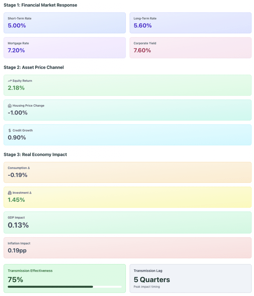
So, here we have the three-stage monetary transmission process – i.e., how policy action flows from financial markets to asset prices and ultimately to the real economy.
Stage 1: Financial market response is about the immediate repricing of interest rates.
Short-term rates reflect the policy move directly, while long-term rates incorporate longer-term expectations and term premia.
Central banks can influence longer-term rates more directly through bond-/asset-buying programs like QE.
Mortgage and corporate yields translate these rate changes into borrowing costs faced by households and firms.
Stage 2: Asset price channel shows how changes in discount rates and financing conditions flow through into asset valuations and credit supply.
Higher rates – relative to discounted, holding all else equal – generally flow through into lower asset prices and constricted credit.
Equity returns respond positively as expected cash flows are discounted at lower rates.
Housing prices decline modestly due to still-elevated mortgage rates and supply constraints. Credit growth increases as lending conditions ease.
Stage 3: Real economy impact flows from behavioral responses to changes in the financial variables we just talked about.
Consumption falls slightly as higher rates continue to weigh on household budgets, while investment rises as financing conditions improve for firms.
The net effect is a small positive GDP impact. Inflation increases modestly as demand firms.
The transmission effectiveness of 75% means strong pass-through. Peak effects occur after a 5-quarter lag, which is consistent with various empirical monetary policy delays.
Real Rate (r*) Models
R-star models are used to estimate the neutral real interest rate.
Deviations between policy rates and r* guide duration and curve positioning.
This figure below is an example framework for comparing the real policy rate to an estimated neutral real rate (r*), and the resulting policy stance over time. It’s illustrative only and not intended to be historically accurate for any specific economy.
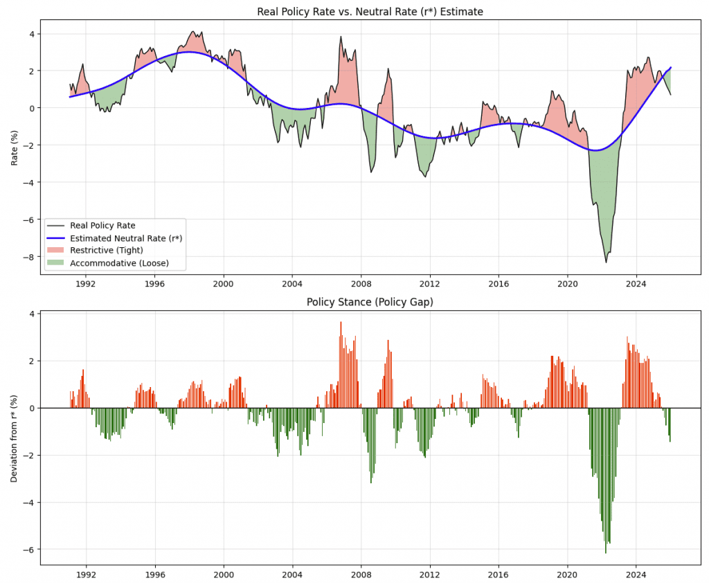
The top panel plots the real policy rate. It’s derived from the nominal policy rate minus inflation, against an estimated r*.
Periods where the real policy rate is above r* are shaded as restrictive, while periods below r* are accommodative.
The neutral rate itself is a smoothed estimate that reflects long-run growth, productivity, demographics (e.g., population growth), and global savings conditions.
The bottom panel shows the policy gap, defined as the deviation of the real policy rate from r*. Positive values indicate tightening relative to neutral, while negative values indicate stimulus.
Inputs typically include nominal policy rates, inflation measures, trend growth, labor force dynamics, productivity assumptions, and smoothing parameters.
Below we have some basics on policy state, condition (i.e., policy relative to r-star/r*), the economic implication, and an example trading strategy.
| State | Condition | Economic Implication | Trading Strategy |
|---|---|---|---|
| Restrictive | r_policy > r* | The Fed is actively trying to slow the economy.
Inflation should fall, and eventually, the Fed will cut rates. |
Long Duration: Buy bonds (yields will likely fall).
Flattener: Short end stays high, long end drops on growth fears. |
| Accommodative | r_policy < r* | The Fed is stimulating the economy.
Growth and inflation are likely to accelerate. Likely to pressure rates upward. |
Short Duration: Sell bonds (yields will likely rise).
Steepener: Long end rises faster on inflation premium. |
| Neutral | r_policy ≈ r* | The economy is in equilibrium. | Market Weight: Focus on idiosyncratic carry or relative value. |
Normally, the yield curve is upward-sloping to reflect normal term premia.
Sometimes it’s inverted when expectations of future growth are expected to fall.
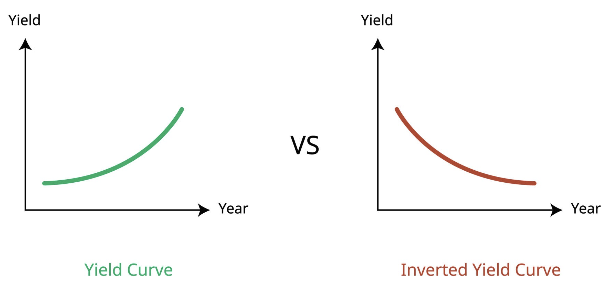
When Policy is Accommodative (Green)
The front end is pinned low.
This stimulates growth, which causes investors to demand higher yields for long-term bonds due to inflation risk. This steepens the curve.
When Policy is Restrictive (Red)
The front end of the curve (policy rate) is pinned high.
However, the restrictive policy chokes off long-term growth and inflation expectations, pulling the long end (10Y/30Y) down. This inverts the curve.
3. Financial Conditions and Liquidity Models
These focus on how financial markets amplify or dampen economic outcomes.
Financial Conditions Indices (FCIs)
Composite measures of credit spreads, equity prices, volatility, and FX.
Widely used as leading indicators for growth and risk appetite.
Example Financial Conditions Index (FCI) Formula
FCI_t = w1 Z(Credit Spreads_t) + w2 Z(Equity Returns_t) + w3 Z(Volatility_t) + w4 Z(FX_t)
Where:
- Z(⋅) denotes a standardized z-score relative to historical norms
- w_i are weights that sum to 1 and reflect transmission strength
Component Interpretation
- Credit spreads (positive contribution) – wider spreads tighten financial conditions
- Equity prices or returns (negative contribution) – rising equities loosen conditions
- Volatility (positive contribution) – higher volatility tightens conditions
- FX (positive or negative) – domestic currency appreciation tightens conditions via more expensive exports and liquidity
Credit Cycle Models
Track leverage growth, lending standards, and default cycles.
Extremely relevant for credit, equities, industrial commodities, and volatility strategies.
Your main input variables are the following:
- Leverage and balance sheet metrics – Total private sector debt to GDP, corporate leverage ratios, household debt to income, household debt payments relative to income, changes in bank balance sheet size.
- Credit growth measures – Y/y growth in bank loans, corporate debt issuance, mortgage credit, and non-bank lending activity.
- Lending standards and credit supply – Bank lending surveys, underwriting standards (e.g., covenant quality trends), and loan officer tightening/easing indicators.
- Credit pricing and risk compensation – Corporate credit spreads (e.g., BBB credit relative to same-tenor Treasury debt), high yield versus investment grade spreads, loan spreads, and risk premia.
- Default and stress indicators – Default rates, delinquency rates, downgrade ratios, recovery rates, and bankruptcy filings.
- Market based stress signals – Equity volatility, credit volatility, funding spreads, and liquidity measures.
Liquidity Preference and Money Supply Models
Used to assess the impact of QE, QT, and balance sheet policy on asset prices.
Some examples of popular inputs:
- Central bank balance sheet measures – Total balance sheet size, pace of asset purchases or runoffs
- Monetary aggregates – Measures such as M0 growth (M1, M2 growth mix money and credit together), reserve balances, bank deposits, and excess reserves held at the central bank.
- Interest rates and opportunity cost of money – Policy rates, short-term money market rates, prime rates, and real (i.e., inflation-adjusted) interest rates that influence the attractiveness of holding cash versus risk assets.
- Liquidity demand indicators – Money velocity, demand for safe assets, usage of reverse repo facilities, cash hoarding behavior during stress.
- Bank intermediation capacity – Reserve requirements, capital constraints, and balance sheet costs. These affect how reserves translate into credit.
- Market liquidity proxies – Bid-ask spreads, repo rates, funding spreads, dealer inventories.
4. Yield Curve and Rates Models
Central to fixed income, macro, and relative-value trading.
Expectations Hypothesis
Views long-term yields as expectations of future short rates plus term premia.
Term Structure Models (Affine Models)
Affine models decompose yields into level, slope, curvature, and term premium components.
Basically what they do is they explain why interest rates differ across maturities and how the yield curve moves over time.
They break bond yields into simple building blocks.
- The level reflects the overall height of rates, driven by inflation and long-run growth expectations (i.e., the nominal rate of growth).
- The slope captures the gap between short and long rates. Often signals economic acceleration or slowdown.
- Curvature describes how the middle of the curve behaves relative to short and long maturities.
- The term premium is the extra return investors demand for holding long-term bonds instead of rolling short-term ones.
For trading, these components help identify whether moves are driven by growth, policy expectations, or risk compensation.
Traders use them to position in curve steepeners or flatteners, choose duration exposure, and separate valuation from macro signals.
Curve Steepening / Flattening Regime Models
Used to position along the curve based on growth, inflation, and policy outlooks.
These trades can be:
- basic bond trades
- long/short rate or bond trading strategies (e.g., long 10-years, short 30-years)
- specific curve steepening/flattening strategies
Growth inputs typically include GDP momentum, purchasing manager indices, employment trends, and leading indicators that signal acceleration or deceleration in economic activity.
Inflation inputs focus on headline and core inflation, wage growth, inflation expectations, and commodity price trends.
Policy inputs include the current policy rate, expected future rate paths derived from futures markets, central bank guidance, and measures of policy credibility.
Market-based inputs such as yield curve spreads, forward rate differentials, term premia, and volatility help confirm whether macro signals are already priced in.
Altogether, these variables will help determine whether:
- a) long rates are likely to rise faster than short rates – producing a steepening, or
- b) whether tighter policy and slowing growth are more likely to compress the curve into a flattening or inversion.
5. International and FX Macro Models
Used for currency trading and global allocation.
Balance of Payments Models
Relate FX rates to trade balances, capital flows, and investment income.
They explain exchange rate movements by tracking how money flows into and out of an economy.
The main inputs are the:
- trade balance, which reflects exports minus imports
- capital flows such as foreign investment and portfolio inflows, and
- investment income earned on overseas assets.
When capital inflows or trade surpluses rise, demand for the currency increases. This supports appreciation.
Persistent deficits or capital outflows tend to weaken the currency.
But not always, especially if there’s strong demand for the currency’s debt.
That’s why reserve currencies often do well despite being highly indebted. (It’s different when they become overly indebted, but it’s a longer-term concern.)
Traders use these models to understand:
- a) whether a currency is fundamentally over- or undervalued and
- b) to identify longer-term pressure points beyond short-term market moves.
Related: Macro Variables in FX Trading
Purchasing Power Parity (PPP)
Long-term valuation anchor for currencies.
Purchasing power parity compares price levels across countries.
This can help determine the exchange rate at which identical goods cost the same in each economy.
When a currency is cheap or expensive relative to PPP, it suggests long term appreciation or depreciation pressure.
Emphasis on long term. It’s not useful for short-term timing.
Overall, traders use PPP as a valuation anchor to frame structural currency views.
Purchasing power parity isn’t foolproof because prices embed far more than just exchange rates.
A Big Mac can cost $8 in one country and $5 in another due to differences in wages, rents, taxes, regulations, supply chains, and other factors, not because the currency is mispriced.
Many inputs to local prices, such as labor and real estate, aren’t tradable across borders and don’t arbitrage away.
Consumption patterns also differ, and firms price to local demand rather than global parity.
Trade barriers, transportation costs, and market competition further distort price comparisons.
Accordingly, currencies can remain far above or below PPP estimates for many years without correcting.
This is why understanding the unique nuances in each situation is so important.
PPP is therefore best viewed as a very long-run valuation reference, not a reliable predictor of near or medium term currency moves.
Interest Rate Parity (Covered and Uncovered)
Interest rate parity explains how interest rate differences between two countries relate to exchange rates.
Covered interest rate parity states that when forward contracts are used to hedge currency risk, returns on similar risk-free investments should be equal across countries.
This relationship determines FX forward pricing.
Uncovered interest rate parity removes the hedge and assumes expected exchange rate changes offset interest rate differentials.
In practice, uncovered parity often fails, which allows higher-yielding currencies to outperform.
Why is this? Because exchange rates don’t consistently adjust to offset interest differentials.
Also, traders/investors demand compensation for risk, capital flows, and market frictions. This way, high yielding currencies tend to earn excess returns.
This is the basis of carry trades, where traders borrow in low-rate currencies and go long higher-rate ones, accepting exchange rate risk in pursuit of excess returns.
So interest rate parity is more academic than an empirical law.
Global Capital Flow Models
Global capital flow models explain currency and asset price movements by tracking how money and credit move across borders in response to returns and risk.
Key inputs include:
- yield differentials between countries, which attract capital toward higher-returning markets, and
- global risk sentiment, which drives shifts between safe havens and risk assets
Reserve management by central banks and sovereign wealth funds also are important because large reallocations can influence exchange rates and bond markets.
When capital flows strongly into a country, its currency and asset prices tend to rise.
Flows create trends that tend to be extrapolated into the forward pricing.
Sudden reversals in flows often trigger volatility accordingly.
This makes these models especially important for FX, rates, and emerging market trading.
6. Risk-Based and Market-Driven Macro Models
These models are often more actionable for trading than traditional macro theory.
Risk-On / Risk-Off Regime Models
Classify environments using volatility, correlations, credit spreads, and funding stress.
Risk on and risk off regime models classify market environments based on whether market participants are seeking risk or avoiding it.
These models use inputs such as equity and credit volatility, cross-asset correlations, credit spreads, and measures of funding stress.
In risk-on regimes, volatility is low, credit spreads are tight or tightening, and funding markets function smoothly.
Capital flows toward equities, credit, and higher-yielding currencies.
In risk-off regimes, volatility rises, correlations converge, credit spreads widen, and funding conditions tighten.
Traders shift toward safe assets such as government bonds, reserve currencies (often including gold, which serves that kind of purpose), and cash.
Traders use these models to adjust positioning or reduce exposure during stress.
They can also be used to avoid being overleveraged when diversification benefits disappear.
The value of these models lies in signaling regime transitions rather than predicting individual asset prices.
Factor-Based Macro Models
Decompose asset returns into growth, inflation, real rates, liquidity, and risk premia factors.
Factor-based macro models explain asset returns by breaking them down into a small number of economic forces that drive markets.
What are the parts and how do we build that back up to the whole?
Instead of viewing price movements as random, these models ask which macro forces are responsible.
For example, in this article we described four main macro forces that dictate price movements – changes in:
- discounted growth
- discounted inflation
- discount rates
- risk premiums
Growth factors relate to how sensitive an asset is to economic expansion or slowdown.
Inflation factors measure how prices respond to changes in inflation or inflation expectations.
Real rate factors reflect sensitivity to changes in interest rates after inflation. If nominal, then changes in interest rates including inflation.
Risk premia factors capture compensation for bearing uncertainty, leverage, or volatility.
Some would argue there’s a liquidity factor, which describes how assets react to easing or tightening financial conditions.
You then estimate how much each factor contributes to returns.
This way, traders can see what they are really exposed to.
Two portfolios that look diversified may share the same factor risks.
For examples, most portfolios react well to growth and poorly when growth falls.
These models help:
- balance exposures
- avoid unintended concentration, and
- design portfolios that perform across different economic environments rather than relying on a single macro outcome
For example, a portfolio that’s stocks and bonds broken down would recognize similar inflation sensitivities, as well as rate sensitivities.
They could then design the portfolio to include other exposures (e.g., gold, commodities) or even short positions to better neutralize duration, delta, etc.
Macro Trend and Momentum Models
Exploit persistence in macro-driven price trends across asset classes.
Macro trend and momentum models are based on the idea that large macro forces move slowly and create persistent price trends.
When growth, inflation, or policy shifts, asset prices often adjust over months rather than days.
These models identify trends using price behavior across equities, bonds, commodities, and currencies, then position in the direction of those trends.
They don’t require precise economic forecasts.
Instead, they let markets reveal the dominant macro regime through sustained price movement.
Traders use these models to capture extended moves and to provide diversification, as trends often perform well during periods of macro stress or transition.
7. Crisis, Stress, and Debt Sustainability Models
These are primarily used for tail-risk assessment and sovereign analysis, not necessarily for the course of everyday trading.
Debt Dynamics Models
Project debt-to-GDP paths under different growth and rate assumptions.
Debt dynamics models analyze how government debt evolves based on economic growth, interest rates, and fiscal balances.
They project future debt-to-GDP ratios under different assumptions to assess sustainability, rollover risk, and vulnerability to rising rates or slower growth.
Balance Sheet Recession Models
Explain prolonged stagnation after debt-driven busts. Relevant for Japan-style and post-crisis environments.
Balance sheet recession models explain why economies can remain weak for long periods after a debt-driven boom collapses.
When asset prices fall, households and firms focus on repairing balance sheets rather than spending or investing, even if interest rates are low.
Debt repayment becomes the priority, reducing demand across the economy.
Traditional monetary policy loses effectiveness because borrowers are unwilling to take on new credit.
Growth stays sluggish, inflation remains low, and savings rise. These models help explain Japan’s long stagnation and the slow recovery after global financial crises.
For traders, they highlight environments where low rates persist, fiscal policy becomes more important, and risk assets underperform expectations based on normal business cycle models.
Financial Instability Hypothesis
Focuses on leverage cycles and endogenous risk buildup rather than equilibrium outcomes.
The financial instability hypothesis argues that periods of stability encourage rising leverage, risk taking, and fragility – which eventually lead to crisis and asset market dislocations.
Risk builds endogenously rather than from external shocks.
Models use inputs such as:
- credit growth
- leverage ratios
- asset price inflation
- debt maturity mismatch
- funding dependence, and
- underwriting standards
As leverage rises and risk is underpriced, the system becomes unstable.
Small shocks can lead to deleveraging, asset price collapses, and financial stress, even without major changes in fundamentals.
8. Practical “Trader Macro” Frameworks
These are not formal models but dominate real trading desks.
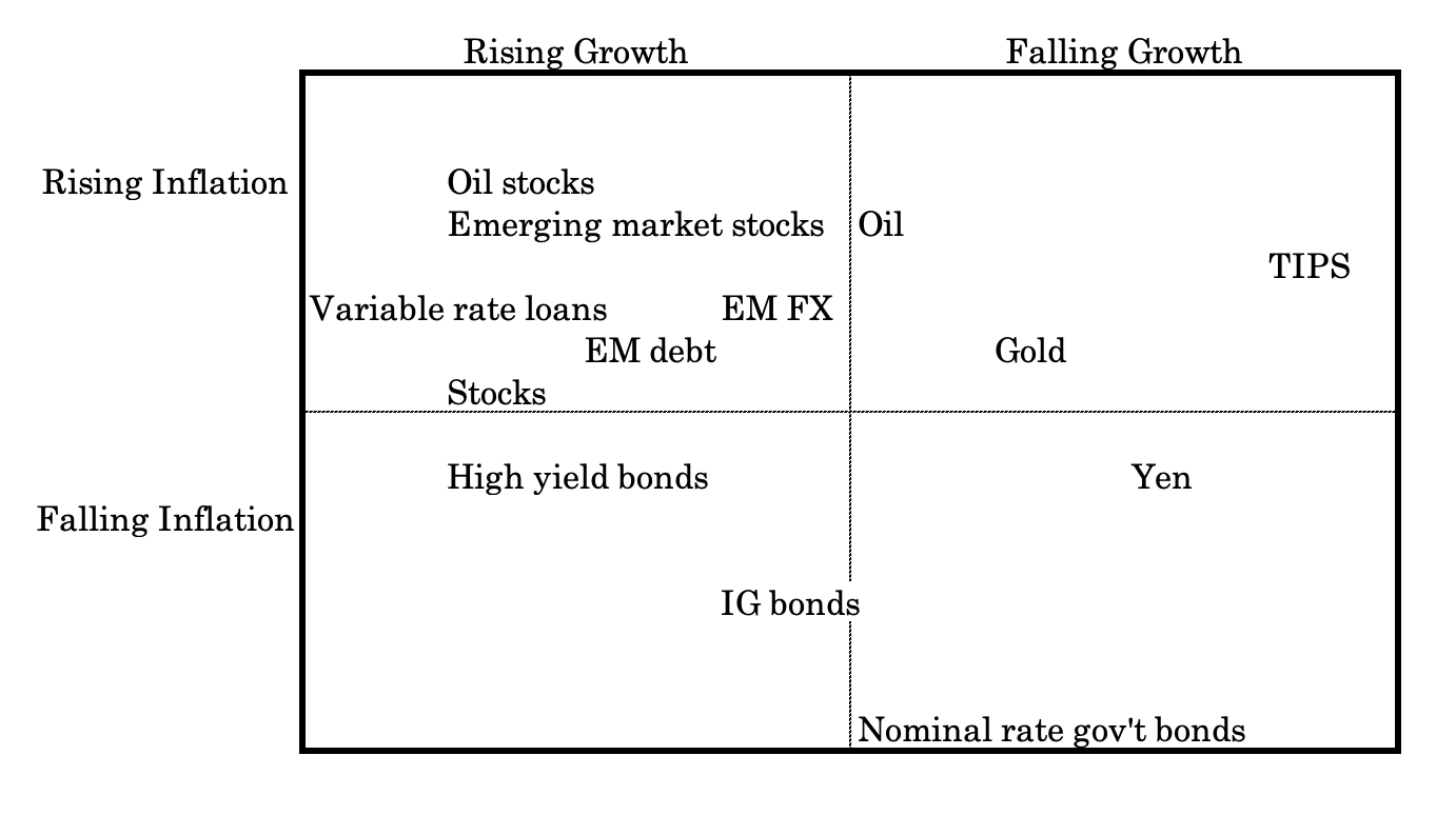
Growth-Inflation Quadrant Models
Classify regimes into accelerating or decelerating growth and inflation to guide asset allocation.
For example:
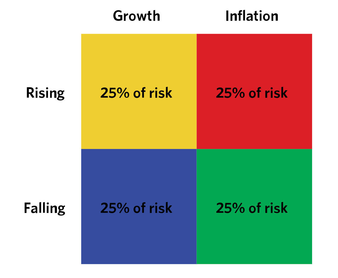
This diagram is standard in a risk parity or balanced beta framework built around the idea that total portfolio risk should be evenly distributed across macroeconomic regimes, rather than concentrated in one outcome.
Growth and inflation are treated as the two dominant macro drivers, each of which can be rising or falling.
Because the future regime is uncertain, the portfolio allocates 25% of risk to each quadrant, so that reward is improved relative to risk.
Rising Growth / Falling Inflation is typically the most equity-friendly regime. Assets here include equities, cyclical stocks (e.g., energy), EM FX/debt, high-yield credit, and risk-on factor exposures.
Rising Growth / Rising Inflation favors real assets and inflation protection. Commodities, energy equities, TIPS, and value stocks relative to growth stocks tend to perform better.
Falling Growth / Falling Inflation is a deflationary slowdown regime. Long-duration government bonds, high-quality sovereign debt, and defensive equity sectors relative to growthier sectors usually dominate.
Falling Growth / Rising Inflation is the most challenging quadrant due to a dearth of assets that naturally fall here. Assets with relative strength here include gold, managed futures, trend-following strategies, select commodities, and TIPS/inflation-linked bonds relative to nominal rate bonds.
Risk parity portfolios combine these exposures so no single macro outcome dominates overall portfolio risk.
Policy Dominance vs. Market Dominance Models
Looks at whether markets are being driven primarily by central banks or by private-sector fundamentals.
Policy dominance versus market dominance models are used to determine what is actually driving asset prices at a given time.
In policy-dominant regimes, central bank actions such as rate changes, forward guidance, and balance sheet policy are the primary forces shaping markets. Asset prices respond more to policy signals than to earnings, growth, or valuation.
In market-dominant regimes, private sector fundamentals take the lead.
Growth trends, inflation dynamics, corporate profits, and risk appetite drive prices, while policy reacts rather than leads.
Inputs include policy surprise measures, rate volatility, balance sheet changes, macro data momentum, and asset sensitivity to policy announcements.
Traders use these models to decide whether to focus on central bank communication or economic fundamentals when positioning and managing risk.
Liquidity-First Frameworks
Assume asset prices are primarily driven by balance sheet expansion (at the most fundamental level driven by monetary and fiscal policy as the levers), funding stress, and collateral availability.
Liquidity first frameworks view asset prices as being driven primarily by the availability and cost of liquidity rather than by traditional valuation or growth metrics.
At the most fundamental level, liquidity is shaped by monetary and fiscal policy through central bank balance sheet expansion, government spending, and deficit financing.
When balance sheets expand and funding is abundant, asset prices tend to rise as leverage and risk-taking increase.
When liquidity is withdrawn through tightening, quantitative tightening, or fiscal restraint, asset prices often weaken regardless of fundamentals.
These frameworks also emphasize funding stress, repo market conditions, and collateral availability, since modern financial systems rely heavily on secured financing.
Traders use liquidity first models to anticipate turning points in risk assets, identify periods when correlations rise, and understand why markets can move sharply even when economic data appears stable.
As Stan Druckenmiller has said:
Earnings don’t move the overall market; it’s the Federal Reserve Board… focus on the central banks and focus on the movement of liquidity… most people in the market are looking for earnings and conventional measures. It’s liquidity that moves markets.
A broader quote:
The major thing we look at is liquidity, meaning as a combination of an economic overview. Contrary to what a lot of the financial press has stated, looking at the great bull markets of this century, the best environment for stocks is a very dull, slow economy that the Federal Reserve is trying to get going… Once an economy reaches a certain level of acceleration… the Fed is no longer with you… The Fed, instead of trying to get the economy moving, reverts to acting like the central bankers they are and starts worrying about inflation and things getting too hot. So it tries to cool things off… shrinking liquidity… [While at the same time] The corporations start having to build inventory, which again takes money out of the financial assets… finally, if things get really heated, companies start engaging in capital spending… All three of these things, tend to shrink the overall money available for investing in stocks and stock prices go down…
The conclusion is that market direction is best understood through the lens of liquidity cycles rather than earnings cycles.
- When liquidity expands, assets rise almost regardless of fundamentals.
- When liquidity contracts, even strong growth and profits fail to support prices.