Simple Portfolios: Improving Outcomes by Simplifying


Does trading and investing seem too complicated? In this article, we look at various examples of simple portfolios to make the process less intimidating.
When something is less confusing, it’s also easier to get started. And the easier it is to get started, the faster you can start reaping the benefits.
A key part of improving risk-adjusted returns and overall trading/investing success is to simplify. Simple portfolios can take you further than overcomplicating your approach.
If you’re a small operation or a one-person manager, complexity is likely to overwhelm your personal bandwidth and create excessive trading costs.
You don’t need a complicated portfolio with dozens of different trades on at once to optimize how much you make. Trying to do too much will do more harm than good.
If you have on 50 different trades, for example, and your approach requires you to actively manage them, you’re unlikely to do as well as you could if your resources are limited.
Save costs
Taking on too much will create costs (e.g., commissions, slippage or price of getting in and out, human error) and won’t help much beyond a point.
Even if you’re with a broker that doesn’t charge you commissions, the trade-off is generally in the execution because they prioritize payment for order flow.
Day traders or high-volume traders are generally best suited using a broker with a smart order router.
A smart order router will monitor changes in market conditions and re-route some or all of your order to obtain price improvement, achieve the best execution possible, and maximize any rebate you might be eligible for.
Even the largest investment managers simplify
Even many firms with billions of dollars under management don’t have extremely complex portfolios that they actively trade.
In fact, a three-asset portfolio of 30 percent stocks, 60 percent bonds, and 10 percent gold has outperformed the standard 100 percent equities portfolio, with a Sharpe ratio of 0.58 versus just 0.42 (Sortino ratio of 0.92 versus 0.60), with a maximum drawdown of only about one-fifth as deep.
The type of portfolio can be leveraged to match the returns of an equities portfolio at less risk, or the same risk but higher returns.
The general goal
If you can find, as a general goal, 10-15 good uncorrelated bets with positive return outcomes that are balanced and diversified well, you’ll be in better shape than trying to trade dozens of things at the same time.
The marginal benefit of diversification is highest at first, then flattens out as you add more bets. Just four uncorrelated, equally good bets cuts your risk in half while keeping the same return.
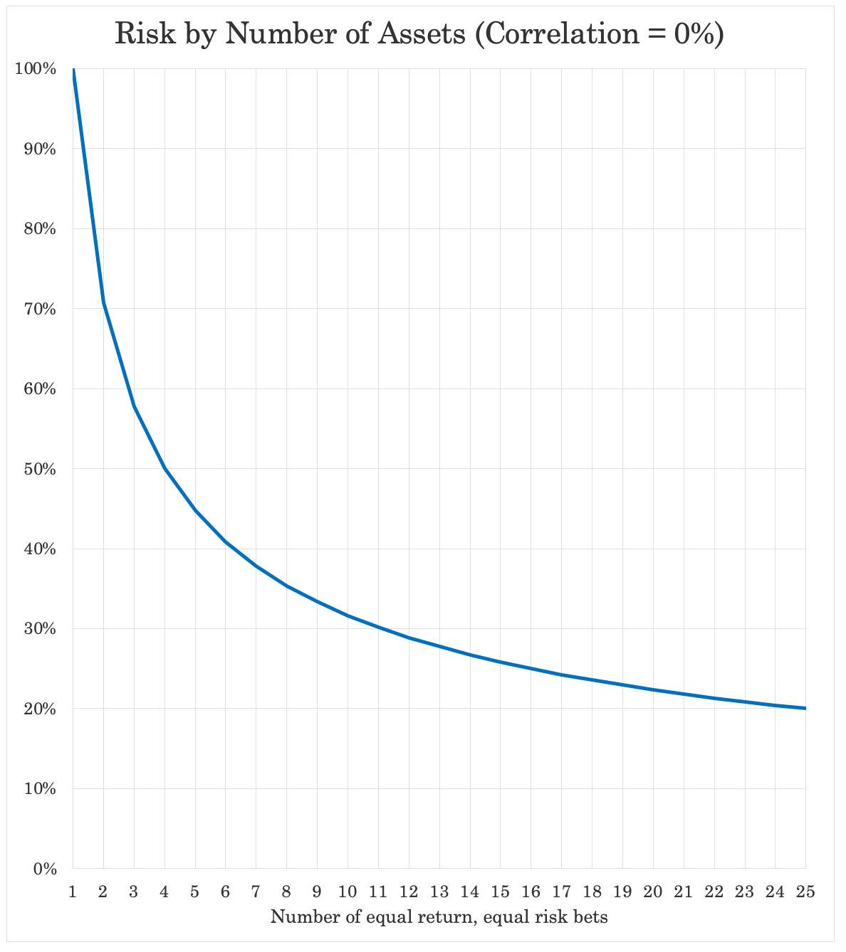
That chart above is at zero percent correlation to each other.
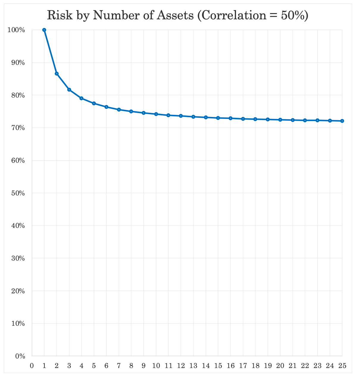
Once you have, for example, 50 percent correlation, going past 8-10 bets doesn’t provide much additional marginal benefit because you’re already in the flat part of the curve.
You’ll find that you’ll benefit from the simplicity in various ways by not overcomplicating, saving you time and money.
“Portfolio watching” won’t take up a lot of your time with a simplified approach. Having to keep your eye on it hours per day is generally a poor use of time.
Simple Portfolios: Examples
Having a balanced portfolio that is not biased toward outperformance or underperformance in an economic environment is key. We covered this in a separate article.
Below we’ll cover individual examples of simple portfolios.
Example #1
In this case, we have a portfolio that’s 35 percent stocks and 65 percent bonds (“Portfolio 1”).
We compare it to a portfolio that’s 100% stocks (“Portfolio 2”).
We take portfolio statistics from 1972 to the present.
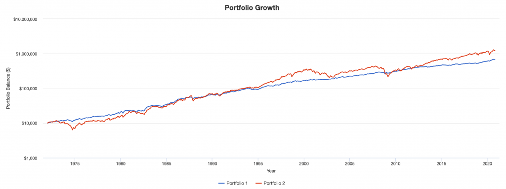
Portfolio Returns
| Portfolio | Initial Balance | Final Balance | CAGR | Stdev | Best Year | Worst Year | Max. Drawdown | Sharpe Ratio | ||
|---|---|---|---|---|---|---|---|---|---|---|
| Portfolio 1 | $10,000 | $596,805 | 8.73% | 7.67% | 32.90% | -7.11% | -16.60% | 0.53 | ||
| Portfolio 2 | $10,000 | $1,213,397 | 10.33% | 15.59% | 37.82% | -37.04% | -50.89% | 0.42 |
We see that we cut our risk (volatility, measured as a standard deviation (“Stdev”)) by about 50 percent.
Our “worst year” was just minus-7 percent instead of minus-37 percent. Our maximum drawdown was only one-third as bad.
The Sharpe ratio was improved to 0.53 from 0.42.
The Sortino ratio, shown in the Appendix to this article, improved to 0.84 from 0.60. (Sortino penalizes downside volatility, the bad kind of volatility, instead of all volatility like the Sharpe ratio does.)
The issue with this portfolio?
It doesn’t return as much since we shifted a lot of the allocation out of high-returning stocks into lower-returning bonds.
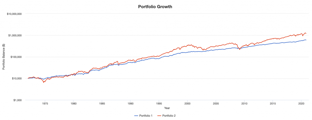
We can see this with the portfolio’s growth over time on a logarithmic scale.
Why 35/65?
We went with 35/65 because this is roughly what we need to have balance between equities and fixed income.
Portfolio Risk Decomposition for 35/65
| Name |
|---|
| 35/65 | Stocks | |
|---|---|---|
| US Stock Market | 51.8% | 100.0% |
| 10-year Treasury | 48.2% |
If we take a 60/40 portfolio, that seems sort of balanced because the dollar terms are almost equitable.
But the problem is that stocks are more volatile than bonds, so you actually have nearly 90 percent of the risk still in stocks.
Portfolio Risk Decomposition for 60/40
| Name |
|---|
| 60/40 | Stocks | |
|---|---|---|
| US Stock Market | 88.5% | 100.00% |
| 10-year Treasury | 11.5% |
And a 50/50 portfolio is really more like close to an 80/20 portfolio in terms of the risk decomposition.
Portfolio Risk Decomposition for 50/50
| Name |
|---|
| 50/50 | Stocks | |
|---|---|---|
| US Stock Market | 78.0% | 100.00% |
| 10-year Treasury | 22.0% |
Those are anything but a balanced portfolio.
Trying to get balanced represents a conundrum because the more you take away from the riskier, higher-yielding assets you allocate more to lower-returning assets. This would be a drag on long-run returns.
But it doesn’t have to be that way.
To have balance between equities and fixed income you need to bring up the fixed income side to match the equities side. This is done by either leveraging the fixed income side or using leverage-like techniques, such as bond futures.
That way you can still be fully invested in stocks (whatever that might mean to any individual’s portfolio), but still have diversification through the fixed income side.
Put another way, your quest for diversification doesn’t need to be constrained by sacrificing long-run returns.
You can still have the ‘100’ in stocks instead of the sub-optimal ’60’, ’50’, or whatever the number.
For example, if you have a $100,000 portfolio, you can put that $100,000 into equities – instead of a much lower figure to try to diversify in a suboptimal way.
The duration of that $100,000 in equities can be matched through bond futures, inflation-linked bond like TIPS, corporate bonds, fixed income ETFs, and other fixed income products – whatever solution(s) make the most sense for your portfolio.
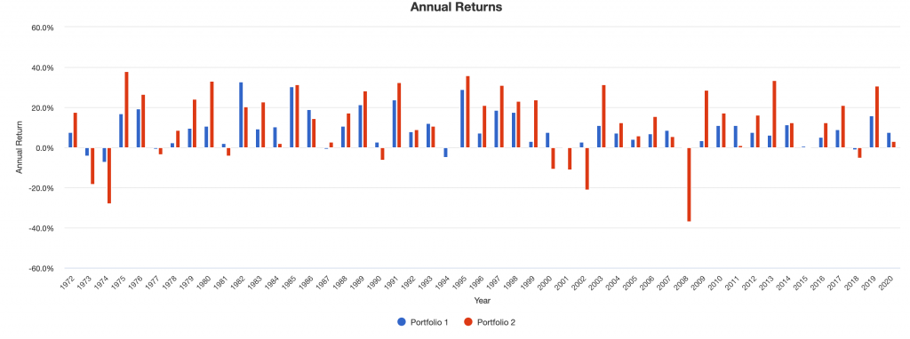
35/65 Drawdowns vs. Stocks Drawdowns
Generally, your drawdowns in a 35/65 portfolio will be much more shallow because of the diversification.
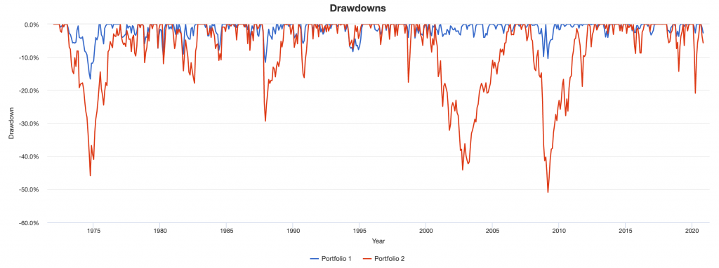
Notice the several large down years for stocks (red bars) and rare down years for diversified (and shallow when they are).
Example #2
A portfolio that’s well balanced among stocks and bonds will diversify well with respect to growth.
Stocks do best when growth runs above expectation. Bonds (the safe variety, not the ones with high credit risk) do best when growth runs below expectation.
The two are a natural offset, which is why balancing well between stocks and bonds improves risk-adjusted returns in a material way, as shown in the preceding example.
However, at the macro level, asset classes don’t move just with respect to fluctuations in growth. Inflation is a big component as well.
Bonds and stocks both do well in a falling inflation environment. When inflation falls, equilibrium interest rates fall as well, holding growth constant.
That benefits stocks and bonds due to the way the present value of cash flows is calculated.
So, having some “inflation assets” is helpful as well.
Your typical choices:
- Gold
- Commodities (oil, agricultural commodities, and so on)
- Inflation-linked bonds (e.g., TIPS, inflation-linked Gilts)
- Variable rate loans
- Some emerging market equities and emerging market credit
In this case, we’re allocating 12 percent of the portfolio to gold while keeping the same relative balance between stocks and bonds.
| Asset Class | Allocation |
|---|---|
| US Stock Market | 30.00% |
| 10-year Treasury | 58.00% |
| Gold | 12.00% |
(Note: Gold can do well in multiple environments, not just inflationary ones. Its long-run value is proportional to total fiat reserves and currency relative to the global gold supply. When a country creates money, it can be effectively negating deflation.)
Is such a portfolio perfectly balanced with respect to inflation?
No, but with gold we do get a clear backtest back to 1972, the first full year gold was floated internationally after the US unilaterally severed its promise pertaining to the convertibility of the US dollar for physical gold at $35 per ounce.
TIPS didn’t exist until 1997, though they didn’t become popular until the early 2000s. (Inflation-linked Gilts were first issued by the British government in 1981.)
Emerging market equities and credit can be more inflation-neutral or correlate somewhat positively to inflation (if big commodity producers, for example). But their track record, in terms of something that could yield a representative benchmark, is difficult to assess beyond a few decades.
Here are the results since January 1972.
“Portfolio 1” in the below images is our new diversified portfolio including gold while “Portfolio 2” is the standard stocks benchmark.
Portfolio Returns
| Portfolio | Initial Balance | Final Balance | CAGR | Stdev | Best Year | Worst Year | Max. Drawdown | Sharpe Ratio | ||
|---|---|---|---|---|---|---|---|---|---|---|
| Balanced | $10,000 | $664,134 | 8.97% | 7.32% | 30.89% | -4.48% | -11.99% | 0.59 | ||
| Stocks | $10,000 | $1,213,397 | 10.33% | 15.59% | 37.82% | -37.04% | -50.89% | 0.42 |
For reference he was 35/65 compared to US stocks:
| Portfolio | Initial Balance | Final Balance | CAGR | Stdev | Best Year | Worst Year | Max. Drawdown | Sharpe Ratio | ||
|---|---|---|---|---|---|---|---|---|---|---|
| 35/65 | $10,000 | $596,805 | 8.73% | 7.67% | 32.90% | -7.11% | -16.60% | 0.53 | ||
| Stocks | $10,000 | $1,213,397 | 10.33% | 15.59% | 37.82% | -37.04% | -50.89% | 0.42 |
So, we see higher returns, less risk, a 28 percent lower maximum drawdown, and a higher Sharpe ratio.
This small change to diversifying better with respect to inflation makes a big difference.
Here we see growth over time on a logarithmic scale compared to a stocks portfolio:
We also see down years that are few and far between and very shallow when they do occur.
For example, the main down years of 1981, 1994, and 2018 for the balanced portfolio were caused by excessively tight liquidity by the central bank.
The central bank eventually finds out that they’re overly tight. Accordingly, this was rectified the following year by an easing up. This led to solid returns in the following years (1982, 1995, 2019).
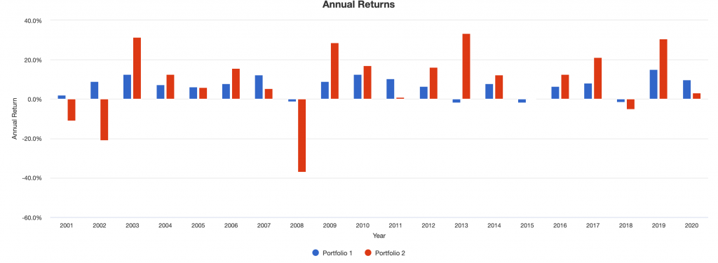
Example #3
Let’s balance to inflation further.
In this case, we’ll have the following allocation:
| Asset Class | Allocation |
|---|---|
| US Stock Market | 24.00% |
| 10-year Treasury | 43.00% |
| Gold | 10.00% |
| Precious Metals | 3.00% |
| TIPS | 20.00% |
In this case, because of limited data for TIPS, we can only go back to January 2001.
However, we still have a decent amount of data.
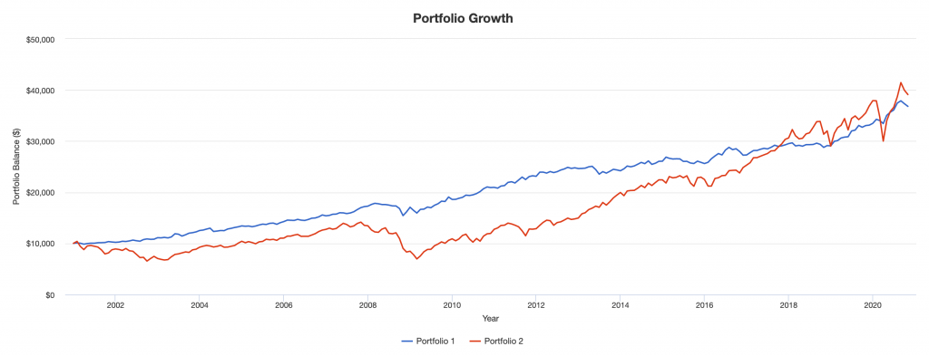
Portfolio Returns
| Portfolio | Initial Balance | Final Balance | CAGR | Stdev | Best Year | Worst Year | Max. Drawdown | Sharpe Ratio | ||
|---|---|---|---|---|---|---|---|---|---|---|
| Balanced | $10,000 | $37,018 | 6.82% | 5.98% | 15.40% | -1.82% | -13.73% | 0.90 | ||
| Stocks | $10,000 | $39,117 | 7.12% | 15.38% | 33.35% | -37.04% | -50.89% | 0.43 |
By diversifying further, we can see our risk is cut by about 61 percent. This is better than the ~50 percent cut we saw above.
This is due to the TIPS kicking in as an additional source of unique diversification, and to a lesser extent the smaller amounts other precious metals added to the portfolio. (Silver and platinum do not diversify as well as gold because they have industrial uses and therefore correlate more to the broader economy.)
Our worst year was very shallow. Our maximum drawdown was only about 27 percent as bad. Our Sharpe ratio more than doubled to 0.90 from 0.43. Having Sharpe ratios of close to 1 at scale are rare.
The Sortino ratio, which focuses on penalizing downside volatility instead of all volatility equally like the Sharpe ratio, improved from 0.61 to 1.49 (see Appendix), an improvement of nearly 2.5x.
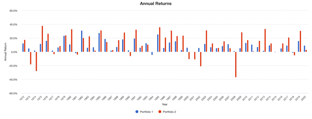
Looking at growth over time, the blue line is balanced; the red line is stocks.
Going back to showing drawdowns, we can see that they’re much more tolerable than the big ones you get being concentrated. You don’t get the big swings down that you’ll get if you’re concentrated in a particular asset class (stocks, bonds, gold, oil):
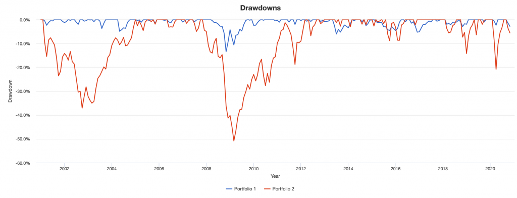
Down years (blue bars) are extremely shallow, none more than 1.8 percent.
The idea behind balanced portfolios
We’ve discussed briefly why balanced portfolios do so much better than concentrated ones on a risk-adjusted basis.
They also come with a host of other benefits, such as lower left-tail risk, lower drawdowns, higher upside to downside capture, among other quantifiable improvements.
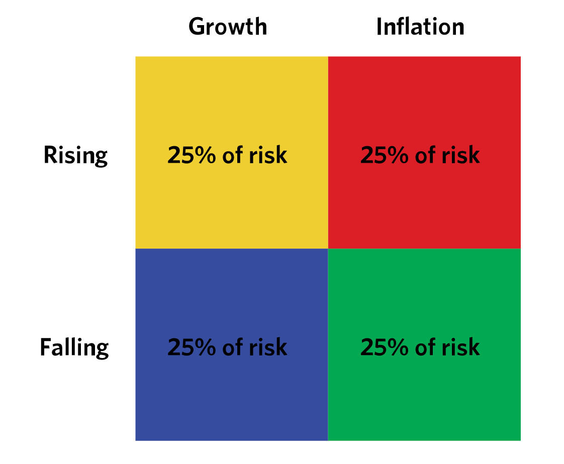
Each asset class has an environmental bias. Growth and inflation are the two main driving forces that change asset class pricing at the macroeconomic level.
Some assets do better in rising or falling growth environments and some assets do better in rising or falling inflation environments.
That means you generally have four main buckets.
- Rising growth / rising inflation
- Rising growth / falling inflation
- Falling growth / rising inflation
- Falling growth / falling inflation
Then you want to put 25 percent of your risk in each bucket. The key is to allocate risk, not capital.
Different forms of capital (stocks, bonds, and so on) have very different risks. This is why a 50/50 stocks/bonds portfolio is poorly diversified. The more volatile stocks portion will dominate the allocation.
Here’s the general idea:
And here’s one example interpretation of where certain asset classes may fall on this dual continuum.
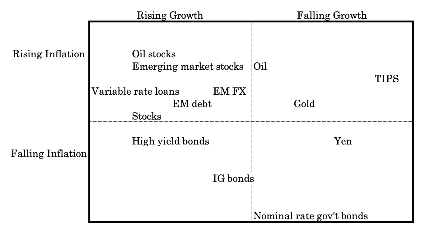
For example, investment-grade (IG) bonds do better in falling inflation environments, but are a mix in terms of growth. Rising growth is ideal, but in a downturn there is greater demand for the type of safety they can provide.
Oil’s place on the continuum depends on where you go.
Oil feeds into higher corporate cost structures, so it generally drives inflation expectations higher. Oil exporters benefit economically from higher oil prices (as do oil-producing companies, naturally), but oil importers want lower oil prices.
High yield bonds are riskier than IG bonds, so require a better growth environment.
Capital shifts far more than it’s destroyed
When stocks decline, that doesn’t mean the money just disappeared. The vast bulk of it wasn’t actual wealth destruction. It simply went into something else.
A lot of the time, when you see a drop in stocks, you see a concomitant rise in bond prices. That’s just capital moving around in response to a shift in growth expectations and to a lesser extent inflation expectations.
It could have went to different countries. When there was a trade announcement with respect to the US and China where the relative exchange rate changed, that’s simply capital shifting between the two in response a new perceived equilibrium.
Capital is always moving between asset classes, different countries, currencies, and fiat and non-fiat stores of wealth (financial assets, gold, commodities, and so on).
If you’re highly concentrated in stocks and have nothing to catch the inevitable falls that accompany equities, then you’re going to suffer big and unnecessary drawdown relative to if you had better diversification.
When you balance and diversify well, you’re extracting the risk premiums from the market in an efficient way. You’re limiting your risk and you’re also not biased toward a positive growth environment like most traders and investors.
Conclusion
In this article, we provided a few simple portfolios that will improve your reward relative to your risk in comparison to an equities portfolio.
The key in all of these simple portfolios is in providing better balance to the environmental sensitivities of different asset classes.
These sensitivities are built into the pricing structures of various asset classes.
Stocks are biased toward a better growth environment and moderate to lower inflation.
Safe government bonds do better in a lower growth, disinflationary/deflationary environment when people want liquidity and safety.
Inflation-linked bonds, gold, commodities, and variable rate loans do better in a rising inflation environment.
If you can hold different asset classes in relation to their risk and environmental sensitivity to achieve balance, you should be able to create a portfolio that can achieve equity returns at about one-third of the risk.
Through the use of leverage or things that provide leverage (e.g., futures), you have the ability to gain exposures to certain asset classes at low margin requirements without having to lower your long-run returns.
You don’t need to allocate away from the high-returning assets. You can simply bring up the lower-returning assets to match the types of exposures you want. For example, this might mean investing in equities and using bond, gold, and commodity futures to create better environmental balance.
We also have an Appendix below to view deeper statistics about each of the three portfolios mentioned in this article.
Appendix
Below we have more detailed portfolio statistics for each of the simple portfolios listed in this article.
Example #1: 35/65 vs. Stocks
| Metric |
|---|
| 35/65 | Stocks | |
|---|---|---|
| Arithmetic Mean (monthly) | 0.72% | 0.92% |
| Arithmetic Mean (annualized) | 9.05% | 11.68% |
| Geometric Mean (monthly) | 0.70% | 0.82% |
| Geometric Mean (annualized) | 8.73% | 10.33% |
| Volatility (monthly) | 2.21% | 4.50% |
| Volatility (annualized) | 7.67% | 15.59% |
| Downside Deviation (monthly) | 1.19% | 2.93% |
| Max. Drawdown | -16.60% | -50.89% |
| US Market Correlation | 0.73 | 1.00 |
| Beta(*) | 0.36 | 1.00 |
| Alpha (annualized) | 4.73% | 0.00% |
| R2 | 52.61% | 100.00% |
| Sharpe Ratio | 0.53 | 0.42 |
| Sortino Ratio | 0.84 | 0.60 |
| Treynor Ratio (%) | 11.49 | 6.50 |
| Calmar Ratio | 2.08 | 0.48 |
| Active Return | -1.59% | 0.00% |
| Tracking Error | 11.33% | 0.00% |
| Information Ratio | -0.14 | N/A |
| Skewness | 0.14 | -0.55 |
| Excess Kurtosis | 1.42 | 2.13 |
| Historical Value-at-Risk (5%) | -2.88% | -7.11% |
| Analytical Value-at-Risk (5%) | -2.92% | -6.48% |
| Conditional Value-at-Risk (5%) | -4.17% | -10.13% |
| Upside Capture Ratio (%) | 44.27 | 100.00 |
| Downside Capture Ratio (%) | 26.14 | 100.00 |
| Safe Withdrawal Rate | 3.90% | 4.33% |
| Perpetual Withdrawal Rate | 4.57% | 5.97% |
| Positive Periods | 383 out of 586 (65.36%) | 366 out of 586 (62.46%) |
| Gain/Loss Ratio | 1.28 | 1.02 |
Example #2: Basic balanced (30/58 stocks/bonds + 12 pct gold) vs. Stocks
| Metric |
|---|
| Balanced(30/58/12) | Stocks | |
|---|---|---|
| Arithmetic Mean (monthly) | 0.74% | 0.92% |
| Arithmetic Mean (annualized) | 9.26% | 11.68% |
| Geometric Mean (monthly) | 0.72% | 0.82% |
| Geometric Mean (annualized) | 8.97% | 10.33% |
| Volatility (monthly) | 2.11% | 4.50% |
| Volatility (annualized) | 7.32% | 15.59% |
| Downside Deviation (monthly) | 1.10% | 2.93% |
| Max. Drawdown | -11.99% | -50.89% |
| US Market Correlation | 0.66 | 1.00 |
| Beta(*) | 0.31 | 1.00 |
| Alpha (annualized) | 5.46% | 0.00% |
| R2 | 43.35% | 100.00% |
| Sharpe Ratio | 0.59 | 0.42 |
| Sortino Ratio | 0.93 | 0.60 |
| Treynor Ratio (%) | 13.90 | 6.50 |
| Calmar Ratio | 2.73 | 0.48 |
| Active Return | -1.35% | 0.00% |
| Tracking Error | 12.10% | 0.00% |
| Information Ratio | -0.11 | N/A |
| Skewness | 0.15 | -0.55 |
| Excess Kurtosis | 1.40 | 2.13 |
| Historical Value-at-Risk (5%) | -2.59% | -7.11% |
| Analytical Value-at-Risk (5%) | -2.73% | -6.48% |
| Conditional Value-at-Risk (5%) | -3.76% | -10.13% |
| Upside Capture Ratio (%) | 41.13 | 100.00 |
| Downside Capture Ratio (%) | 19.33 | 100.00 |
| Safe Withdrawal Rate | 4.71% | 4.33% |
| Perpetual Withdrawal Rate | 4.78% | 5.97% |
| Positive Periods | 377 out of 586 (64.33%) | 366 out of 586 (62.46%) |
| Gain/Loss Ratio | 1.38 | 1.02 |
Example #3: Balanced w/ more inflation diversification vs. Stocks
| Metric |
|---|
| Balanced | Stocks | |
|---|---|---|
| Arithmetic Mean (monthly) | 0.56% | 0.67% |
| Arithmetic Mean (annualized) | 6.98% | 8.40% |
| Geometric Mean (monthly) | 0.55% | 0.57% |
| Geometric Mean (annualized) | 6.79% | 7.12% |
| Volatility (monthly) | 1.72% | 4.44% |
| Volatility (annualized) | 5.94% | 15.38% |
| Downside Deviation (monthly) | 1.00% | 3.09% |
| Max. Drawdown | -13.49% | -50.89% |
| US Market Correlation | 0.45 | 1.00 |
| Beta(*) | 0.17 | 1.00 |
| Alpha (annualized) | 5.36% | -0.00% |
| R2 | 20.20% | 100.00% |
| Sharpe Ratio | 0.90 | 0.43 |
| Sortino Ratio | 1.49 | 0.61 |
| Treynor Ratio (%) | 30.93 | 6.70 |
| Calmar Ratio | 2.74 | 0.48 |
| Active Return | -0.33% | 0.00% |
| Tracking Error | 13.77% | 0.00% |
| Information Ratio | -0.02 | N/A |
| Skewness | -0.51 | -0.66 |
| Excess Kurtosis | 3.14 | 1.40 |
| Historical Value-at-Risk (5%) | -2.11% | -8.03% |
| Analytical Value-at-Risk (5%) | -2.26% | -6.63% |
| Conditional Value-at-Risk (5%) | -3.62% | -10.32% |
| Upside Capture Ratio (%) | 27.22 | 100.00 |
| Downside Capture Ratio (%) | 3.75 | 100.00 |
| Safe Withdrawal Rate | 8.04% | 5.92% |
| Perpetual Withdrawal Rate | 4.63% | 4.93% |
| Positive Periods | 157 out of 238 (65.97%) | 155 out of 238 (65.13%) |
| Gain/Loss Ratio | 1.23 | 0.79 |