
Stocks-Bonds Correlation



The relationship between stocks and bonds is a common theme any time someone talks about diversification.
Whether you’re a day trader, swing trader, or into a longer-term style or investing, diversification is important so your trades aren’t all doing the same thing.
In terms of conventional allocation, if you put most of your money in stocks, hold some bonds, and the bonds are supposed to cushion you when stocks fall. That’s the pitch behind the classic 60/40 portfolio, and a whole generation of investors built their thinking around it.
But stocks and bonds aren’t reliably diversifying. They can be. They have been, for long stretches. They also haven’t been, and the times they stop offsetting each are often the times you need the offset most.
Historically, the interaction between these two asset classes has fluctuated, influenced by the market environment, monetary policy, economic cycles, and sentiment.
Stocks and bonds can be diversifying, but aren’t inherently diversifying.
So let’s walk through how the relationship actually works, what drives it, when it flips, and what you do about it if you’re faced with this puzzle.
The short version: it comes down to whether changes in discounted inflation or growth is the main thing moving markets.
Key Takeaways – Stocks-Bonds Correlation
- Correlation Fluctuates
- The stocks-bonds correlation isn’t stable.
- Inflation shocks often lead to positive correlation, reducing diversification.
- Growth surprises generally create negative correlation (good for stocks, less attractive for bonds).
- Economic Drivers
- Inflation and growth surprises, i.e., shifts in expectations, are the primary drivers of stock-bond dynamics, not their absolute levels.
- Traders will need to focus on unexpected shifts if they wish to trade this dynamic.
- Inflationary Risks
- In inflation-driven environments, traditional diversification falters.
- Alternatives like gold, commodities, and inflation-linked bonds can offer better hedging than just stocks, bonds, and pure financial assets alone.
- Policy Shifts Matter
- Coordinated fiscal and monetary policies increase inflation risks, which can complicate traditional diversification strategies.
- Dynamic Strategies
- Traders can monitor relative yield differences and the real bond yield, then adjust portfolios as the correlation regime changes.
Understanding the Basics of Correlation
What Is Correlation?
In finance, correlation measures the degree to which two assets move in relation to each other.
It’s expressed as a value between -1 and +1:
- Positive correlation (+1) = Both assets move in the same direction.
- Negative correlation (-1) = Assets move in opposite directions.
- Zero correlation (0) = No consistent relationship between the movements of the two assets.
Two things to keep in mind before you lean on this number too hard.
First, correlation doesn’t inform you about size. Two assets can be perfectly negatively correlated and still lose money together if one falls far more than the other rises. The sign tells you the direction of the relationship. It doesn’t tell you whether the hedge is big enough to matter.
Second, the number you calculate depends entirely on the window you choose.
Correlations are fleeting byproducts of the assets interacting in a specific type of environment and set of circumstances.
A 20-day correlation and a 5-year correlation of the same two assets can tell opposite stories. Most of the work in this area uses a rolling window, often 52 weeks, so you can watch the relationship change over time rather than freezing it into a single static figure.
That distinction matters, because the whole idea here is that the relationship moves.
Why Stocks and Bonds Move Together or Apart
Before getting into the history, it helps to understand the mechanism.
The Discount Rate Channel
A stock is theoretically worth the present value of the cash flows a company is expected to throw off in the future.
A bond is worth the present value of its coupons and the return of principal. Both are future cash flows, and both get discounted back to today at an interest rate to come up with a price.
That shared discount rate is the link between them. When the rate moves, both asset prices move. Similarly, two assets within the same asset class are joined by the discount rate. Even if one company sells forestry products and the other sells software, their correlation is tied due to interest rates/discount rates moving.
The question that decides whether stocks and bonds move in the same direction or opposite directions is simple: why is the rate moving?
Walk through the two cases.
Case one
The rate is moving because of growth news.
Stronger-than-expected growth lifts the cash flows companies are expected to earn, which is good for stocks.
At the same time, stronger growth pushes interest rates up, which is bad for bonds (existing bonds with lower fixed coupons fall in price). Stocks up, bonds down.
That’s negative correlation, and it’s the result of a growth surprise.
Case two
The rate is moving because of inflation news. An inflation surprise pushes the discount rate up for everything at once.
But there’s no offsetting boost to real cash flows the way there is with a growth surprise.
Higher rates hit bond prices, and the same higher rates hit stock valuations, while inflation also squeezes corporate margins.
Some companies can pass off higher prices to consumers to help offset costs, others can’t.
Both fall together. That’s positive correlation, and it’s the result of an inflation surprise.
Same lever, the discount rate, pulled by two different hands.
The Two Parts of a Bond Yield
It pays to break a bond yield into its pieces.
The yield consists of two parts: the expected inflation rate + the expected real bond yield
Both matter for the value of money and debt as a place to store wealth.
The real bond yield is the most important number to watch in finance.
It tells you what return you can lock in above inflation, free of inflation risk and default risk, if you hold a safe government bond. The real bond yield has averaged around 2% over the last hundred years, though it swings a lot around that average.
Why bring this up here? Because when you separate the yield this way, you can see exactly which surprises hit which assets.
A jump in the inflation component hammers nominal bonds and, in a high-inflation regime, hammers stocks too.
A move in the real-yield component driven by growth tends to split them. Watch the real 10-year rate and its two parts and you’re watching the bedrock of every capital market.
Bonds Hedge Growth, Not Inflation
This is the line worth tattooing somewhere.
Bonds are a growth hedge. They’re not an inflation hedge.
When the problem facing the market is a growth scare (a recession, a credit event, a collapse in demand), money runs from risky investments to safer ones, from stocks into government bonds and cash. Yields fall, bond prices rise, and that rally offsets the loss on your stocks. The hedge works.
When the problem is an inflation scare, the thing hurting your stocks is rising rates, and rising rates are exactly what crushes your bonds.
The two losses stack instead of canceling. The hedge fails right when you wanted it.
Also, while some prefer inflation-linked bonds because they’ll give you CPI + a headline yield (essentially a real rate bond), they’re still sensitive to interest rates, so they’re not a pure inflation hedge like an inflation hedge.
The Historical Context of Stocks-Bonds Correlation
Low-Inflation, Low-Yield Environments: Negative Correlation
When inflation is low and stable, bond yields tend to sit low as well, and the dominant source of market surprises becomes growth rather than prices.
In that environment, stocks and bonds tend to show a negative correlation.
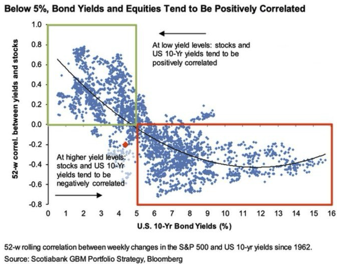
In such environments:
- Growth Is the Driver – With inflation quiet, the central bank isn’t fighting prices, so the big swings in markets come from changing expectations about growth. Good growth news lifts stocks and pushes yields up (bonds down). Bad growth news does the reverse.
- Bonds Become the Safe Haven – When a growth scare hits, traders run to government bonds for safety. Yields fall, bond prices rise, and that move cushions the stock drawdown. This is the behavior that built the reputation of the 60/40 portfolio.
High-Inflation, High-Yield Environments: Positive Correlation
When inflation runs hot, yields run high, and the picture inverts. Now the correlation between stocks and bonds typically turns positive:
- Inflation and Tight Monetary Policy – High yields usually signal that the central bank is tightening to curb inflation. Rising rates pressure both bond prices and equity valuations at the same time, so the two fall together.
- Competition for Capital – High bond yields make fixed income genuinely attractive next to stocks, which can pull money out of equities.
- For example, if traders can get a 6% yield in safer bonds and stocks are trading at a forward P/E of 20x (the inverse of that, 5%, is the current earnings yield), then bonds compete well with stocks.
- That said, the dominant force in a high-inflation environment is the shared inflation shock dragging both down, not the slow rotation between them.
When the Correlation Breaks: Inflation Shocks
The relationship between stocks and bonds is often assumed to provide reliable diversification, but the correlation is, of course, unstable.
Inflationary shocks, in particular, disrupt this dynamic.
Historical trends reveal that the correlation between these asset classes fluctuates considerably depending on the economic environment. In periods dominated by growth-driven dynamics, where growth volatility is the main driver of returns rather than inflation, stocks and bonds often show negative correlation.
During inflation-driven periods, this relationship flips to a positive correlation, gutting the diversification value of bonds.
The volatility in the correlation is the whole reason you can’t treat it as a fixed input.
Economic surprises, whether tied to inflation or growth, are what move the relationship, rather than the absolute levels of growth or inflation themselves.
As is the way markets work, it’s not how things are but how they turn out relative to discounted expectations.
What Actually Drives It: Surprises, Not Levels
The stock-bond correlation is shaped by unexpected shifts in growth or inflation. Not the level. The surprise.
This is the part traders get wrong most often. A 4% inflation rate that everyone already expects is largely priced in. It’s the move from an expected 2% to a realized 5% that repriced everything in 2022.
Markets discount the future, so what moves them is the gap between what was priced and what showed up (or what’s newly discounted).
During the 1990s and early 2000s, growth surprises had the dominant role in markets. That created a sustained run of negative correlation between stocks and bonds, as equities thrived on optimism while bonds provided a hedge against downturns.
And so it raised a new generation of traders and investors who relied on a relationship that isn’t actually reliable.
By contrast, periods of strong inflationary pressure, such as the post-World War II era, produced a positive stock-bond correlation. In those inflation-driven times, both stocks and bonds often struggled at once and lost their value as counterbalancing assets.
This pattern of alternating drivers is the reason you have to understand the macroeconomic forces at play when constructing a portfolio. The same two assets behave like a hedge in one regime and like the same bet in another.
The Shift Toward Coordinated Fiscal and Monetary Policy
The policy backdrop has changed in recent years, moving toward coordinated fiscal and monetary interventions. Governments spend, central banks finance, and the two increasingly move in the same direction at the same time.
This raises the probability that inflation, rather than growth, becomes the dominant driver of stock-bond dynamics. And an inflation-dominant regime, as we’ve covered, is the environment where bonds stop hedging.
Under these conditions, low bond yields and tighter liquidity create extra problems for diversification. The traditional framework of leaning on bonds to offset equity risk becomes less effective, which forces traders and investors to rethink their strategies and what kind of allocation approach actually fits the environment they’re in.
Debt Monetization Dynamics
There’s a deeper point underneath this. When there’s a big debt problem that becomes too painful, policymakers eventually print money to make it easier for debtors to pay, which devalues the money relative to other assets.
That tendency tilts the long-run risk toward inflation outcomes, which tilts the long-run risk toward positive stock-bond correlation.
A Walk Through the Decades
Let’s walk the timeline. The correlation tracked which force, inflation or growth, was running the show.
1940s to 1980s: The Inflation Era
For most of this stretch, a positive stock-bond correlation prevailed because inflation surprises kept showing up.
The post-war period, then the two oil shocks of the 1970s, produced inflation that came in waves, and both stocks and bonds did poorly in real terms.
This was the era of stagflation, the combination of economic stagnation and inflation that wasn’t supposed to be able to happen because it was so different from history.
Stocks went nowhere in real terms for years. Bonds got destroyed as yields climbed, with the US 10-year reaching nearly 16% in 1981.
The assets that worked were the ones nobody talks about in a 60/40 pitch: gold, commodities, and other inflation hedges. It paid to be a borrower-debtor, because the inflation chewed through the real value of debt.
The dynamic started to settle in the early 1980s, once Paul Volcker pushed rates high enough to break the inflation psychology. That set the stage for what came next.
1990s to 2010s: The Growth Era
With inflation tamed, growth surprises took over as the main driver. That produced a long, comfortable period of negative stock-bond correlation, and it ran for the better part of three decades.
In this era, every equity scare came with a bond rally. The dot-com bust, 2008, the 2011 debt-ceiling episode, the 2018 fourth-quarter drawdown: in each case, stocks fell and Treasuries rose.
Bonds did exactly what the textbook said. Diversification was nearly free, and risk-adjusted returns for a balanced portfolio were excellent.
This is also where the trouble started, mentally. Three decades is long enough that most working investors have never managed money in any other regime.
They learned one relationship and assumed it almost was like a law of nature. Rather, it was a feature of a low-inflation world.
2020s: Inflation Comes Back
Then the regime turned. Massive fiscal and monetary stimulus during COVID, tangled supply chains, and an energy shock pushed US inflation to roughly 9% by the middle of 2022, the highest in four decades.
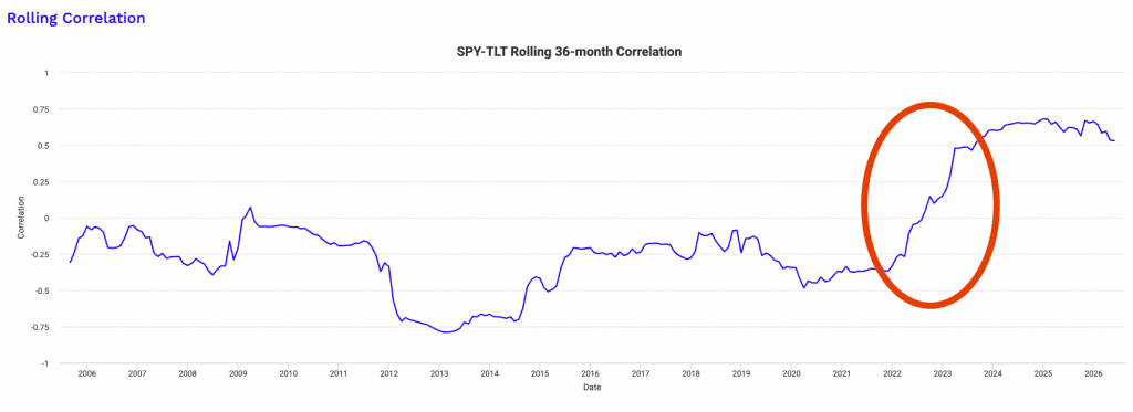
The correlation flipped positive, and it did so fast. The Federal Reserve hiked from near zero to the mid-4% range by the end of 2022 and past 5% in 2023.
Bonds and stocks fell together, hard, and the diversification that an entire generation took for granted simply wasn’t there. For many managers, 2022 was the worst year since 2008 and for diversified managers, it may have been their worst year.
The 2022 Stress Test: When 60/40 Broke
2022 deserves its own section because it’s the cleanest modern example of bonds failing as a hedge, and because so many portfolios were built on the assumption that this couldn’t happen.
What Happened to the 60/40
On a total-return basis, the S&P 500 fell roughly 18% in 2022. The broad US bond market fell around 13%.
The longest-dated Treasuries, the ones traders and investors hold specifically because they move the most when rates fall, lost somewhere between a quarter and a third of their value as rates went the other way.
Put those together and a standard 60/40 portfolio lost around 16%, one of its worst calendar years in roughly a century.
The bonds didn’t cushion the stocks, but added to the loss. And it wasn’t bad luck. It was an inflation-driven environment doing exactly what an inflation-driven regime does to a portfolio that depends on stocks and bonds being negatively correlated.
What Happened to Risk Parity
The same logic hit risk parity strategies, the approach that balances risk contributions across asset classes rather than dollars, often holding a large, sometimes borrowed, position in bonds.
The whole design rests on having uncorrelated return streams, and bonds doing well when stocks do badly is, I wouldn’t say a core assumption, but it’s treated as a separate beta.
When that assumption broke in 2022, many of these strategies had a rough year, because the bond portion that’s supposed to be the ballast fell alongside everything else.
This isn’t a knock on the idea of diversifying across environments. It’s a reminder of what the idea actually requires: assets that respond differently to growth and to inflation.
A pile of stocks and a pile of bonds gives different ways to bet on growth and almost no protection against an inflation shock.
The takeaway for a trader is concrete. If your portfolio’s risk reduction depends on a negative stock-bond correlation, you need to be prepared.
Factors That Drive the Relationship
To sum up the forces moving the stock-bond correlation:
1) Inflation Expectations
Rising inflation erodes the real returns on bonds, so bond prices fall and yields rise.
Inflation also raises costs for companies, which can weigh on stock performance.
Stocks are a nominal asset, so over long horizons they can pass through some of those price increases. Over short horizons, when inflation surprises to the upside and the central bank reacts, they usually can’t pass it through fast enough.
So rising inflation tends to be bad for bonds and neutral-to-bad for stocks. Both hurt. That’s your positive correlation.
2) Growth Expectations
Rising growth tends to be good for stocks but not great for bonds, because of their fixed-rate returns.
(Corporate credit tends to do well here, because it’s largely in the same bucket as stocks. Tighter credit spreads in a growing economy offset some of the hit from higher base rates.)
Falling growth flips it: stocks struggle, and government bonds rally as money seeks safety and the central bank cuts. That’s your negative correlation.
3) Central Bank Policy
When central banks cut interest rates, bond yields fall and equities often benefit from the added liquidity.
When they hike, they can dampen stock performance while pushing bond yields up (and bond prices down).
The wrinkle is the reason for the move. A central bank cutting because growth is collapsing is a different signal than a central bank cutting because inflation finally came down. The first comes with falling stocks, the second with rising ones. Watch why they’re moving, not just that they’re moving.
4) Economic Cycles
During expansions, both stocks and bonds can grind higher over time, which can show up as a mild positive correlation in total returns even while the high-frequency relationship stays negative.
In recessions, investors seek safety in bonds, which produces a clean negative correlation with stocks, at least when inflation is under control.
5) Liquidity and Positioning
There’s a fifth factor that only shows up under stress, and it overrides the others briefly. In a genuine liquidity event, everyone sells what they can, not what they want to. Liquidity, the ability to turn investments into cash, becomes the only thing anyone cares about.
When that happens, even safe assets get dumped for cash, and correlations across everything spike toward 1 for a few days. It doesn’t last, but it can do real damage while it does, and it’s worth knowing it exists.
Diversification and Portfolio Management Implications
Risk Reduction
A negative correlation between stocks and bonds improves diversification and lowers overall portfolio risk.
This is most valuable during market downturns, when equities are under pressure and you want something pulling the other way. The catch, again, is that the negative correlation is conditional on the regime. You get the benefit in growth-driven selloffs and lose it in inflation-driven ones.
Asset Allocation
In low-yield, low-inflation environments, a balanced portfolio can carry a higher equity weight, because bonds are doing their hedging job.
In high-yield, high-inflation environments, more bonds doesn’t necessarily buy you more safety, since the two assets are moving together. Here, tilting toward assets that respond differently to inflation tends to deliver better risk-adjusted returns than simply adding duration.
Dynamic Strategies
Investors should reassess the correlation regime periodically and adjust allocations as it shifts. This doesn’t mean trading it daily. It means knowing which environment you’re in and not assuming the last regime is the permanent one. The cost of that assumption was on full display in 2022.
Case Studies and Real-World Applications
History gives you the cleanest teaching cases. Each of these is the same mechanism showing up under different conditions.
The 1970s: Stagflation
The 1970s are the case study for positive correlation, and most people alive today never traded through it.
Inflation arrived in two waves, driven by two short-term debt cycles and two oil shocks: the 1973 OPEC embargo and the 1979 disruption around the Iranian revolution. Both stocks and bonds did badly.
Equities went nowhere in real terms across the decade, and bonds were a poor place to be as yields marched higher. Commodity producers boomed, gold ran, and the only real protection came from hard assets. If you’d held a 60/40 portfolio and expected the bonds to save you, they didn’t.
The 2008 Financial Crisis
During the 2008 financial crisis, the correlation between stocks and bonds turned sharply negative, and bonds did exactly what diversifiers are supposed to do:
- Deflationary Crisis – 2008 was like 1929: too much debt, too concentrated, producing a deflationary debt crisis. That’s the environment the safest government bonds are built for.
- Flight to Safety – As equities fell by more than half from peak to trough, investors poured into government bonds, driving yields down and bond prices up.
- Policy Response – Central banks slashed rates to near zero, which lifted bond prices further and eventually stabilized markets.
This is the mirror image of 2022. Same two assets, opposite outcome, because the driver was a growth-and-credit collapse rather than an inflation shock.
March 2020: The Dash for Cash
The COVID crash is a quick lesson in factor five. In the worst stretch of March 2020, Treasuries didn’t rally smoothly the way the deflation playbook says they should. For about a week, even US government bonds sold off, because investors needed cash and were selling whatever was liquid enough to sell.
Then the Fed stepped in with enormous liquidity support, and Treasuries snapped back to behaving like a safe haven. The lesson: in a true liquidity scramble, the normal correlations can break for a few days before policy responds. It’s rare, it’s brief, and it’s violent.
The 2013 Taper Tantrum
A smaller, purely rates-driven episode. In May 2013, the Fed signaled it would start tapering its bond purchases, and yields jumped, with the 10-year climbing from around 1.6% toward 3% by year-end. Stocks wobbled but recovered. There was no inflation spike and no growth collapse, just a repricing of policy expectations. A useful reminder that the bond market can move sharply on the expected path of central bank buying alone.
The Post-COVID Market and 2022
In the aftermath of the pandemic, the correlation shifted again:
- Stimulus Measures – Massive fiscal and monetary stimulus pushed both stock and bond prices higher at first, producing a positive correlation on the way up.
- Inflation Fears – Then rising inflation and rate hikes re-established a positive correlation on the way down, which is where 2022 came in.
It comes down to one question: are inflation surprises (which favor positive correlation) or growth surprises (which favor negative correlation) the dominant force right now?
Reading the Chart
Let’s look at this chart again.
The chart maps US 10-year bond yields against the 52-week rolling correlation of stock and bond movements. What comes through is the correlation isn’t fixed, and it shifts as the yield and inflation regime shifts.
Green Zone (Lower Yields)
The lower-yield region lines up with the low-inflation, growth-driven regime, where the rolling correlation tends to sit negative or near zero. This is the world where bonds hedge equities.
Red Zone (Higher Yields)
As yields climb into the higher region, the correlation tends to push positive, reflecting the inflationary pressure and tighter policy that drag both assets down together.
Curve Dynamics
The relationship is non-linear, which is why a single number like a 5% threshold is only a rough marker rather than a hard line. The transition points are where the relationship changes character.
The data also thins out at the highest yield levels, simply because markets haven’t spent much time there. Treat the far end of the chart with appropriate caution, since it’s drawn from fewer observations.
Are Bonds Still Effective Diversifiers in Modern Portfolios?
The Low-Yield Problem
When bond yields are very low, two things happen.
First, the income cushion is thin, so you’re paid little to hold them.
Second, and more important, there’s less room for yields to fall in a crisis, which limits how much price upside the bonds can deliver when you need the hedge to fire.
Bonds still provide stability and income, and in a clean growth-driven downturn they still rally. But they’re a weaker tool from a low starting yield than they were when you could buy them at 6%. Traders also have to factor in credit risk, especially anywhere outside the safest government issues.
The Case for Alternatives
In inflation-driven environments, the assets that actually diversify look different. To cushion against the regime where stocks and bonds fall together, investors can hold inflation-sensitive assets:
- Gold – A traditional store of value that tends to do well during currency devaluation and periods of negative real rates. Gold has no yield, which is its weakness in a high-real-rate world and its strength when real rates are low or falling.
- Commodities – Assets like oil and agricultural products often appreciate when inflation rises. There’s a chicken-and-egg quality to this, since commodities are frequently the source of the inflation in the first place.
- Inflation-Linked Bonds – Government securities that adjust for inflation, at least one measure of it (CPI), which gives you a more stable real income stream in the exact environment where nominal bonds suffer. See inflation-linked bonds for the mechanics.
These can help cushion a portfolio against the dual pressure of falling stock and bond prices during an inflation shock. Commodities in particular tend to be the cleanest hedge for the specific regime that breaks the 60/40.
Private assets might also pick up more traction as people look for return streams that don’t move with public markets.
But don’t fall for the obvious trap. It isn’t safe to assume private assets are good diversifiers or carry less risk just because there’s less price data on them. Smooth-looking returns aren’t the same as low risk. They’re often the same risk with the marks updated less often.
How to Use Correlation Data: Practical Steps for Traders & Investors
Watch the Real Yield
Start with the real bond yield, the nominal yield minus expected inflation. It’s the single most useful gauge of which regime you’re in.
When real yields are rising sharply, you’re usually in an environment where bonds and stocks can fall together. When real yields are falling because growth is weakening, bonds are more likely to do their hedging job.
Monitor Yield Levels
Pay attention to the direction of nominal bond yields, since they sit at the center of the stock-bond relationship. Look at rolling correlations rather than a single static number, so you can see the regime changing in close to real time rather than after the fact.
Use Rolling Correlations
Build the habit of tracking a rolling correlation between your equity and bond exposures, using a window long enough to be stable (52 weeks is common, though short-term traders might look at 60 days) and short enough to catch a trend shift.
The signal you’re watching for is the sign flipping from negative toward positive. That flip is the market telling you your bonds may have stopped hedging, which is the moment to revisit how much real protection your portfolio actually holds.
This is part of how CTAs manage a portfolio to take advantage of trends.
Adjust Allocations
When the correlation is positive, diversify into asset classes that don’t move with stocks: gold, commodities, inflation-linked bonds, CTAs, and other return streams driven by something other than growth.
When the correlation is negative, you can lean on bonds to reduce portfolio volatility, because in that regime they’re doing the work you’re holding them to do.
Conclusion
The stock-bond correlation isn’t a constant, and one of the biggest mistakes in portfolio construction is treating it like one.
Bonds hedge growth shocks. Alas, they do not hedge inflation shocks (and neither do TIPS due to their rate sensitivity). Whether stocks and bonds protect each other depends entirely on which of those two forces is moving the market, and that changes over time.
For most of the last forty years, low inflation kept the correlation negative and made the 60/40 look good in retrospect. 2022 was the reminder that the rule isn’t financial canon, and inflation as the major macro driver behind markets is the main reason it de-links.
Watch the real yield and the rolling correlation to monitor the relationship, and hold something that works when bonds don’t.