Do TIPS & Inflation-Linked Bonds Increase Risk-Adjusted Returns?


Inflation is a key worry for market participants, as both stocks and bonds are exposed.
It’s especially a worry for those holding nominal bonds.
For this reason, traders and investors can turn to instruments like Treasury Inflation-Protected Securities (TIPS) or other inflation-linked bonds to shield their portfolios.
With these, you get a stated return plus whatever the defined inflation rate is (CPI in the US).
However, does adding TIPS actually improve the overall risk-adjusted returns of a diversified portfolio?
Using historical backtesting data, we look at three distinct portfolios to determine the impact of substituting some amount of nominal Treasuries with inflation-linked bonds.
Key Takeaways – Do TIPS & Inflation-Linked Bonds Increase Risk-Adjusted Returns?
- Inflation is a major risk in most portfolios. It can hurt both stocks and especially nominal bondholders.
- TIPS offer a stated real yield plus inflation. As such, they’re a form of insurance against surging prices (they can lose value in an inflationary environment due to rising interest rates).
- Backtesting shows adding TIPS to a portfolio gave a tiny higher return (CAGR up 0.13%), but also slightly increased volatility and drawdown.
- Risk-adjusted returns (Sharpe, Sortino) were marginally better for portfolios with only nominal Treasuries versus those splitting with TIPS.
- During deflationary market shocks, nominal Treasuries gave superior downside protection. TIPS did not hedge equity risk as well as nominals with a more positive correlation with stocks.
- In the 1970s’ stagflation, TIPS would have dramatically outperformed; nominal bonds lost real value almost every year with high inflation.
- TIPS act as “inflation disaster insurance,” but may drag on efficiency in long periods of disinflation and low rate regimes.
- Both nominal bonds and inflation-linked bonds can play a part in having effective diversification and balance to various economic/market outcomes.
Portfolio Construction
To isolate the impact of TIPS, we compare a baseline diversified portfolio (Portfolio 1) against a variation that includes a dedicated allocation to TIPS (Portfolio 2).
We also include a more aggressive bond-less allocation (Portfolio 3) for context on risk limits.
These portfolios are also leveraged 2.5x with a 3% fixed funding rate ($1.50 borrowed for every $1 in cash invested).
This is done to better mirror what many institutions would do as the backbone of their beta exposure (rather than simply trading off the highest returning asset for lower returning assets to diversify).
Portfolio 1 (The Baseline)
This portfolio relies on nominal Treasuries for its fixed-income allocation.
| Asset Class | Allocation |
|---|---|
| US Stock Market | 45.00% |
| 10-year Treasury | 40.00% |
| Gold | 15.00% |
Portfolio 2 (TIPS Inclusion)
This portfolio splits the fixed-income allocation evenly between nominal Treasuries and TIPS to test the diversification benefit.
| Asset Class | Allocation |
|---|---|
| US Stock Market | 45.00% |
| TIPS | 20.00% |
| 10-year Treasury | 20.00% |
| Gold | 15.00% |
Portfolio 3 (Control; No Bonds)
| Asset Class | Allocation |
|---|---|
| US Stock Market | 70.00% |
| Gold | 30.00% |
Performance Summary
| Metric | Portfolio 1 | Portfolio 2 | Portfolio 3 |
|---|---|---|---|
| Start Balance | $10,000 | $10,000 | $10,000 |
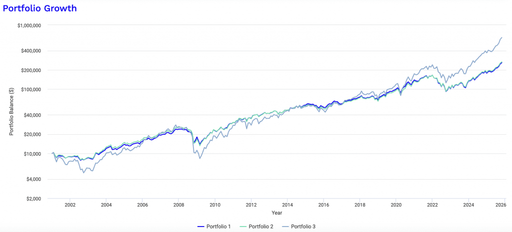
| End Balance | $259,392 | $266,763 | $638,781 |
| Annualized Return (CAGR) | 14.01% | 14.14% | 18.22% |
| Standard Deviation | 19.33% | 19.98% | 30.07% |
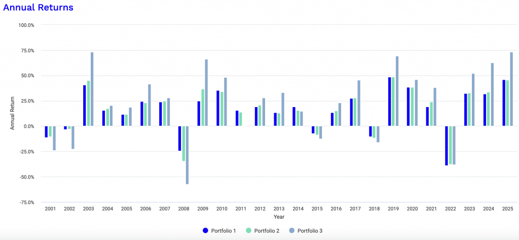
| Best Year | 48.41% | 48.37% | 73.35% |
| Worst Year | -38.77% | -37.66% | -57.45% |
| Maximum Drawdown | -44.60% | -48.37% | -70.09% |
| Sharpe Ratio | 0.69 | 0.68 | 0.66 |
| Sortino Ratio | 1.05 | 1.03 | 1.00 |
Performance Analysis
When analyzing the historical performance statistics, the inclusion of TIPS (Portfolio 2) resulted in marginally higher absolute returns but failed to improve risk-adjusted metrics compared to the baseline (Portfolio 1).
Return Profile
Portfolio 2 outperformed the baseline slightly in terms of raw growth.
- Portfolio 1 CAGR: 14.01%
- Portfolio 2 CAGR: 14.14%
- Portfolio 3 CAGR: 18.22%
The TIPS allocation squeezed out an additional 0.13% in annualized returns, but we can look at the “cost” of that (albeit, very small) return in terms of volatility and drawdowns.
Risk Profile
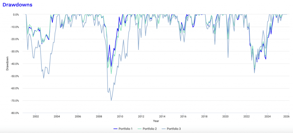
The data indicate that replacing half of the nominal Treasuries with TIPS increased the overall portfolio volatility and drawdown depth slightly.
- Standard Deviation – Portfolio 1 (19.33%) vs. Portfolio 2 (19.98%).
- Maximum Drawdown – Portfolio 1 (-44.60%) vs. Portfolio 2 (-48.37%).
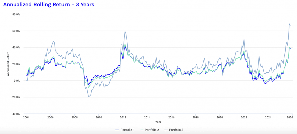
Interestingly, during the Subprime Crisis (Nov 2007 – Mar 2009), Portfolio 2 suffered a significantly deeper drawdown (-48.37%) compared to Portfolio 1 (-42.37%).
This suggests that during deep deflationary crashes, nominal Treasuries offer superior protection compared to TIPS.
Having some amount of standard nominal bonds can provide an offset during these periods.
Risk-Adjusted Ratios
The primary question is whether TIPS improve efficiency.
The Sharpe and Sortino ratios suggest they didn’t in this specific sample.
| Metric | Portfolio 1 (Baseline) | Portfolio 2 (With TIPS) | Difference |
| Sharpe Ratio | 0.69 | 0.68 | -0.01 |
| Sortino Ratio | 1.05 | 1.03 | -0.02 |
| Treynor Ratio | 13.24% | 12.46% | -0.78% |
From both the Sharpe and Sortino measures, the baseline portfolio was slightly more efficient at generating returns per unit of risk.
Risk and Return Metrics
| Metric | Portfolio 1 | Portfolio 2 | Portfolio 3 |
|---|---|---|---|
| Arithmetic Mean (monthly) | 1.26% | 1.28% | 1.79% |
| Arithmetic Mean (annualized) | 16.16% | 16.46% | 23.79% |
| Geometric Mean (monthly) | 1.10% | 1.11% | 1.40% |
| Geometric Mean (annualized) | 14.01% | 14.14% | 18.22% |
| Standard Deviation (monthly) | 5.58% | 5.77% | 8.68% |
| Standard Deviation (annualized) | 19.33% | 19.98% | 30.07% |
| Downside Deviation (monthly) | 3.59% | 3.76% | 5.63% |
| Maximum Drawdown | -44.60% | -48.37% | -70.09% |
| Benchmark Correlation | 0.81 | 0.85 | 0.91 |
| Beta(*) | 1.01 | 1.09 | 1.75 |
| Alpha (annualized) | 5.18% | 4.61% | 4.33% |
| R2 | 65.69% | 72.19% | 82.09% |
| Sharpe Ratio | 0.69 | 0.68 | 0.66 |
| Sortino Ratio | 1.05 | 1.03 | 1.00 |
| Treynor Ratio (%) | 13.24 | 12.46 | 11.30 |
| Calmar Ratio | 2.33 | 2.49 | 3.98 |
| Modigliani–Modigliani Measure | 12.49% | 12.34% | 12.00% |
| Active Return | 5.06% | 5.19% | 9.27% |
| Tracking Error | 11.33% | 10.63% | 17.27% |
| Information Ratio | 0.45 | 0.49 | 0.54 |
| Skewness | -0.57 | -0.72 | -0.62 |
| Excess Kurtosis | 1.74 | 2.71 | 2.13 |
| Historical Value-at-Risk (5%) | 8.45% | 8.59% | 12.81% |
| Analytical Value-at-Risk (5%) | 7.92% | 8.21% | 12.48% |
| Conditional Value-at-Risk (5%) | 12.06% | 12.59% | 18.51% |
| Upside Capture Ratio (%) | 113.67 | 120.44 | 199.11 |
| Downside Capture Ratio (%) | 91.84 | 99.17 | 160.75 |
| Safe Withdrawal Rate | 9.65% | 9.77% | 8.44% |
| Perpetual Withdrawal Rate | 10.39% | 10.49% | 13.69% |
| Positive Periods | 192 out of 298 (64.43%) | 188 out of 298 (63.09%) | 184 out of 298 (61.74%) |
| Gain/Loss Ratio | 0.99 | 1.04 | 1.06 |
| * US Stock Market is used as the benchmark for calculations. Value-at-risk metrics are monthly values. | |||
The Correlation Factor: Why Did TIPS Lag?
The “Monthly Correlations” table provides the answer to why Portfolio 1 had superior risk-adjusted returns.
Monthly Correlations
| Name | US Stock Market | 10-year Treasury | Gold | TIPS | Portfolio 1 | Portfolio 2 | Portfolio 3 |
|---|---|---|---|---|---|---|---|
| US Stock Market | 1.00 | -0.19 | 0.06 | 0.18 | 0.81 | 0.85 | 0.91 |
| 10-year Treasury | -0.19 | 1.00 | 0.29 | 0.71 | 0.32 | 0.23 | -0.05 |
| Gold | 0.06 | 0.29 | 1.00 | 0.42 | 0.49 | 0.48 | 0.47 |
| TIPS | 0.18 | 0.71 | 0.42 | 1.00 | 0.56 | 0.56 | 0.33 |
- 10-year Treasury Correlation to Stocks = -0.19
- TIPS Correlation to Stocks = 0.18
Diversification relies on combining assets that move independently or inversely to one another.
In this dataset, nominal 10-year Treasuries had a negative correlation to the stock market, meaning they often rose when stocks fell (a “flight to safety” effect).
TIPS, conversely, showed a positive correlation (0.18) to the stock market.
Because TIPS are less effective at counteracting equity volatility than nominal bonds, Portfolio 2 experienced higher volatility without a proportional increase in return, leading to a lower Sharpe ratio.
Is 25 Years Enough? The Sample Size Dilemma
When analyzing a 25-year backtest (roughly 2001 through 2025), investors might assume the sample size is definitive.
This kind of sample size should be statistically significant for measuring modern correlations and approximating realistic returns and volatilities.
At the same time, this specific period presents a “regime bias” when evaluating inflation-linked assets like TIPS.
Even with decades of data, if the environment changes relative to what it’s been, then the data won’t be valid.
For example, over this same period, gold has outperformed stocks.
But, of course, that doesn’t mean that gold has a theoretically higher return than stocks or that it’s advisable to optimize the portfolio based on how things have done in the past.
A History of Disinflation
The primary issue with this sample is that it captures a period defined largely by disinflation (a slowing rate of inflation) and falling interest rates.
From 2000 to 2020, the Federal Reserve spent more time fighting deflationary pressures (the 2008 GFC, the Eurozone crisis, and the 2020 COVID shock) than fighting inflation.
During deflationary crashes (like 2008), nominal Treasuries generally act as the ultimate “flight to safety” and rally aggressively if they have sufficient duration (and there’s enough yield to bite down on).
TIPS, however, suffer because the market prices in lower future inflation.
Because this 25-year dataset is dominated by these deflationary shocks, nominal Treasuries appear superior simply because the specific “disaster” TIPS are designed to hedge against (sustained inflation) was largely absent until 2022.
At this point, the stock-bond correlation also changed.
The “Insurance” Paradox
Evaluating TIPS based on this period can be kind of like evaluating flood insurance during a 20-year drought.
The lower base yields compared to nominals appear inefficient because the payout event (high inflation) never really occurred.
In Portfolio 2, TIPS increased volatility and reduced the Sharpe ratio because they are positively correlated with stocks (0.18 correlation).
In a low-inflation growth environment, TIPS often act like “expensive equities,” whereas nominal Treasuries (with their -0.19 correlation) acted as a true diversifier.
Is this sample large enough?
Mathematically, yes, for approximating many things (e.g., volatility, drawdowns). But historically, no.
It accurately reflects how markets behave in a “Great Moderation” monetary regime, but it goes through a period that doesn’t capture the 1970s-style stagflation where stocks and nominal bonds fall together. (2022 was a shorter exception.)
In that specific scenario (which is the theoretical argument for holding TIPS) nominal Treasuries would likely fail, and the relative performance of Portfolio 2 would likely invert and outperform the baseline.
If TIPS Had Existed in the 1970s (or a Strong Stagflationary Period)…
TIPS are a relatively new instrument (1997), which is why we can’t look at them over very long time horizons.
But we can estimate how they would have done in periods that are of the most interest to us, especially their relative performance compared to nominal-rate bonds.
During the 1970s, the real return (after inflation) of holding 10-year US Treasuries was negative or close to zero due to sustained, unexpected spikes in inflation.
Let’s look at standard Treasuries measured over the 1972-1980 period:
Performance Summary
| Metric | 10-year Treasury |
|---|---|
| Start Balance | $10,000 |
| End Balance | $13,422 |
| Annualized Return (CAGR) | 3.32% |
| Standard Deviation | 7.87% |
| Best Year | 15.29% |
| Worst Year | -1.29% |
| Maximum Drawdown | -15.76% |
| Sharpe Ratio | -0.45 |
| Sortino Ratio | -0.57 |
These returns are nominal.
If we compare to inflation:
Annual Returns
| Year | Inflation | 10-year Treasury Return | 10-year Treasury Balance | 10-year Treasury |
|---|---|---|---|---|
| 1980 | 12.52% | -1.29% | $13,422 | -1.29% |
| 1979 | 13.29% | 1.83% | $13,598 | 1.83% |
| 1978 | 9.02% | -0.74% | $13,353 | -0.74% |
| 1977 | 6.70% | 0.53% | $13,453 | 0.53% |
| 1976 | 4.86% | 15.29% | $13,382 | 15.29% |
| 1975 | 6.94% | 5.52% | $11,607 | 5.52% |
| 1974 | 12.34% | 4.05% | $10,999 | 4.05% |
| 1973 | 8.71% | 3.29% | $10,572 | 3.29% |
| 1972 | 3.41% | 2.35% | $10,235 | 2.35% |
We can see that in all these years, except for 1976, the 10-year Treasury underperformed the inflation rate.
In contrast, TIPS would have better preserved purchasing power and delivered a positive real yield, comparable to their stated yield above inflation, whereas traditional Treasury bondholders lost real value.
So, we can construct a “Synthetic TIPS” return to demonstrate how they likely would have performed compared to the nominal Treasuries.
To do this, we model TIPS behavior using their core mechanic: CPI (Inflation) + A Fixed Real Yield.
- Nominal Return – Known directly
- Real Return (The “Hidden” Loss) = Nominal return minus inflation
- Synthetic TIPS Return = Inflation + 2.0% (Historical average real yield coupon)
The 1970s Stagflation Stress Test (1972–1980)
Here is the year-by-year breakdown.
Note the massive disparity in the years with double-digit inflation.
| Year | Inflation (CPI) | Nominal 10y Treasury Return | Real Return (Nominal) | Synthetic TIPS Return (CPI + 2%) |
| 1980 | 12.52% | -1.29% | -13.81% | 14.52% |
| 1979 | 13.29% | 1.83% | -11.46% | 15.29% |
| 1978 | 9.02% | -0.74% | -9.76% | 11.02% |
| 1977 | 6.70% | 0.53% | -6.17% | 8.70% |
| 1976 | 4.86% | 15.29% | +10.43% | 6.86% |
| 1975 | 6.94% | 5.52% | -1.42% | 8.94% |
| 1974 | 12.34% | 4.05% | -8.29% | 14.34% |
| 1973 | 8.71% | 3.29% | -5.42% | 10.71% |
| 1972 | 3.41% | 2.35% | -1.06% | 5.41% |
Some Findings
The “Safe” Asset Was Dangerous
In the previous 2001–2025 dataset, nominal Treasuries were a great hedge taking the period collectively.
In the 1970s, they were a disaster.
In 1980, nominal bondholders lost 1.29% on paper, but in terms of purchasing power (real return), they lost 13.81% in a single year.
The Inversion of Correlations
Notice 1978, 1979, and 1980. Inflation was high and clearly embedded.
- Nominal Treasuries – Prices crashed (yields rose to compensate for inflation), resulting in negative returns.
- Stocks (S&P 500) – Generally struggled during this period (stagflation).
- TIPS (Synthetic) – Would have returned double digits (11% to 15%).
Conclusion on Sample Size
This data shows why the 25-year sample (2001–2025) is “regime biased.”
If you run a portfolio backtest including this 1972-1980 period, Portfolio 2 (with TIPS) would vastly outperform Portfolio 1 (nominal only).
- Portfolio 1 would have suffered a “lost decade” where the bond portion of the portfolio dragged down returns every time inflation spiked.
- Portfolio 2 would have seen the TIPS portion do better exactly when inflation was higher and putting traditional portfolios under stress.
Summary
Nominal Treasuries protect against deflation (2008, 2020).
TIPS protect against inflation (1970s, 2022) – at least in relative terms. They’re still sensitive to changes in interest rates and price falls due to duration risk
A diversified portfolio will need assets that can do well in both rising and falling inflation environments as well as rising and falling growth environments, as you can’t know for sure which regime will dominate the following years and the exact nature of it.
Both nominal and inflation-linked bonds can be a piece of that puzzle when thinking of how to balance yourself to various outcomes.
Conclusion
Based on this backtest, introducing a 20% allocation to TIPS (funded by reducing nominal Treasuries) did not improve risk-adjusted returns.
However, the sample size is largely biased due to a mostly disinflationary regime.
While TIPS provided a nominal return boost (raising CAGR from 14.01% to 14.14%), the portfolio had more volatility and a bit larger drawdowns overall.
The negative correlation of nominal Treasury bonds were a more valuable hedge against equity risk over this sample size than the inflation protection offered by TIPS during the measured period.
Those specifically fearing distinct inflationary regimes – or want more theoretical diversification – might still accept the slightly lower efficiency of TIPS for insurance purposes.
Appendix
Historical Market Stress Periods
| Stress Period | Start | End | Portfolio 1 | Portfolio 2 | Portfolio 3 |
|---|---|---|---|---|---|
| Subprime Crisis | Nov 2007 | Mar 2009 | -42.37% | -48.37% | -70.09% |
| COVID-19 Start | Jan 2020 | Mar 2020 | -16.68% | -20.16% | -35.18% |
Drawdowns for Portfolio 1
| Rank | Start | End | Length | Recovery By | Recovery Time | Underwater Period | Drawdown |
|---|---|---|---|---|---|---|---|
| 1 | Jan 2022 | Sep 2022 | 9 months | Jul 2024 | 1 year 10 months | 2 years 7 months | -44.60% |
| 2 | Mar 2008 | Feb 2009 | 1 year | Mar 2010 | 1 year 1 month | 2 years 1 month | -42.37% |
| 3 | Feb 2001 | Jul 2002 | 1 year 6 months | Sep 2003 | 1 year 2 months | 2 years 8 months | -24.05% |
| 4 | Feb 2020 | Mar 2020 | 2 months | May 2020 | 2 months | 4 months | -16.68% |
| 5 | Feb 2018 | Dec 2018 | 11 months | Mar 2019 | 3 months | 1 year 2 months | -14.39% |
| 6 | Mar 2015 | Sep 2015 | 7 months | Jun 2016 | 9 months | 1 year 4 months | -13.69% |
| 7 | May 2013 | Jun 2013 | 2 months | Oct 2013 | 4 months | 6 months | -11.20% |
| 8 | Apr 2004 | Jul 2004 | 4 months | Nov 2004 | 4 months | 8 months | -10.95% |
| 9 | Aug 2016 | Nov 2016 | 4 months | Apr 2017 | 5 months | 9 months | -10.45% |
| 10 | Sep 2011 | Sep 2011 | 1 month | Nov 2011 | 2 months | 3 months | -10.08% |
| Worst 10 drawdowns included above | |||||||
Drawdowns for Portfolio 2
| Rank | Start | End | Length | Recovery By | Recovery Time | Underwater Period | Drawdown |
|---|---|---|---|---|---|---|---|
| 1 | Nov 2007 | Feb 2009 | 1 year 4 months | Apr 2010 | 1 year 2 months | 2 years 6 months | -48.37% |
| 2 | Jan 2022 | Sep 2022 | 9 months | Jul 2024 | 1 year 10 months | 2 years 7 months | -43.91% |
| 3 | Feb 2001 | Jul 2002 | 1 year 6 months | Aug 2003 | 1 year 1 month | 2 years 7 months | -23.46% |
| 4 | Feb 2020 | Mar 2020 | 2 months | Jun 2020 | 3 months | 5 months | -20.16% |
| 5 | Feb 2018 | Dec 2018 | 11 months | Apr 2019 | 4 months | 1 year 3 months | -16.03% |
| 6 | Mar 2015 | Sep 2015 | 7 months | Jun 2016 | 9 months | 1 year 4 months | -15.18% |
| 7 | May 2013 | Jun 2013 | 2 months | Oct 2013 | 4 months | 6 months | -11.75% |
| 8 | Sep 2011 | Sep 2011 | 1 month | Oct 2011 | 1 month | 2 months | -11.64% |
| 9 | Apr 2004 | Apr 2004 | 1 month | Nov 2004 | 7 months | 8 months | -10.72% |
| 10 | Sep 2020 | Oct 2020 | 2 months | Nov 2020 | 1 month | 3 months | -9.79% |
| Worst 10 drawdowns included above | |||||||
Drawdowns for Portfolio 3
| Rank | Start | End | Length | Recovery By | Recovery Time | Underwater Period | Drawdown |
|---|---|---|---|---|---|---|---|
| 1 | Nov 2007 | Feb 2009 | 1 year 4 months | Feb 2011 | 2 years | 3 years 4 months | -70.09% |
| 2 | Feb 2001 | Sep 2002 | 1 year 8 months | Feb 2004 | 1 year 5 months | 3 years 1 month | -51.98% |
| 3 | Jan 2022 | Sep 2022 | 9 months | Feb 2024 | 1 year 5 months | 2 years 2 months | -47.66% |
| 4 | Feb 2020 | Mar 2020 | 2 months | Jul 2020 | 4 months | 6 months | -35.18% |
| 5 | May 2011 | Sep 2011 | 5 months | Mar 2012 | 6 months | 11 months | -28.80% |
| 6 | Feb 2018 | Dec 2018 | 11 months | Jun 2019 | 6 months | 1 year 5 months | -24.53% |
| 7 | Mar 2015 | Jan 2016 | 11 months | Jun 2016 | 5 months | 1 year 4 months | -22.63% |
| 8 | Apr 2012 | May 2012 | 2 months | Sep 2012 | 4 months | 6 months | -17.42% |
| 9 | Sep 2020 | Oct 2020 | 2 months | Dec 2020 | 2 months | 4 months | -13.78% |
| 10 | Apr 2004 | Jul 2004 | 4 months | Nov 2004 | 4 months | 8 months | -11.79% |
| Worst 10 drawdowns included above | |||||||
Portfolio Assets
| Name | CAGR | Stdev | Best Year | Worst Year | Max Drawdown | Sharpe Ratio | Sortino Ratio |
|---|---|---|---|---|---|---|---|
| US Stock Market | 8.95% | 15.56% | 33.35% | -37.04% | -50.89% | 0.52 | 0.75 |
| 10-year Treasury | 3.55% | 7.43% | 20.53% | -15.19% | -23.18% | 0.27 | 0.42 |
| Gold | 11.00% | 16.28% | 52.03% | -28.33% | -42.91% | 0.62 | 1.04 |
| TIPS | 4.36% | 5.82% | 16.61% | -12.02% | -13.54% | 0.46 | 0.67 |
Portfolio Return Decomposition
| Name | Portfolio 1 | Portfolio 2 | Portfolio 3 |
|---|---|---|---|
| US Stock Market | $215,329 | $212,538 | $453,481 |
| 10-year Treasury | $24,100 | $12,249 | |
| Gold | $77,223 | $78,272 | $265,515 |
| TIPS | $20,798 | ||
| Return attribution decomposes portfolio gains into its constituent parts and identifies the contribution to returns by each of the assets. | |||
Portfolio Risk Decomposition
| Name | Portfolio 1 | Portfolio 2 | Portfolio 3 |
|---|---|---|---|
| US Stock Market | 72.47% | 73.27% | 81.07% |
| 10-year Treasury | 12.21% | 4.16% | |
| Gold | 15.31% | 14.52% | 18.93% |
| TIPS | 8.06% | ||
| Risk attribution decomposes portfolio risk into its constituent parts and identifies the contribution to overall volatility by each of the assets. | |||