Lorenz Curve & Gini Coefficient


What Is a Lorenz Curve?
A Lorenz curve is a graphical representation of the distribution of wealth or income.
It is a plot of the cumulative percentages of the population against the cumulative percentages of wealth or income held. The name comes from American economist Max O. Lorenz, who developed the concept in 1905.
The horizontal axis shows the percentage of the population and the vertical axis shows the percentage of wealth or income.
The diagonal line represents perfect equality, where each person has an equal share of the wealth or income. Points above this line represent states of inequality and points below it represent states of equality.
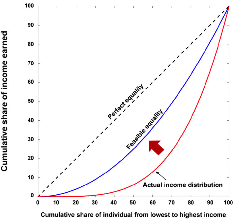
The further away a point is from the diagonal line, the greater the level of inequality.
Gini Coefficient
The Gini coefficient is a measure of inequality that can be derived from a Lorenz curve. It is usually expressed as a percentage and ranges from 0 to 100.
A low Gini coefficient indicates a more equal distribution of wealth or income, while a high Gini coefficient indicates a less equal distribution.
The Gini coefficient can be calculated using the following formula:
Gini = A/(A+B)
where:
- A = area between the line of equality and the Lorenz curve
- B = area below the line of equality
For example, if the Gini coefficient is 30%, this means that 30% of the wealth is held by 70% of the population. In other words, there is a 30:70 ratio of wealth between the richest and poorest 70% of the population.
The Gini coefficient is a useful tool for comparing the level of inequality in different countries or over time.
However, it should be used with caution as it does not take into account factors such as the distribution of wealth within a country or how well off the poorest people are.
The Lorenz Curve and Wealth Inequality
The Lorenz curve is commonly used to measure wealth inequality. It shows how wealth is distributed across the population and can be used to calculate the Gini coefficient.
Wealth inequality has been on the rise in recent years largely due to low interest rates helping increase asset values, with the top 1% of the population owning more than half of the world’s wealth.
Even with the world as a whole seeing rising living standards, wealth inequality can create greater populism and social conflict. This feeds into political movements, as well as what kind of policy may be adopted.
There are a number of factors that contribute to wealth inequality, such as globalization, technological change, and tax policy.
Globalization has led to increased competition and upped the ante for skills required to prosper in developed countries, while technological change has made it easier for businesses to automate jobs.
Tax policy has also played a role, with lower taxes on capital gains and inheritances helping businesses keep more of their profits.
The Lorenz curve can be used to measure wealth inequality and track changes over time. It is a useful tool for policymakers and economists to identify areas of concern and potential solutions.
Measuring income inequality: The Lorenz curve and Gini coefficient
Conclusion – Lorenz Curve
The Lorenz curve is a graphical representation of the distribution of wealth or income. It is a plot of the cumulative percentages of the population against the cumulative percentages of wealth or income held. The name comes from American economist Max O. Lorenz, who developed the concept in 1905.
The horizontal axis shows the percentage of the population and the vertical axis shows the percentage of wealth or income. The diagonal line represents perfect equality, where each person has an equal share of the wealth or income. Points above this line represent states of inequality and points below it represent states of equality.
The further away a point is from the diagonal line, the greater the level of inequality. The Gini coefficient is a measure of inequality that can be derived from a Lorenz curve.
The Lorenz curve is a useful tool for measuring inequality, as averages may not tell the story of how a population as a whole is doing. It is a valuable tool for policymakers and economists to determine a country’s relative level of inequality.