Ichimoku Cloud


The Ichimoku cloud involves five different indicators and is designed to give insight into the trend of the market.
Top Ichimoku Cloud Analysis Brokers
-
1
 Interactive Brokers
 -
2
 NinjaTrader
 -
3
 eToro USAeToro USA LLC and eToro USA Securities Inc.; Investing involves risk, including loss of principal; Not a recommendation
 -
4
 Plus500USTrading in futures and options involves the risk of loss and is not suitable for everyone.
The Ichimoku cloud may at first seem intimidating and make the chart look closer to a piece of abstract art, but is relatively straightforward once acquainted with its interpretation.
It is made up of the following:
- A lagging span, translated into Japanese as the Chikou Span (teal line in chart below)
- A conversion line, translated as the Tenkan Line (red line)
- A base line, translated as the Kijun Line (white line)
And two lines that make up the Ichimoku cloud, the colored space existing between them:
- Leading Span A, or Senkou Span A (yellow line)
- Leading Span B, or Senkou Span B (royal blue line)
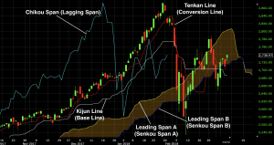
We’ll go through each of these lines one by one:
Lagging Span / Chikou Span
The lagging span line represents the price from 26 days (or periods) ago. In other words, if you take price and shift it back 26 days (in the case of using the daily chart), that represents exactly what this line is.
When the trend over the past 26 days is decidedly up, this generally has the effect of making this line the highest up on the chart due to the fact that it’s been shifted back. This is indicative of a bullish trend.
If the trend has been distinctly down over the past 26 days, then this will generally make it the lowest line on the chart. This denotes a bearish trend.
If the lagging span crosses over the conversion/tenkan line (red line in above images), in particular, to become the highest line on the chart, this is interpreted as an especially bullish signal. If it crosses over the conversion line to become the lowest line on the chart, this is a bearish signal.
More generally, any time the lagging span crosses up over a line, this is interpreted as bullish. Any time the lagging span crosses down over a line, this is interpreted as bearish.
Conversion Line / Tenkan Line
The conversion line is calculated as:
(9-day high + 9-day low) / 2
In a strongly uptrending market, the conversion will generally be the second-highest line, below the lagging span.
The cross of the conversion line above the base line / kijun line is interpreted as a mildly bullish signal. Conversely, a cross of the conversion below the base line is interpreted as a mildly bearish signal.
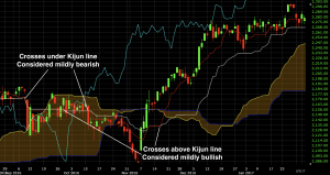
Why? Because the conversion line is based more heavily on recent price activity relative to the base line. Namely, it relies on 9 days of price data versus 26 days of price data. An uptrend calculated from an average of more recent data is inherently stronger than an uptrend calculated from an average of less recent data. What happened in the very recent past is statistically more likely to be more relevant to the present and future than something further in the past.
Base Line / Kijun Line
The base line is calculated as:
(26-day high + 26-day low) / 2
In trending markets one way or the other, the base line will be the middle line.
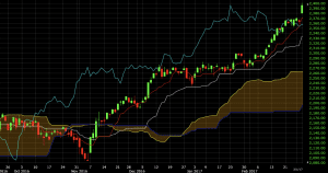
In uptrending markets, the lagging span will be above the conversion line, which will be above the base line, which will be above the Ichimoku cloud (both leading span A and leading span B).
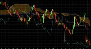
During downtrending markets, the Ichimoku cloud will be above the base line, which will be above the conversion line, which will be above the lagging span.
In terms of more minor signals, a move of the base line above the conversion line or lagging span is considered bearish. A move of the base line above the Ichimoku cloud is considered bullish.
Leading Span A / Senkou Span A
Leading Span A is calculated as:
(Conversion Line + Base Line) / 2
In uptrending markets, leading span A will be above leading span B (yellow line above blue line), as shown below. It will also generally lag the lagging span, conversion line, and base line.
It will, however, be higher than leading span B, which is an average of the 52-day high and 52-day low.
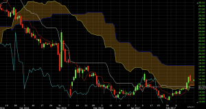
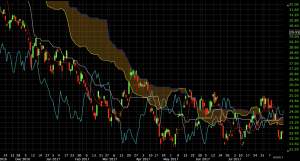
The leading span A will only be the highest or lowest line on the chart in markets that are consolidating or in the midst of transitioning. This was the case on the chart of Valeant (VRX) in the middle part of 2017.
In clear downtrending markets – such as the one below – it will generally be the second-highest line on the chart, just below leading span B. (This is a chart of Valeant (VRX) from late 2016 to early 2017.)
Leading Span B / Senkou Span B
Leading span B is calculated as:
(52-day high + 52-day low) / 2
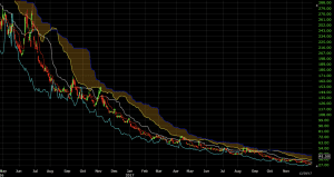
When leading span B is the highest line on the chart it is generally indicative of a robust downtrend. This is due to the fact that leading span B accumulates so much prior data.
If we are in a downtrend, there are going to be values at the very beginning of this 52-day range that are high, giving leading span B a higher value overall. For the other Ichimoku-related indicators that rely on 9-day and 26-day calculations, these high values will have already washed out of the data, leaving them with lower values.
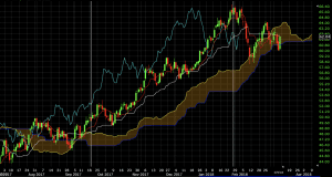
We can see this on a price chart of VXX, for example, which was in a clear downtrend when developed market equity markets had very low volatility until the early portion of 2018. Leading span B (blue line) was the highest on the chart over 98% of the time.
When leading span B is lowest, on the other hand, that generally means we’re in a strong uptrend. Values at the beginning of the 52-day range were low relative to the 26-day and 9-day, giving leading span B a low overall reading.
We can observe this during Nvidia’s (NVDA) run up in price from mid-June 2017 into 2018. The blue line is lowest on the chart throughout the entirety of this move:
Role of the Ichimoku Cloud
The Ichimoku Cloud is often interpreted as an area of support and resistance in the market.
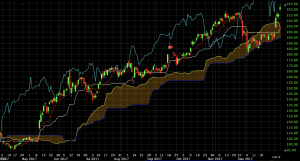
On a daily chart of the S&P 500, we see three instances over the course of an uptrend where price fell to the cloud and acted as support.

In other cases, the cloud can act as an area of resistance, as seen in the case of the chart of the following exchange-traded fund of cocoa. Price was in a steep downtrend, and a short trade opportunity could have been explored upon a touch of the cloud, taken in the direction of the ongoing trend.
Trading Examples of the Ichimoku Cloud
Example #1: WTI Crude Oil
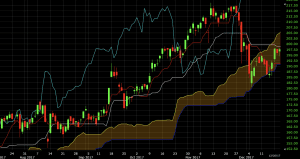
For trade signals based on the indicator itself, we could go with the standard approach of having all five align. This signals maximally bullish or maximally bearish trends.
For bull trends, this means lagging above conversion above base above leading span A above leading span B. For bear trends, the opposite order would hold true.
In the case of crude oil, we saw all five line up in September 2017 when WTI was priced in the high-$40s. The beginning of the long trade is signaled by the first white vertical line. The exit is signaled by the second white vertical line.
For an exit signal, we could take a crossover of any one of these lines. Since all five are in perfect alignment to signal a bullish trend, any crossover would be considered bearish.
But the lagging span (teal line) crossing over the conversion line (red line) would be considered a fairly weak bearish signal. It would be up to the discretion of the trader if a long trade would be exited if that occurred. There is of course no perfectly right or wrong answer in this case.
A bearish crossover of the lagging span over the base line would be considered a more reliable bearish signal. Accordingly, this is where this particular trade could have been reasonably exited.
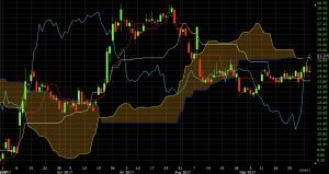
Example #2: 20+ Year US Treasuries (via the ETF TLT)
Same set-up with crude oil above, but flipped. In this case, a bearish trade is created from all five indicators aligning in textbook bearish fashion. The first vertical white line indicates the sell/short entry while the second vertical white line denotes the exit.
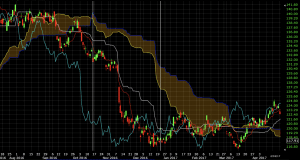
A move up in price toward the end of December 2017 caused a weak bullish signal in the form of the lagging span moving above the conversion line. But this exit wasn’t taken. Instead, like the previous trade in the first example above, the trade was exited once the lagging span closed above the base line.
Conclusion
The Ichimoku cloud is a group of five separate indicators collectively used as (primarily) a trend following indicator. But it can also be used to find reversal points in the market by taking trades upon a touch of the cloud in the direction of the overall trend.
The most bullish configuration of the five indicators goes, from high to low in terms of positioning on the chart:
- Lagging span (chikou span)
- Conversion line (tenkan line)
- Base line (kijun line)
- Leading span A (senkou span A)
- Leading span B (senkou span B)
The most bearish configuration would be the opposite, from high to low:
- Leading span B (senkou span B)
- Leading span A (senkou span A)
- Base line (kijun line)
- Conversion line (tenkan line)
- Lagging span (chikou span)
Mildly bullish signs can be extracted when they do occur, such as the conversion line crossing above the base line, or leading span A crossing above leading span B. But they are weak trade signals.
The Ichimoku cloud can yield information about the trend or potential areas of reversal that can’t be yielded from price alone. But it should not be used on its own. It is often used in conjunction with other momentum-related indicators, such as the Relative Strength Index (RSI), to confirm readings and improve the accuracy of its signals.