Binary Options Charts


Learning how to read and analyze binary options charts is an important part of successful trading. This guide will cover how candlestick, line and bar charts can be used in binary options trading. Our team also share their tips on interpreting charts and getting the most out of indicators and drawing tools.
Quick Introduction
- Binary options charts show historical and live price changes for a given asset.
- Charting software can help you decide when to enter a position and whether to go high or low.
- While an asset’s price history is no guarantee of future performance, it can be useful when planning trades.
- The top brokers provide free access to binary options charts.
Best Binary Options Brokers for Charts
In our broker reviews we found that these are the top 4 binary options brokers with trading charts:


List all Binary Options Brokers
Types Of Binary Options Charts
There are a few different types of binary options chart configurations and while they all show essentially the same information, the way that they are presented will vary.
Finding the charting setup that works best for you can improve your binary options trading experience.
Japanese Candlesticks
Candlesticks have been used to show market data for centuries and are an ideal way to convey a lot of information on binary options charts. The image below is an example of how a candlestick chart looks.
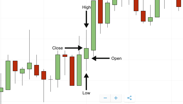
The key features of Japanese Candlesticks:
- Each candlestick has the same width, which relates to the chosen time frame
- The central box shows the entry price and exit price
- The box color tells you the direction the market moved over this time period. Green signifies a bullish trend whereas red signifies a bearish trend
- The two wicks above and below the main box indicate the highest and lowest values that the asset reaches during this time period
- If there is no colored central box, such as can be seen in the image above, the entry and exit prices are the same
- If there are no wicks, the entry and exit prices were the maximum and minimum during the time frame
Bar Charts
Bar charts, or ‘open high low close’ charts, are also popular for binary options trading. They are very similar to candlesticks but present the information without using colour.
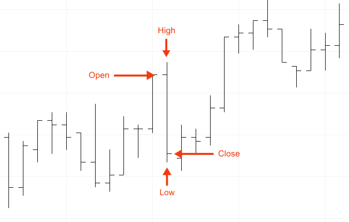
The key features of the bar chart:
- The horizontal line on the left of the wick indicates the open price
- The horizontal line on the right of the wick indicates the exit price
- The highest point of the wick shows the asset’s maximum value within the time frame
- The lowest point of the wick shows the asset’s minimum value within the time frame
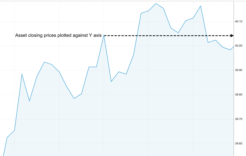
Line & Mountain Charts
Rather than using discreet price points, line and mountain binary options charts show a continuous closing price history plotted against the Y-axis. As a result there is limited information presented when compared with Japanese Candlesticks and Bar Charts.
To interpret a line or mountain chart, you simply connect the price point with a time along the X- axis. The main benefit of using a line or mountain chart for binary options trading is the ease of identifying trend lines.
Line charts and mountain binary options charts are essentially the same as they both plot the same lines. The only difference between the two is that mountain charts include shading beneath the line.
How To Analyze Binary Options Charts
An important aspect of binary options trading is knowing how to read the information that the charts present. You could have an abundance of data but it will be irrelevant if not combined with proper analysis.
What Is On The Horizontal Axis?
One of the main parts of binary options trading is the consideration of an expiration time whereby you need to predict what the price of an asset will be at a specified time.
On the x-axis of all binary options charts is time, which can be scaled using different time frames. These time frames can be anywhere from 60-second steps all the way to entire years.
It is important you select a time frame that is suited best to your strategy so you can focus on the most important information. For day trading binary options, you usually need short term time frames such as 1 minute, 2-minute, 10-minute, 30 minute and maybe even 60-minute steps.
Tools & Indicators
Listed below are a few examples of tools and indicators you can use with binary options charts to analyze potential assets and execute trades.
This is not an exhaustive list and so you should complete your own research to find what suits you best.
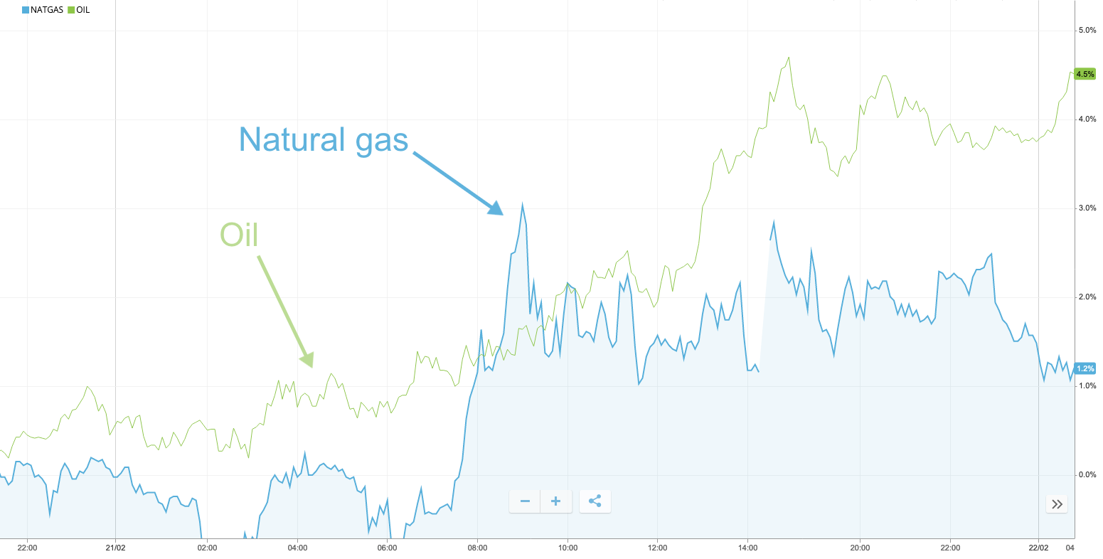
Comparison Tool
This is a helpful tool to show the performance of a chosen asset relative to another.
Simply, the price history of one asset is overlaid onto the price chart of the other, as seen in the image below. In this example, the traded price of natural gas is compared with that of oil.
This is useful if you wish to adopt an arbitrage strategy between any two linked assets, for example, the strength of JPY and the price of oil.
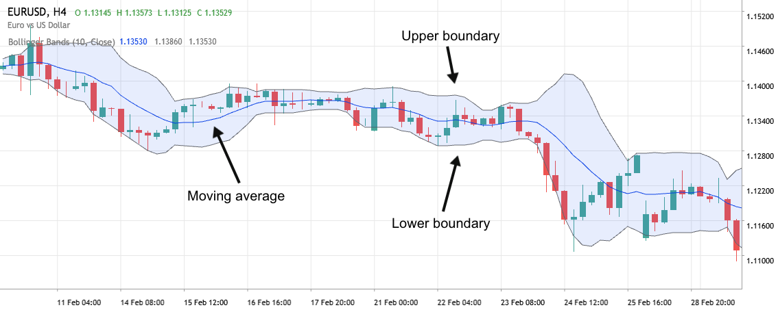
Bollinger Bands
Bollinger bands are a popular type of indicator that can be added to binary options charts.
With this indicator, the asset’s moving average is calculated and plotted on the chart. In the example below, this is for the EUR/USD forex pair.
The upper and lower boundaries which form the bubble are plotted two standard deviations away from the moving average.
Bollinger Bands are helpful on binary options charts as they can indicate when an asset is oversold or overbought:
- In an oversold market, where the asset is believed to be undervalued, you could open a call option in anticipation of a bullish trend.
- In an overbought market, where the asset is believed to be overvalued, you could open a put option in anticipation of a bearish trend.
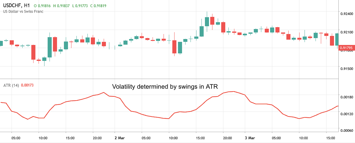
Average True Range
The average true range (ATR) is an indicator of market volatility.
When the market is highly volatile and there are sudden and large swings in an asset’s price, the ATR value is greater. When the market is less volatile, the ATR is lower.
You can use the ATR to identify when you should enter a binary options trade or when you should avoid it.
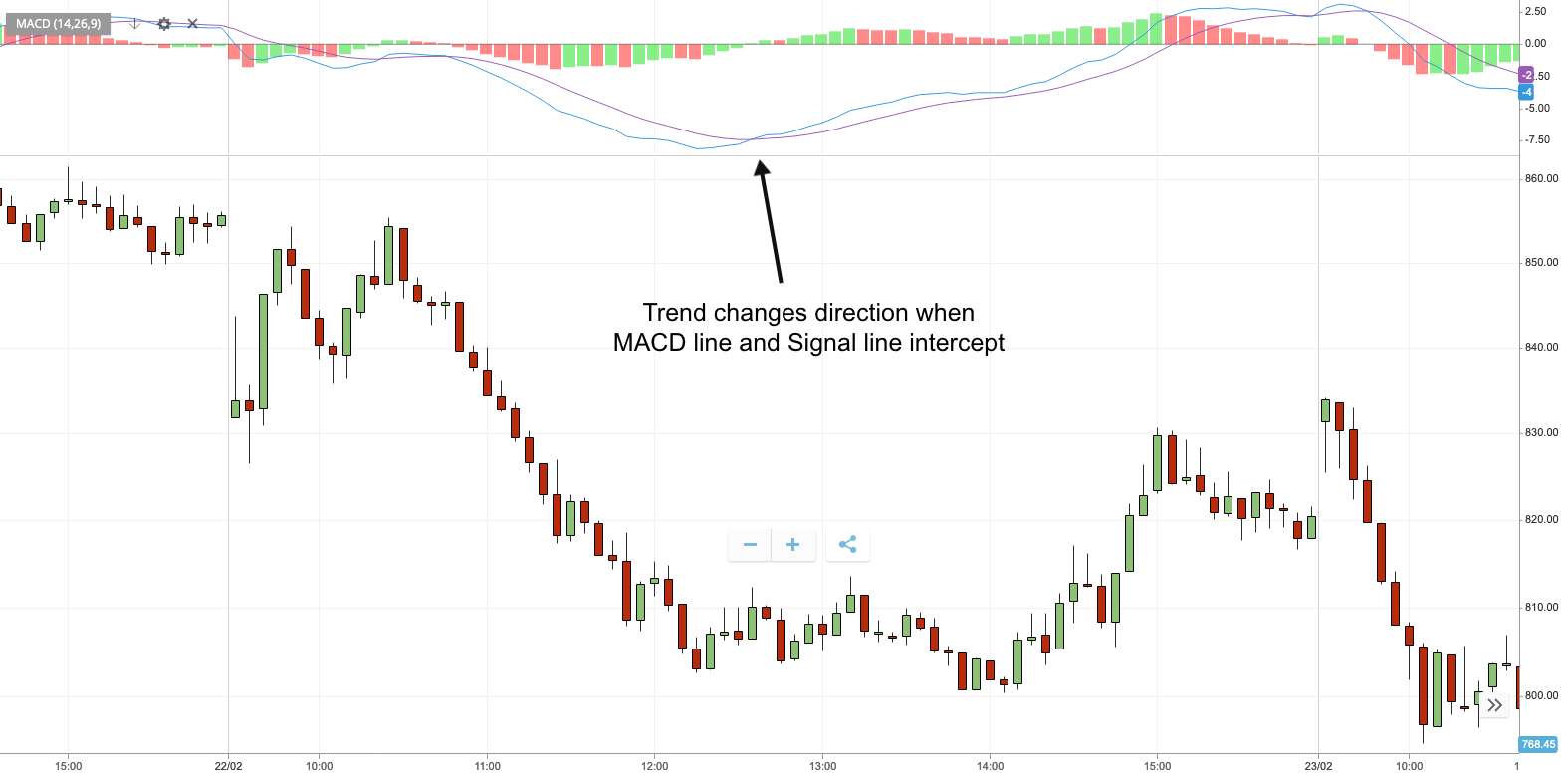
Moving Average Convergence/Divergence
The moving average convergence/divergence (MACD) indicator is used to show trends for an asset’s price.
It involves creating two different lines called the MACD line and the signal line, both of which are derived from historical data.
The two lines can be used as alerts for when to buy or to sell an asset according to the distance between them, which is shown using a histogram.
In the example below, the MACD line is blue, the signal line is purple and the histogram is green and red. Green indicates that the MACD line is increasing at a greater rate than the signal line and red indicates vice versa.
The greater the bar chart’s value, the stronger the trend, which means it is more likely to continue. When the MACD and signal lines intercept, the market trend swaps direction.
How To Start Trading With Binary Options Charts
Once you have done some research into the binary options charts you wish to use, you can start following these steps to start trading:
- Determine the strategy, or strategies, you wish to use for binary options trading. Your binary options strategy will impact the way you interpret charts and so it is important that you first establish criteria for analysis.
- Create or sign into a brokerage account. Find a binary options broker that will accommodate your strategy and is well-suited to your needs. For instance, check the payouts, contract timeframes, deposit and withdrawal methods, markets available to trade, charting software, and customer support.
- Search for suitable assets and opportunities. Technical analysis using signals and indicators can help you to find the optimal assets that suit your trading strategy. Furthermore, you may favor trading one asset class over another, for example, commodities rather than forex. In this case, focus on what you are most comfortable with.
- Determine the type of binary options trade you wish to make. There are several to choose from such as high/low, boundary, ladder and touch/no-touch. This also is likely to be influenced by your choice of strategy.
- Fund your trading account. Your broker will likely facilitate deposits via bank transfer, e-wallets and debit/credit cards. Make sure to look out for any transaction fees.
- Begin trading. Once you understand how binary options work and how to interpret charts and signals, you can begin trading. This does not mean you need to stop researching or learning, though. In fact, a free demo account is a great way to build your experience trading binaries from charts.
Bottom Line
It is important that you invest time into learning how to use and analyze binary options charts. Indicators and signals can aid your trading strategy and potentially boost your profits by showing real-time data.
If you are unsure which type of graph you prefer, use a demo account to try out candlestick, bar and line/mountain charts to find which is best for you.
FAQs
What Are Binary Options Charts?
Binary options charts can help you analyze price data to inform trading decisions. Charts can be customized using different time frames depending on your strategy, ranging from just a few seconds to several hours, days, weeks and even months. To help interpret price changes, you can overlay a series of technical indicators onto binary options charts.
What Are The Different Types Of Binary Options Chart?
The main types of binary options charts are Japanese candlesticks, bars and lines/mountains. Candlestick and bar charts show entry and exit prices, as well as the highest and lowest prices reached during a given time frame. Line and mountain charts simply show a continuous price history of an asset.
Do I Have To Pay For Binary Options Charts?
At most brokers, access to binary options charts is free for all users with an account. You may, however, be restricted to certain indicators and signals depending on your account type.
What Are The Best Indicators For Binary Options Charts?
There are many indicators to choose from that can provide deeper graph analysis for binary options. There are price and momentum oscillators, the relative strength index, pivot points, moving averages and Ichimoku clouds. This is not a complete list of indicators and so you should perform your own research to find what works best for you.